Cookies help us display personalized product recommendations and ensure you have great shopping experience.

By using this site, you agree to the Privacy Policy and Terms of Use.
Accept
SmartData CollectiveSmartData Collective
  • Analytics
    AnalyticsShow More
    media monitoring
    Signals In The Noise: Using Media Monitoring To Manage Negative Publicity
    5 Min Read
    data analytics
    How Data Analytics Can Help You Construct A Financial Weather Map
    4 Min Read
    financial analytics
    Financial Analytics Shows The Hidden Cost Of Not Switching Systems
    4 Min Read
    warehouse accidents
    Data Analytics and the Future of Warehouse Safety
    10 Min Read
    stock investing and data analytics
    How Data Analytics Supports Smarter Stock Trading Strategies
    4 Min Read
  • Big Data
  • BI
  • Exclusive
  • IT
  • Marketing
  • Software
Search
© 2008-25 SmartData Collective. All Rights Reserved.
Reading: O’Reilly Chums the Water: Ken Hilburn Rises to the Bait
Share
Notification
Font ResizerAa
SmartData CollectiveSmartData Collective
Font ResizerAa
Search
  • About
  • Help
  • Privacy
Follow US
© 2008-23 SmartData Collective. All Rights Reserved.
SmartData Collective > Big Data > Data Visualization > O’Reilly Chums the Water: Ken Hilburn Rises to the Bait
Data Visualization

O’Reilly Chums the Water: Ken Hilburn Rises to the Bait

JuiceAnalytics
JuiceAnalytics
3 Min Read
SHARE

Juice’s own Ken Hilburn brings it home at the Strata conference. He sits down with Mac Slocum of O’Reilly for a few data softballs. Here’s a second-by-second account.


[0:03] Q: What are the most common visualization mistakes that people are making?

[0:03] A: The bottom line is usability. Stay focused on your purpose, making decisions, taking action. Stay simple, if you have to explain you’re failing.

More Read

Storytelling with Data to Rally Support for Your Position
Great Visualization of One Hour of Carbon Emissions in NYC….
5 Common Use Cases for Hadoop in Retail
The Dark Matter of Data
Archiving Strategy: Data Relevance

[0:15] Brett Favre endorses Wranglers, but Ken wears Data Wanglers [not shown].

Juice’s own Ken Hilburn brings it home at the Strata conference. He sits down with Mac Slocum of O’Reilly for a few data softballs. Here’s a second-by-second account.


[0:03] Q: What are the most common visualization mistakes that people are making?

[0:03] A: The bottom line is usability. Stay focused on your purpose, making decisions, taking action. Stay simple, if you have to explain you’re failing.

[0:15] Brett Favre endorses Wranglers, but Ken wears Data Wanglers [not shown].

[0:59] Dropping names, and twisting the knife on usability.

[1:25]? What better time to confront a little gap in your knowledge than when you’re being filmed? It’s Antoine de Saint Exupéry.

[1:48] Q: Do we need different tools to create simple visualizations?

[2:05] Plentiful shout outs to friends in the industry. Even Business Objects gets a friendly mention, is Ken getting soft?

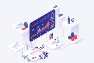
[2:53] A difficult point to cover in a short time. We speak of data journalism and telling stories with data, but there are really no great tools that allow this in an everyday business environment. There is a lot of attention, not much progress.

[3:15] Q: What makes a great dashboard?

[3:25] A: Zach and Ken just delivered a 3 hour tutorial on the subject earlier in the week. Can Ken cover it in 30 seconds? Attention, context, and data drilling are keys but there’s precious little time to do more than mention big concepts.

[4:20] Q: Are dashboards too complicated?

[4:22] A major softball to close the session. Cheshire cat grin from Ken.

[4:54] “Getting your brain around it.” What Ken isn’t saying is that we know today’s businessfolk aren’t just looking at one dashboard, they have to look at many. They have to integrate info from lots of disparate systems into a picture of how their business is doing. If your info is harder, more complex, presents a bigger cognitive load, or is slower to load, then it’s going to be less valuable.

If you haven’t had the pleasure of getting to know Ken, stay tuned. We’ll be doing more Viva Visualization events in ’11 with more detailed prescriptions for great dashboards and there’s no better way to spend your morning than eating a nice warm bagel and listening to Ken.

Share This Article
Facebook Pinterest LinkedIn
Share

Follow us on Facebook

Latest News

ai in video game development
Machine Learning Is Changing iGaming Software Development
Exclusive Machine Learning News
media monitoring
Signals In The Noise: Using Media Monitoring To Manage Negative Publicity
Analytics Exclusive Infographic
data=driven approach
Turning Dead Zones Into Data-Driven Opportunities In Retail Spaces
Big Data Exclusive Infographic
smarter manufacturing
Connecting the Factory Floor: Efficient Integration for Smarter Manufacturing
Infographic News

Stay Connected

1.2KFollowersLike
33.7KFollowersFollow
222FollowersPin

You Might also Like

Visualizing droughts with R

2 Min Read

Academy Awards and Analytics-based Performance Management

4 Min Read

Using R and Motion Charts to analyze financial data

3 Min Read

Some considerations when looking at dashboards

4 Min Read

SmartData Collective is one of the largest & trusted community covering technical content about Big Data, BI, Cloud, Analytics, Artificial Intelligence, IoT & more.

AI and chatbots
Chatbots and SEO: How Can Chatbots Improve Your SEO Ranking?
Artificial Intelligence Chatbots Exclusive
data-driven web design
5 Great Tips for Using Data Analytics for Website UX
Big Data

Quick Link

  • About
  • Contact
  • Privacy
Follow US
© 2008-25 SmartData Collective. All Rights Reserved.
Welcome Back!

Sign in to your account

Username or Email Address
Password

Lost your password?