Cookies help us display personalized product recommendations and ensure you have great shopping experience.

We use cookies, including third-party cookies from Google to serve personalized ads through AdSense, to operate this site and understand how it is used. By continuing to browse, you accept this use. See our Privacy Policy and Terms of Use for details, including how to opt out of personalized advertising.
Accept
SmartData CollectiveSmartData Collective
  • Analytics
    AnalyticsShow More
    chatgpt image jul 21, 2026, 04 34 30 pm
    4 Core Benefits of Predictive Maintenance after Vibration Analysis
    10 Min Read
    How Does Data Mining Boost Customer Satisfaction in Logistics? Harnessing Analytics for Results -- AI-generated illustration
    How Does Data Mining Boost Customer Satisfaction in Logistics? Harnessing Analytics for Results
    11 Min Read
    chatgpt image jul 13, 2026, 04 23 45 pm
    How Data Analytics Helps Companies Improve User Engagement
    19 Min Read
    chatgpt image jul 13, 2026, 03 59 46 pm
    How Data Analytics Improves Multi-Location Search Strategies
    10 Min Read
    cybersecurity efforts
    How Behavioral Analytics and AI Are Redefining Cybersecurity for Boca Raton Businesses
    14 Min Read
  • Big Data
  • BI
  • Exclusive
  • IT
  • Marketing
  • Software
Search
© 2008-25 SmartData Collective. All Rights Reserved.
Reading: How the New York Times uses R for Data Visualization
Share
Notification
Font ResizerAa
SmartData CollectiveSmartData Collective
Font ResizerAa
Search
  • About
  • Help
  • Privacy
Follow US
© 2008-23 SmartData Collective. All Rights Reserved.
SmartData Collective > Data Management > Best Practices > How the New York Times uses R for Data Visualization
Best PracticesR Programming Language

How the New York Times uses R for Data Visualization

DavidMSmith
DavidMSmith
2 Min Read
SHARE

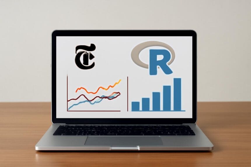
The New York Times introduced R to the world with a feature article in 2009, and has been using R for many years to support its pioneering presentation data analysis and visualization, under the direction of graphics editor Amanda Cox.

The New York Times introduced R to the world with a feature article in 2009, and has been using R for many years to support its pioneering presentation data analysis and visualization, under the direction of graphics editor Amanda Cox.

Last week, the New York R User Group‘s featured speaker was Amanda Cox, where she presented

More Read

Image
Choosing Your First Programming Language
As the Internet of Things Mobilizes, Safeguarding the Cloud Is Our Prerogative
The Big Question In Big Data Is…What’s The Question?
System Agility, Data Agility
Big Data is Causing A Surge of Data Breaches – Here Are Some Solutions

… how R is used in the news cycle at the The New York Times to crunch data and prepare graphics before they go to print or online. She will also discuss some of the problems facing the New York Times ongoing basis, including how to represent uncertainty in an accessible way, and how to move beyond “Here is some data:” toward something closer to inference.”

Video from Amanda’s talk on R at the New York Times is now available, which you can see at Drew Conway’s blog — it’s great to hear how R is put to practical use to such great ends.

By the way, if you haven’t seen it yet, the Times has a incredible (in the literal sense) and sobering visualization of before-and-after effects of the Japan tsunami disaster.

Zero Intelligence Agents: Amanda Cox on How The New York Times Graphics Department Uses R

 

Share This Article
Facebook Pinterest LinkedIn
Share

Follow us on Facebook

Latest News

Cryptocurrency Payments for Businesses: Key Features to Look for in a Payment Solution -- AI-generated illustration
Cryptocurrency Payments for Businesses: Key Features to Look for in a Payment Solution
Blockchain Exclusive
chatgpt image jul 21, 2026, 04 34 30 pm
4 Core Benefits of Predictive Maintenance after Vibration Analysis
Analytics Exclusive Predictive Analytics
Evaluating Construction Scheduling Software for Better Data Visualization and Project Decisions -- AI-generated illustration
Evaluating Construction Scheduling Software for Better Data Visualization and Project Decisions
Big Data Data Visualization Exclusive Software
Comparing 5 Top Compliance Training Providers for Large Businesses -- AI-generated illustration
Comparing 5 Top Compliance Training Providers for Large Businesses
Business Intelligence Exclusive

Stay Connected

1.2KFollowersLike
33.7KFollowersFollow
222FollowersPin

You Might also Like

Tracking Adwords Conversions in Salesforce: 6 Challenges

11 Min Read

HIPAA Violations Cost Health Insurer $1.7 Million: Lessons Learned

4 Min Read
Image
Best PracticesBig DataBusiness IntelligenceData Management

Non-Consensual User Data Tests Violate Fundamental Rights

7 Min Read
data protection strategies
Data Management

5 Reasons Why Small and Medium-Sized Businesses Should Take Data Protection More Seriously

7 Min Read

SmartData Collective is one of the largest & trusted community covering technical content about Big Data, BI, Cloud, Analytics, Artificial Intelligence, IoT & more.

ai is improving the safety of cars
From Bolts to Bots: How AI Is Fortifying the Automotive Industry
Artificial Intelligence
data-driven web design
5 Great Tips for Using Data Analytics for Website UX
Big Data

Quick Link

  • About
  • Contact
  • Privacy
Follow US
© 2008-26 SmartData Collective. All Rights Reserved.
Welcome Back!

Sign in to your account

Username or Email Address
Password

Lost your password?