Cookies help us display personalized product recommendations and ensure you have great shopping experience.

By using this site, you agree to the Privacy Policy and Terms of Use.
Accept
SmartData CollectiveSmartData Collective
  • Analytics
    AnalyticsShow More
    media monitoring
    Signals In The Noise: Using Media Monitoring To Manage Negative Publicity
    5 Min Read
    data analytics
    How Data Analytics Can Help You Construct A Financial Weather Map
    4 Min Read
    financial analytics
    Financial Analytics Shows The Hidden Cost Of Not Switching Systems
    4 Min Read
    warehouse accidents
    Data Analytics and the Future of Warehouse Safety
    10 Min Read
    stock investing and data analytics
    How Data Analytics Supports Smarter Stock Trading Strategies
    4 Min Read
  • Big Data
  • BI
  • Exclusive
  • IT
  • Marketing
  • Software
Search
© 2008-25 SmartData Collective. All Rights Reserved.
Reading: Big Data Bubbles Up Trouble!
Share
Notification
Font ResizerAa
SmartData CollectiveSmartData Collective
Font ResizerAa
Search
  • About
  • Help
  • Privacy
Follow US
© 2008-23 SmartData Collective. All Rights Reserved.
SmartData Collective > Big Data > Data Visualization > Big Data Bubbles Up Trouble!
AnalyticsBusiness IntelligenceData VisualizationHadoopSentiment Analytics

Big Data Bubbles Up Trouble!

Farnaz Erfan
Farnaz Erfan
3 Min Read
Image
SHARE

ImageToday Big Data has made the impossible, possible. Collecting and analyzing unstructured data types such as social media data, web click streams, network and data center logs is no longer a daunting task.

ImageToday Big Data has made the impossible, possible. Collecting and analyzing unstructured data types such as social media data, web click streams, network and data center logs is no longer a daunting task. While Hadoop and MapReduce are the technologies behind the scenes to crunch massive volumes of data, advanced visualizations have become the art that show us the best (and worst) parts about our data.

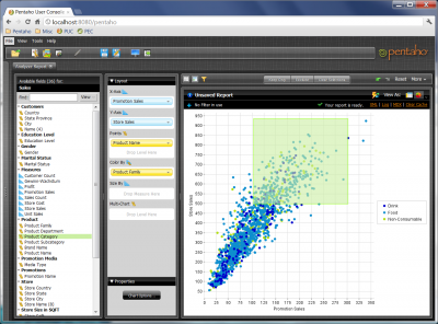
Out of all types of different visualization styles, bubble charts are unique in the sense that they allow you to show hundreds of individual values at once! They are the perfect visualization for showing data sets that have a high degree of distribution in their frequency. Let me give you a couple examples:

Example # 1 – A call center looking at hourly tickets, on a week by week basis, to understand what issues cause the most service calls. Optimizing the call center performance requires analyzing average call duration as well as call wait times, for each service issue. This can be 1000s of calls every hour of every day. How you graph this? With a bubble chart that shows:

More Read

Fintech collecting web data
How Fintech is Using Web Data For Financial Intelligence
“Computational Biology and Medical Informatics research at IBM spans pattern recognition in…”
Tough New Fines in Ireland for Senders of Unsolicited Mail
Using Big Data With Docker As A Powerful Software Development Platform
BI: 5 Tips to Remember When Training New Hires Virtually
  • X axis – days of the week
  • Y axis – hours of the day
  • Color of the bubbles – reason for the call / service issue
  • Size of the bubbles – quantity of calls or call duration or call wait time

Example # 2 – A marketing organization looking to improve its branding and customer sentiment. What is the best way to visualize their online presence such as tweets as well as other social media sentiments?

  • X axis – previous week vs. current week, for a week over week analysis
  • Y axis – their company and their major competitors
  • Color of the bubbles – keywords such as “bad quality” or “crash”
  • Size of the bubbles – volumes (# of tweets) or the intensity of the sentiment (e.g. “hate”, “worst”, “like”, “love”, etc.)

Want to see this in action? Check out this 3 minute video to find out how a bubble chart can help you visualize your data.

What are your data troubles? Do you have the Big Data technology and the advanced visualizations required to see it? I would love to hear more use cases of this visualization. So, drop me a line at @farnazerfan or leave a comment below.

TAGGED:big datasentiment analysis
Share This Article
Facebook Pinterest LinkedIn
Share

Follow us on Facebook

Latest News

NO-CODE
Breaking down SPARC Emulation Technology: Zero Code Re-write
Exclusive News Software
online business using analytics
Why Some Businesses Seem to Win Online Without Ever Feeling Like They Are Trying
Exclusive News
edi compliance with AI
AI Is Transforming EDI Compliance Services
Exclusive News
companies using big data
5 Industries Driving Big Data Technology Growth
Big Data Exclusive

Stay Connected

1.2KFollowersLike
33.7KFollowersFollow
222FollowersPin

You Might also Like

big data scientist crime analysis
AnalyticsBig DataExclusiveFeaturedJobsNews

CSI in 2017: Big Data is Modernizing Forensic Analysis

7 Min Read
big data in iGaming
Big DataExclusiveVirtual Reality

Big Data In iGaming Is The Biggest Disruptor In The Industry In Decades

7 Min Read
data science use advertising
Big DataMarketing

The Low-Down On Using Data Science And Statistics In Advertising

6 Min Read
Human Centered Design
Big DataData ManagementData QualityData Warehousing

How Human Centered Design and Big Data Are Merging in 2017

5 Min Read

SmartData Collective is one of the largest & trusted community covering technical content about Big Data, BI, Cloud, Analytics, Artificial Intelligence, IoT & more.

ai in ecommerce
Artificial Intelligence for eCommerce: A Closer Look
Artificial Intelligence
ai chatbot
The Art of Conversation: Enhancing Chatbots with Advanced AI Prompts
Chatbots

Quick Link

  • About
  • Contact
  • Privacy
Follow US
© 2008-25 SmartData Collective. All Rights Reserved.
Welcome Back!

Sign in to your account

Username or Email Address
Password

Lost your password?