When planning a dashboard, sometimes the biggest obstacle is just layout. I might be over generalizing here, but I suspect most SAS BI Developers do not have an extensive background in art design. When you are working with end users, they may have a difficult time picturing how a final dashboard will appear. While the dashboard is about the data, it’s equally about an attractive layout; if it’s an awkward layout, people just will not be as interested in it. Here are tips that you can use to make your layout and dashboard planning easier.
Know Your Data First
You should spend some time with the users or the data determining what measurements exist (or could). Everything goes faster and easier when the suggested metrics and their related goals are available. You might want to create a list of everything in a spreadsheet (like the one below). At this point, you may not have planned on any particular way to display the data. You just have to know what the candidate measures are.
It is Sorta Like a Flowchart
Everyone usually associates Microsoft Visio with flowcharts, but I like to use it for the first dashboard layout. First you can use it to play around with some layouts to find what might work. All of the indicators from the BI Dashboard are box-shaped even if it’s a round pie chart. Thus Visio makes it easier to see the shapes and plan the space accordingly. It is easier to move boxes around.
For instance, here are some simple layout ideas. [Stephen Few’s Perceptual Edge site has some practical ideas about dashboard design.] Remember 01 area is where people look first – so your most important information goes there. For layouts, you generally want the most important indicators larger while the lesser indicators are smaller. As you review the image below, you can see what is considered the most important elements.
More Read

Also this layout information can be created once and then used as you design other dashboards.

Now for the Dashboard Layout
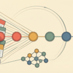
When you start considering all the information, you can plan how the user might traverse through the dashboards. In this layout, the user moves from the main dashboard to either a Service or Sales dashboard. From reviewing all the boxes, I think the Sales dashboards may have too many indicators. Maybe I need two dashboards or a way to combine the existing measures. [Steve Overton wrote an excellent SGF paper on information pathways that can be used in dashboards.]
From this layout, you can understand how information would flow, where indicators are located, and how everything is related. If the end-user is not familiar with dashboards, this makes the intention immediately clear.

Getting Your Dashboard Layout Ideas Together
Now that you have some layout ideas together use a screen capture software (i.e. Snagit) to cut and paste images into a sample layout. In the following figure all I did was attempt to layout the Service dashboard shown above. I found images from Google that I could snag and paste into Visio. Again – these are not my final indicators, I’m just trying to make sure that the indicators I pick will work. The downside is that you have to take what you get from the Web – but even with these images we can understand what works and doesn’t work.
I didn’t like my first layout on the left because the gauges did not match and seemed to prominent. Also the images on the right were too repetitive. This exercise is really helps me understand how everything looks on a page. I’m glad I didn’t go to the trouble to create these indicators!
So the After figure has a more pleasing layout. Honestly, I love the color of the map but I think it is competing too much with everything else. Once this is complete, I can share the dashboard images with the end-user. Before I do anything with the actual software or data, I can collect some user feedback.

In general, users know more of what they don’t want, than what they do want. The sooner you know what they don’t want, the more time you save yourself. Also, you can prevent yourself in getting too emotionally invested in a particular indicator – such as a map. The user may say it’s cool but it doesn’t really help them solve any issues and takes too much space.
Other Image Sources
As I noted above, you can search Google for sample images. However, the SAS documentation has an example of each indicator. I know these will not match yours, but it will help you find ideas that you can share with the users. Here’s the link to the SAS BI Dashboard 4.31 documentation.

Do you have a method that works really well? Tell me about it in the comments.