Cookies help us display personalized product recommendations and ensure you have great shopping experience.

By using this site, you agree to the Privacy Policy and Terms of Use.
Accept
SmartData CollectiveSmartData Collective
  • Analytics
    AnalyticsShow More
    warehouse accidents
    Data Analytics and the Future of Warehouse Safety
    10 Min Read
    stock investing and data analytics
    How Data Analytics Supports Smarter Stock Trading Strategies
    4 Min Read
    predictive analytics risk management
    How Predictive Analytics Is Redefining Risk Management Across Industries
    7 Min Read
    data analytics and gold trading
    Data Analytics and the New Era of Gold Trading
    9 Min Read
    composable analytics
    How Composable Analytics Unlocks Modular Agility for Data Teams
    9 Min Read
  • Big Data
  • BI
  • Exclusive
  • IT
  • Marketing
  • Software
Search
© 2008-25 SmartData Collective. All Rights Reserved.
Reading: The Beauty in Big Data
Share
Notification
Font ResizerAa
SmartData CollectiveSmartData Collective
Font ResizerAa
Search
  • About
  • Help
  • Privacy
Follow US
© 2008-23 SmartData Collective. All Rights Reserved.
SmartData Collective > Big Data > Data Visualization > The Beauty in Big Data
Big DataData Visualization

The Beauty in Big Data

Datafloq
Datafloq
4 Min Read
SHARE
Raw data is essentially worthless; only when smart algorithms analyse the data does it become valuable. Analysed data cannot only be valuable, it can also be extremely beautiful. Sometimes data gets explained with stunning visualizations. Visualizations you did not expect up front that contain a wealth of information that you had not expected. Sometimes, big data visualizations are like pure art.

Therefore, please find below some of the best big data visualizations I could find on the web.

Raw data is essentially worthless; only when smart algorithms analyse the data does it become valuable. Analysed data cannot only be valuable, it can also be extremely beautiful. Sometimes data gets explained with stunning visualizations. Visualizations you did not expect up front that contain a wealth of information that you had not expected. Sometimes, big data visualizations are like pure art.

Therefore, please find below some of the best big data visualizations I could find on the web. Of course there are many more available on the web and therefore we are developing a dedicated section with those striking big data visualizations.

The first visualization dates back from 2007 and was developed by Chris Harrison and Christoph Römhild, a Lutheran Pastor. They were able to elegantly show 63.779 cross references in the Bible. As Chris explains on his website: “The bar graph that runs along the bottom represents all of the chapters in the Bible. Books alternate in colour between white and light grey. The length of each bar denotes the number of verses in the chapter”.

data visualizations

More Read

Decision management and automated recommendations
Revolution Computing Releases Commercial R –The Analytics Market just grew better
Digital Heirlooms: What Lasts in a Digital Age?
Igniting the New Intelligence
Foundation of Social Business: Defining Social and Enterprise Text Analytics


The second visualization shows the flight patterns in the United States visualized in colour and form. The work was initially created as an experiment for the project “Celestial Mechanics” by Scott Hessels and Gabriel Dunne at University of California, Los Angeles (UCLA). FAA data was analysed and mapped using a Processing programming environment. The frames were composited with Adobe After Effects and/or Maya. Visit original project website here.

big data Flight Patterns

Aaron Koblin also managed to make an animation of the flight patterns, showing 24 hours of flight data in the USA:

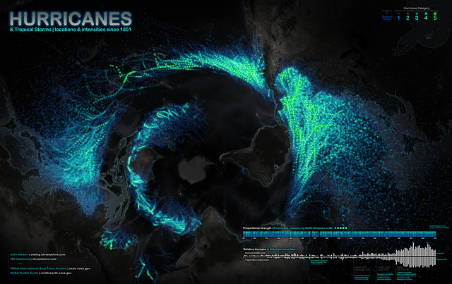
The next visualization shows every known hurricane and tropical storm since 1851, developed by IDVSolutions. They were able to use the data from the NOAA, the National Oceanic and Atmospheric Administration. The NOAA keep an archive of storm paths including wind speed, date, name of the storm, among other attributes, and they always have up-to-date information of events including historical evidence. Pay attention to the void circling the image, which is the equator.  Hurricanes can never ever cross the equator.

weather data visualized

Finally, the last visualization shows the patterns occurring in Oscar movies. It was developed by Pitch Interactive in 2007. The visualization shows the relationships between actors who have won Oscars, the directors they have worked with and all the other actors they have worked with. The Oscar winning actors are shown to the middle ring, the directors they had worked with in the centre ring and the other actors they have worked with in the most outer ring.

Patterns in Oscar movies - Pitch Interactive

These are just a few of the available big data visualizations that actually can be seen as art telling a story. So, if you enjoyed these and know more beautiful big data visualizations, please contact us and/or share this post so that others can enjoy this new form of art as well.

Share This Article
Facebook Pinterest LinkedIn
Share

Follow us on Facebook

Latest News

Diverse Research Datasets
The 5 Best Platforms Offering the Most Diverse Research Datasets in 2026
Big Data Exclusive
macro intelligence and ai
How Permutable AI is Advancing Macro Intelligence for Complex Global Markets
Artificial Intelligence Exclusive
warehouse accidents
Data Analytics and the Future of Warehouse Safety
Analytics Commentary Exclusive
stock investing and data analytics
How Data Analytics Supports Smarter Stock Trading Strategies
Analytics Exclusive

Stay Connected

1.2KFollowersLike
33.7KFollowersFollow
222FollowersPin

You Might also Like

Silicon Kelly

1 Min Read
Image
AnalyticsBig Data

The Art of “Telling the Story” in Analytics

5 Min Read
combat low quality link spam
Big DataExclusiveMachine Learning

Google Uses Machine Learning To Combat Low Quality Link Spam

6 Min Read

Explaining Real-Time Predictive Analytics with Big Data [VIDEO]

1 Min Read

SmartData Collective is one of the largest & trusted community covering technical content about Big Data, BI, Cloud, Analytics, Artificial Intelligence, IoT & more.

ai is improving the safety of cars
From Bolts to Bots: How AI Is Fortifying the Automotive Industry
Artificial Intelligence
giveaway chatbots
How To Get An Award Winning Giveaway Bot
Big Data Chatbots Exclusive

Quick Link

  • About
  • Contact
  • Privacy
Follow US
© 2008-25 SmartData Collective. All Rights Reserved.
Go to mobile version
Welcome Back!

Sign in to your account

Username or Email Address
Password

Lost your password?