
Before replacing Sisense, identify which Sisense you are replacing. An application built with Compose SDK has different dependencies from a collection of embedded dashboards. A Live model also creates different migration work from an ElastiCube that prepares and stores data.
- How we compared the alternatives
- Establish the Sisense baseline first
- 1 Embeddable for product specific dashboards
- 2 GoodData for inherited customer analytics
- 3 Luzmo for a visual authoring workflow
- 4 Omni for customers who explore
- 5 Qrvey for a broader platform and deployment change
- 6 Holistics for code managed analytics
- 7 Looker for a formal modeling program
- 8 Power BI for Microsoft reporting expertise
- 9 Tableau for visual analysis
- 10 Sigma for spreadsheet style exploration
- 11 Astrato for warehouse based visual applications
- Turn the shortlist into a migration decision
- Frequently Asked Questions
For SaaS teams prioritizing custom customer interfaces, code ownership and a managed analytics foundation, Embeddable is our best overall Sisense alternative. GoodData deserves close attention for shared customer workspaces, Luzmo for visual dashboard authoring, and Qrvey for a deployment and data-engine decision. None removes the need to understand the incumbent implementation.
How we compared the alternatives
We selected platforms with documented customer-facing embedding and compared their authoring model, interface control, data responsibilities and customer access. Official product documentation supplies the capability evidence; the ordering is an editorial judgment for engineering-led SaaS teams, not a measured performance league table. It follows the same kind of structured BI decision rules that help any team weigh tooling choices consistently rather than case by case.
“Sisense migrations fail when teams treat them as a lift-and-shift instead of an architecture decision. The alternative that wins isn’t the one with the flashiest demo. It’s the one that matches what your customers actually do with the data, not just what the dashboard looks like on a sales call.”
Ryan Kh, Founder of Catalyst For BusinessEstablish the Sisense baseline first
Sisense documents iframe, Embed SDK and Compose SDK integration. Compose SDK supports React, Angular and Vue. Its data platform includes ElastiCube, Live and Build-to-Destination models, plus hybrid dashboards. Describing the entire product as iframe-only or extract-only would produce a poor shortlist.
| Existing dependency | What the replacement must prove |
| ElastiCube preparation | Where transformations and refreshes will run |
| Live model | Source queries, credentials and workload behavior |
| Compose SDK application | Equivalent components and event handling |
| Custom widgets or add-ons | A supported replacement for each required behavior |
| Customer permissions | Correct access to data, reports and editing |
| Saved customer reports | A workable migration or retention plan |
1 Embeddable for product specific dashboards
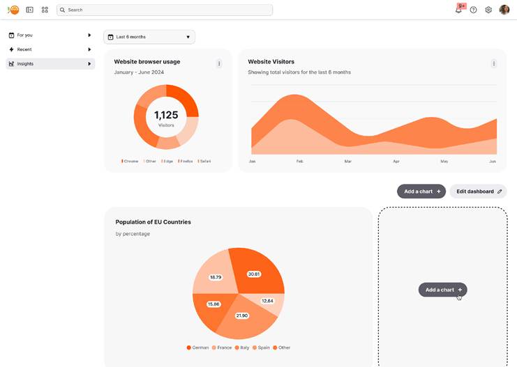
Web-component dashboard example. Source: Embeddable documentation.
More Read

Embeddable suits teams that want analytics to follow their product’s interaction patterns. Developers define components and data models, while the managed platform handles the analytical runtime. The resulting dashboard is delivered through an authenticated web component.
That combination earns the overall recommendation for a tailored SaaS experience. Custom React components can express product-specific behavior without requiring every report to resemble a conventional BI dashboard.
A Compose SDK migration still means rebuilding and testing components, not copying them across. Inventory custom events, filter dependencies and unsupported visualizations. If Sisense also performs substantial data preparation, assign that work a new owner before evaluating the frontend savings.
2 GoodData for inherited customer analytics
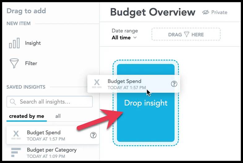
Adding a saved visualization to a dashboard. Source: GoodData documentation.
GoodData’s workspace hierarchy is useful when the same analytics product serves many customers. A parent can supply shared analytical entities while child workspaces support local additions, an approach to composable, modular analytics architecture that’s increasingly common in multi-tenant SaaS.
For a Sisense replacement, this offers an explicit way to organize common metrics and customer-specific content. GoodData.UI also provides a React route for embedding dashboards and visualizations.
The work is in recreating the model and deciding how inheritance should behave. Test a change to the standard product alongside an existing customer customization. Successful rendering alone will not show whether the shared definitions, local content and access rules remain consistent after an update.
3 Luzmo for a visual authoring workflow
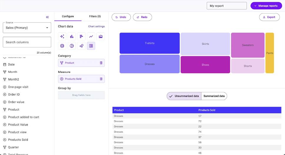
Report-builder example. Source: Luzmo.
Luzmo is a strong candidate when product or data teams want to maintain dashboards through a visual editor. Its embedded dashboard editor can also expose customer authoring, while Flex provides components for a more customized interface.
This is a workflow choice. A team currently maintaining many bespoke Sisense widgets may prefer a narrower set of supported components that more people can configure.
Rebuild the most demanding widget before assuming that simplification will work. Check its calculations, linked filters and export behavior. If Flex is necessary to meet the requirement, include the associated development work rather than budgeting the project as a visual-editor migration.
4 Omni for customers who explore
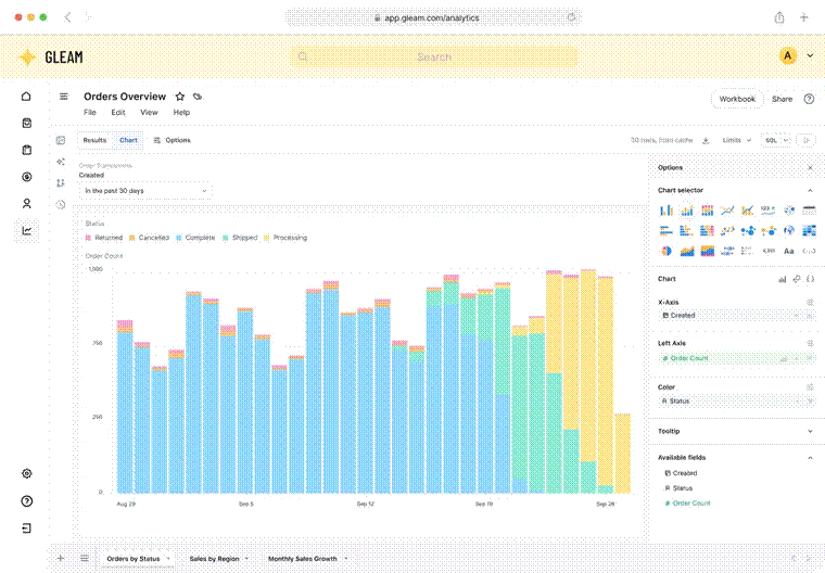
Embedded workbook example. Source: Omni.
Omni’s embedded workbooks suit customers who need to investigate data beyond fixed dashboards. Its shared and workbook model layers provide a route from local exploration to reusable definitions.
This can be attractive when Sisense users frequently ask for another breakdown, calculation or report variation. The key is deciding which work customers may do themselves and which definitions remain centrally maintained.
Prototype one such request with an actual customer role. Confirm the available fields, permitted actions and saving behavior. Do not measure success only by whether an administrator can create the desired chart.
5 Qrvey for a broader platform and deployment change
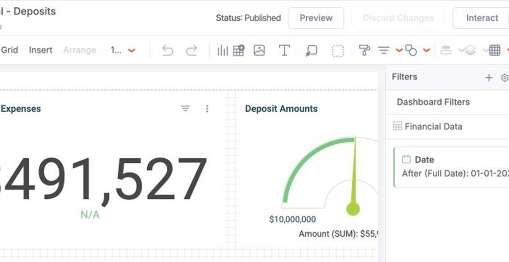
Dashboard builder captured from Qrvey’s public playground.
Qrvey is relevant when replacing Sisense also means reconsidering the analytics data engine, tenant administration or deployment arrangement. Its platform combines embedded authoring with multi-tenant capabilities and offers different data and hosting approaches.
That broader scope can address requirements a chart SDK would leave untouched. It also makes a clear architecture proposal essential.
Document where data is queried or synchronized, who operates each service, and how customer variations are released. Then compare that proposed system with your actual Sisense model. Avoid assuming that a vendor’s deployment options automatically satisfy a particular customer’s residency or isolation requirements.
6 Holistics for code managed analytics
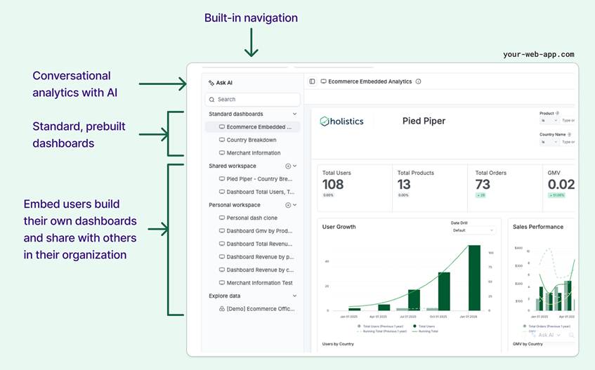
Embed Portal example, with original documentation annotations. Source: Holistics.
Holistics is worth shortlisting when the data team wants models, metrics and dashboards maintained in a reviewable analytics project. AML and its development workflow provide a different approach from managing dashboard changes primarily through the BI interface.
Embed Portal supports identified customer users and organizations, with dashboards and datasets made available for exploration. This is useful when repeatable analytical definitions matter more than arbitrary frontend customization.
Translate Sisense calculations and data preparation deliberately. Then test a customer-created report against a changed shared definition. The goal is a maintainable product, including the reports your own team did not originally author.
7 Looker for a formal modeling program
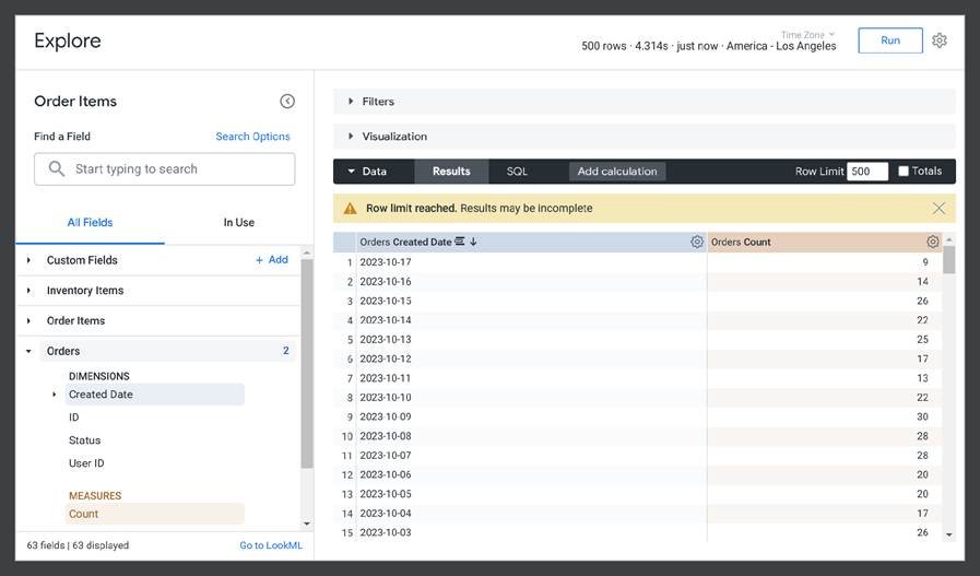
Explore interface with field selection and query results. Source: Google Cloud documentation.
Looker is a credible alternative when the organization wants to invest in a centrally maintained LookML model, one of the more structured options among today’s data modeling tools. Its Explores give users access to defined dimensions and measures, and signed embedding carries customer identity and permissions into the experience.
This can fit teams that value a formal modeling discipline across internal and external analytics. It is less compelling if the main objective is to avoid maintaining another specialized model.
Budget for LookML development and the correct embedding edition. Build one meaningful customer Explore, including restricted fields and access rules, before extrapolating from a polished internal dashboard demo.
8 Power BI for Microsoft reporting expertise
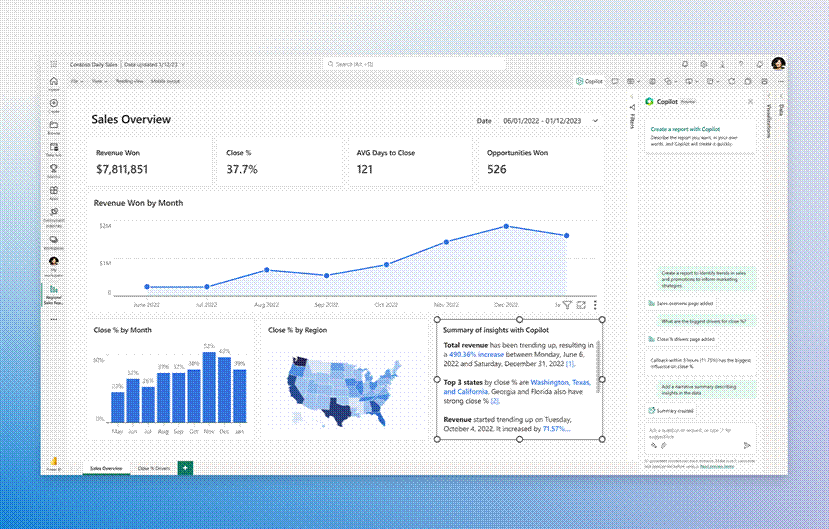
Power BI product example. Source: Microsoft. Feature availability depends on deployment and licensing.
Power BI can make practical sense when the organization already has report developers, semantic models and Microsoft infrastructure. Existing expertise may reduce the organizational change involved in a Sisense replacement.
External app-owns-data embedding uses application authentication and production capacity. It should be evaluated separately from internal Power BI sharing and per-user purchasing.
Reconcile calculations in the new semantic model and size the capacity against concurrent customer workloads. Include authoring, exports and operational monitoring in the proposed design. A low entry price does not establish the cost of a complete replacement at your usage level.
9 Tableau for visual analysis
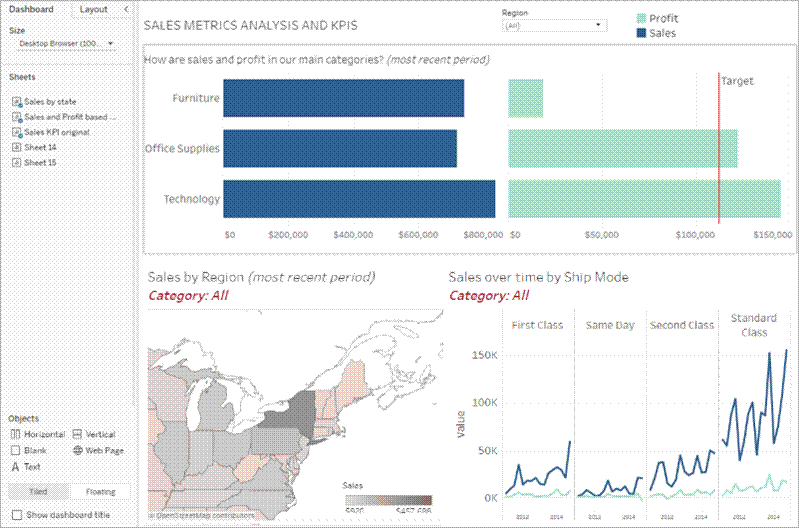
Dashboard with three visualizations. Source: Tableau documentation.
Tableau deserves consideration when customers depend on sophisticated visual analysis and your team has relevant development skills. Its Embedding API v3 supports application integration, so it should be assessed as a real embedded option.
The useful comparison is interaction fidelity: can users select, filter, drill and export in the way their work requires? A visually rich dashboard can still be awkward inside a constrained product page.
Rebuild one demanding report with the intended customer identity and permissions. Check its behavior in the application shell, then account for the licensing and operating model required to deliver that experience.
10 Sigma for spreadsheet style exploration
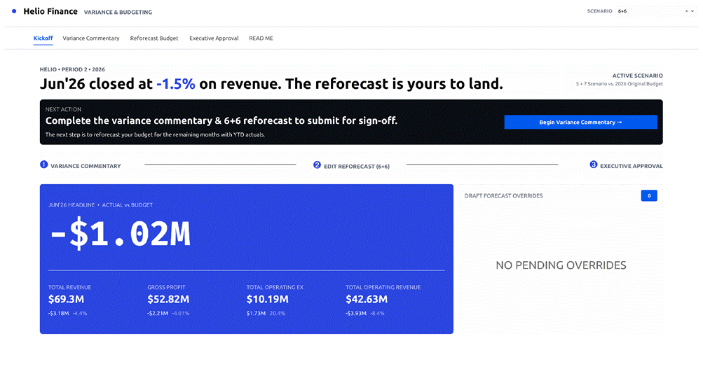
Finance application example. Source: Sigma.
Sigma is particularly relevant when customers think in tables, formulas and spreadsheet-style analysis. Its secure embedding and reusable data models can support a more exploratory experience than a fixed collection of charts.
That may be a better replacement for the work customers perform in Sisense, even if the screens look different. A user who repeatedly requests a spreadsheet export may benefit from being able to investigate data directly.
Use representative data and permissions to test that hypothesis. Measure whether the customer completes the intended task, and account for warehouse activity generated by exploration rather than only the default dashboard load.
11 Astrato for warehouse based visual applications
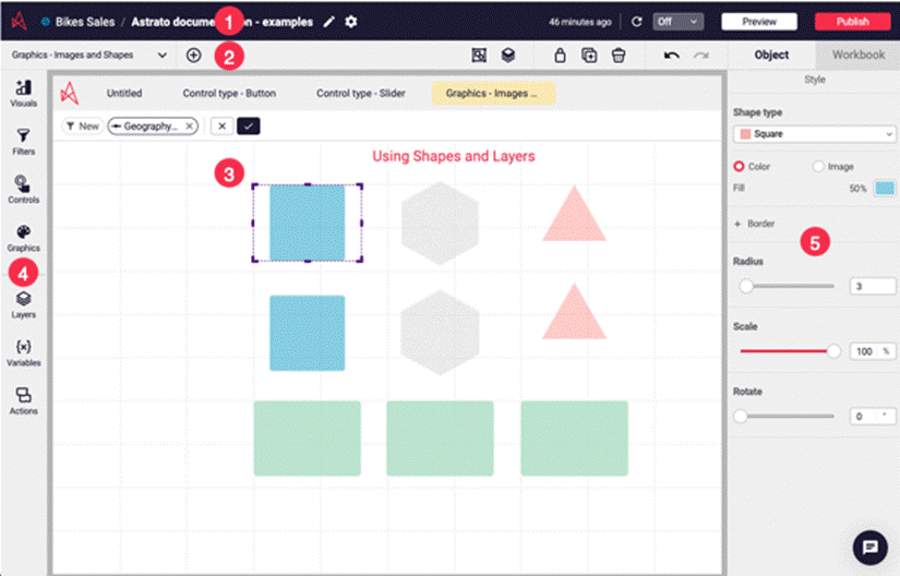
Workbook editor and its design controls. Source: Astrato documentation.
Astrato offers embedding for full dashboards, individual charts and object groups, with authentication and access-policy configuration. It is a useful option when the intended experience is designed visually around a supported data platform.
A move from an ElastiCube estate needs particular care: determine which transformations already exist upstream and which must be recreated before the new dashboard can query useful data.
Test the required application events and tenant rules with the chosen embedding unit. A chart-level embed and a complete dashboard may suit different pages. Select the route that matches the actual customer task rather than maximizing the number of embedded objects.
Turn the shortlist into a migration decision
Create a parity matrix with one row per customer requirement and an owner for each replacement. Mark whether the capability is native, configurable, custom-built or intentionally retired. Include reports customers have saved, scheduled deliveries, exports and support tools, not just the initial dashboard.
For example, a customer may depend on a daily CSV whose columns feed another system. Reproducing the chart does not preserve that contract. Record the delivery schedule, column names, ordering, timezone and recipient rules, then decide whether the new platform or your application will produce it. Give the recipient a sample before switching the live delivery.
Plan the cutover by customer or report group. Define how saved changes made during the transition will be handled, which system is authoritative, and who can reverse the rollout. This avoids discovering after launch that a customer continued editing a report in the old system.
Use the same data snapshot to compare calculations. Then run the replacement as two different customer identities and attempt to open each other’s saved content. A correct data filter does not establish correct report ownership.
For an Embeddable pilot, Custom Canvas deployment is especially relevant: it documents saved state, while the application manages the directory and sharing of multiple dashboards. Assign those responsibilities explicitly.
These are proposed acceptance checks, not results from a completed benchmark. Keep the existing Sisense implementation available while the agreed requirements are verified. The strongest alternative is the one that solves your actual constraint with a supportable amount of new work.
The payoff for getting this right is real. Procurement platform Spendflo moved its ad-hoc reporting onto a purpose-built embedded analytics platform rather than staffing it internally:
“We cut down on 6 months of work for our data analysts and saved around $300k by maintaining a smaller, more efficient team, avoiding the need to hire extra analysts just to handle ad-hoc reports.”
Ajay, Chief Technology Officer at Spendflo, in Databrain case study, 2026That result is specific to Spendflo’s own build-versus-buy decision, not a guarantee for every migration. It is a real, sourced data point for what a well-scoped move off a homegrown or high-maintenance setup can return, and it reflects the same trade-off underlying most Sisense-replacement decisions.
Frequently Asked Questions
What is the best Sisense alternative for embedded analytics?
There is no single best alternative for every team. For SaaS teams prioritizing custom customer interfaces, code ownership and a managed analytics foundation, Embeddable is the strongest overall fit covered here. GoodData is worth close attention for shared customer workspaces, Luzmo for visual dashboard authoring, and Qrvey when the deployment and data engine also need to change. The right pick depends on which part of Sisense (Compose SDK, ElastiCube, Live model) you are actually replacing.
What are the key differences between Sisense and Looker?
Sisense centers on ElastiCube/Live data models with Compose SDK for custom embedding. Looker centers on a centrally maintained LookML semantic model, with Explores giving users access to defined dimensions and measures, and signed embedding carrying customer identity into the experience. Looker fits teams that want a formal, governed modeling discipline across internal and external analytics; it is less compelling if the goal is simply to avoid maintaining another specialized model.
Is buying embedded analytics cheaper than building it in-house?
For most SaaS teams, yes, unless analytics is the core product differentiator. Spendflo’s CTO reported saving roughly $300k and 6 months of engineering effort by adopting a purpose-built embedded analytics platform instead of expanding an internal team to handle ad-hoc reporting. That result won’t generalize exactly, but the underlying trade-off (ongoing engineering overhead vs. a managed platform) is the same one driving most Sisense-replacement decisions.