

Business intelligence dashboards have become the main interface between decision‑makers and data. When charts, KPIs, and reports are hard to read, even the most sophisticated models quickly lose their impact. Instead of seeing opportunities and risks, stakeholders see noise. That is why mature data teams invest not only in data pipelines and BI platforms, but also in AI image enhancement solutions that keep every chart and dashboard screenshot clear wherever it is used. That is why mature data teams invest not only in data pipelines and BI platforms, but also in solutions like this AI Image Enlarger to keep every chart and dashboard screenshot clear wherever it is used.
BI dashboards as a decision engine
From reporting to real‑time decisions
Not so long ago, dashboards were treated as “nice‑to‑have” add‑ons to traditional reports. Today, they are the default way leaders interact with data. Executives open a sales dashboard before a meeting. Product managers live inside feature and adoption dashboards. Marketing teams monitor acquisition and retention in real time.
In this environment, dashboards are no longer just a visual wrapper on top of a database. They are a decision engine. If the information is not immediately understandable, decisions are delayed or, worse, made on gut feeling rather than facts.
What “clear visuals” really mean in BI
Clear visuals are not about making a dashboard look pretty. They are about making it instantly readable.
More Read

Let’s be real. Ugly dashboards make numbers look fake. You can spend a whole week writing perfect code, but if the front end looks messy, it’s over. If the fonts look weird or things get blurry on a smaller screen, people just tap out.

Most clients aren’t tech guys. They won’t look at your code or tables. They look at the screen during the meeting, and that’s it. If a chart looks washed out, they immediately start doubting the math. They literally think: “If the layout looks this bad, the numbers are probably messed up too.” That doubt kills the whole thing. In big meetings about pricing or company risk, executives will just ignore your report.
Good design is just about not wasting people’s time. Don’t use weird charts. Stick to standard bars and lines. Keep contrast high so nobody has to squint, and make sure images stay sharp. When it looks clean, people don’t have to guess what they are looking at. They get it in a second, and they can actually make a decision.
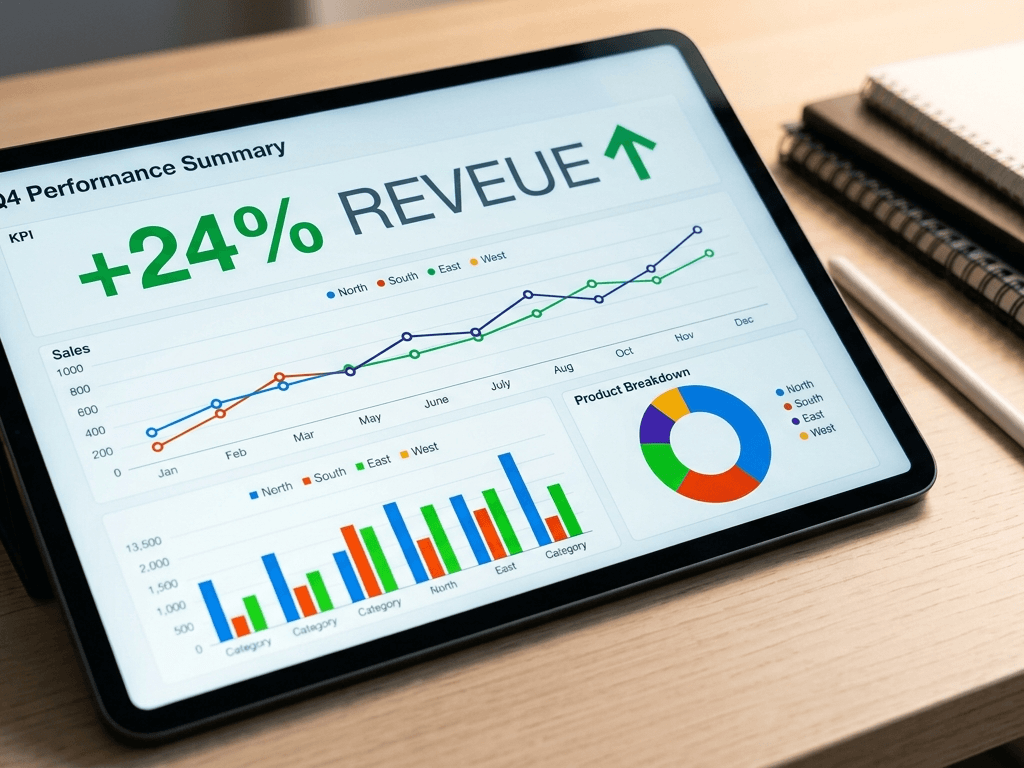
Clients or managers probably won’t say it to your face, but they’re definitely thinking it: “If this report looks like a total mess, how do I know the data isn’t messed up too?” That tiny doubt is exactly why people stop using dashboards. When the stakes are high – like changing your pricing or managing company risk – sloppy design is the number one reason executives just close the tab and ignore your work completely.
On the flip side, clean layouts just make life easier. When everything is sharp and clear, nobody has to sit there and stress over what the graphs mean. They get the main point in a heartbeat.
- Are we above or below target?
- Is this trend getting better or worse?
- Where should I focus my attention first?
When teams work with exported dashboards, screenshots, or embedded charts in slide decks, image quality often becomes a hidden bottleneck. Instead of recreating visuals from scratch, many data teams now use AI tools to enhance image quality online – they upload a chart or dashboard screenshot and get a sharper version ready for reports and presentations. This tiny improvement in clarity can noticeably speed up how fast stakeholders “get” the story the data is telling.
UX principles for visually clear dashboards
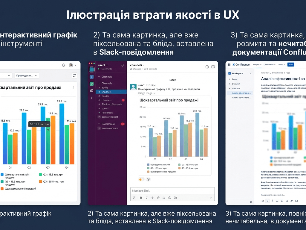
Design for clarity, not decoration
There is a growing trend to make dashboards look like works of art: heavy gradients, complex layouts, too many colors. It might look impressive in a screenshot, but it rarely helps decision‑makers.
Designing for clarity means asking simple questions:
- Can someone new to this dashboard understand the main KPI in 5 seconds?
- Is color used to encode meaning, or just to “spice things up”?
- Are we using labels and legends that a non‑analyst would understand?
Clarity over decoration does not mean ugly dashboards. It means purposeful dashboards, where every visual choice supports understanding.
Image quality as part of dashboard UX
We usually think of UX in terms of navigation, layout, or loading speed. But image quality is also a UX factor. A dashboard that looks fine in a BI tool can become frustrating when viewed through low‑resolution screenshots, compressed email attachments, or pasted images in documentation.
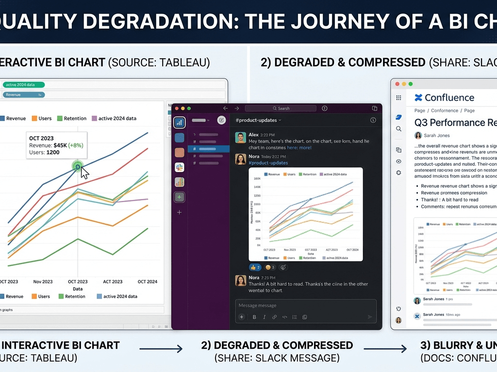
This is especially visible in:
- Internal knowledge bases (Confluence, Notion, wikis)
- Slack/Teams threads with pasted charts
- Onboarding guides explaining “how to read this dashboard”
If the images are fuzzy, new users struggle to read numbers, legends, or notes. The experience feels sloppy.
For teams that frequently share dashboards via screenshots in documentation, chats, or knowledge bases, having a quick way to upgrade those visuals is a small UX win with a big impact. A dedicated AI image enhancement tool can standardize visual quality across reports without changing existing BI workflows or asking designers for help every time.
From dashboards to slides: keeping visuals sharp everywhere
The presentation gap
One of the biggest gaps in visual quality appears when dashboards leave their native environment. Inside a BI tool, charts are crisp and interactive. Once exported to PowerPoint, PDF, or a shared drive, the same visuals often look like they lost a few levels of resolution.
Common symptoms include:
- Axis labels that are barely readable on a projector
- Fuzzy lines in trend charts
- Pixelated annotations or comment boxes
- Legends that blur into the background
By the time these visuals reach a board presentation or client meeting, they no longer match the polished, data‑driven image the company wants to project.
A practical workflow for data teams
The good news is that fixing this does not require rebuilding dashboards or changing BI platforms. A simple workflow can go a long way:
- Build and validate the dashboard in your BI tool as usual.
- Export or screenshot the key views you need for reports or slides.
- Enhance those images to improve sharpness and readability.
- Use the upgraded visuals in presentations, reports, wikis, and training materials.
Lots of teams just screenshot their dashboards, run them through an online AI upscaler, and slap them right into presentation decks. It’s a super fast workaround. You get sharp images in seconds without bothering the design guys or tweaking complex settings in your BI tool. The actual metrics don’t change at all, but the slides look completely different and way more polished.
Actionable steps to improve visual clarity in BI
Audit your existing dashboards
Before designing anything new, it is worth auditing what you already have. Pick a handful of high‑impact dashboards – executive, revenue, product, operations – and review them with a “clarity first” mindset:
- Is the main question of each dashboard obvious?
- Are colors, fonts, and layouts consistent?
- Are any charts overloaded with labels or series?
- Do screenshots of these dashboards stay sharp in a slide or PDF?
You will usually find a few quick wins: simplifying one chart type, removing a distracting background, enlarging a key KPI, or replacing old low‑resolution images with clearer ones.
Build a simple visual quality checklist
To make clarity sustainable, many teams create a lightweight checklist for any new dashboard or report. It might include questions like:
- Can this be read comfortably on a standard laptop screen?
- Is this still clear when viewed as a screenshot in a chat?
- Are fonts and colors accessible for most viewers?
- Would I be comfortable showing this screenshot to a senior executive?
As part of that checklist, it helps to define a standard way to fix low‑quality visuals. Many teams simply add a step like “run key screenshots through an AI image quality enhancer before sharing them with stakeholders.” This lowers friction for analysts and keeps the visual standard high across the organization.
Conclusion: clear visuals as a strategic advantage
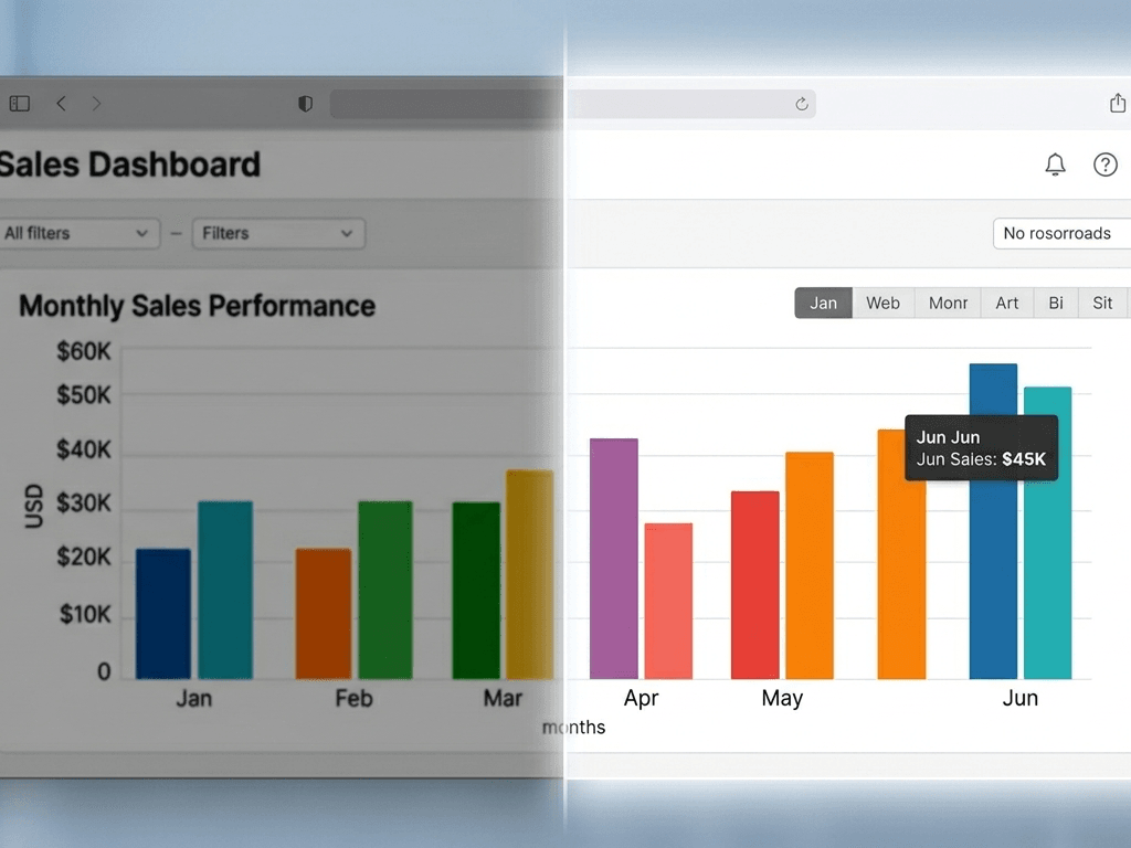
Good BI design isn’t about making things look pretty. It directly impacts speed, trust, and how fast a team actually takes action. When a report looks clean and stays perfectly sharp – no matter if it’s open in a browser tab, a presentation slide, or a downloaded PDF – people actually start using it to run their business.
Investing a bit of time in visual clarity, supported by simple practices and the right tools, can turn “yet another dashboard” into a genuine strategic asset for your organization.