Surfing the web soon after the July 19th massacre in Colorado yielded two geovisualizations that touched, in part or in whole, on variables that were associated with that event, notably firearms, deaths, and place. Both the narratives that described the data visualization were fairly short, and I think based upon some key assumptions. One assumption, quite clear to me, was that data gathered at the scale of states (of the union) were a useful lens for the authors.
Surfing the web soon after the July 19th massacre in Colorado yielded two geovisualizations that touched, in part or in whole, on variables that were associated with that event, notably firearms, deaths, and place. Both the narratives that described the data visualization were fairly short, and I think based upon some key assumptions. One assumption, quite clear to me, was that data gathered at the scale of states (of the union) were a useful lens for the authors. Another, perhaps implicit, is that the authors’ efforts were intended as (at least) a loose manifestation of exploratory data analysis (EDA), or its younger sister, exploratory spatial data analysis (ESDA). The geovisualizations were primarliy inductive observations, as opposed to definitive or systematic deductive research. My goal then is to share these two examples with you in order to compare, contrast, and offer some commentary.
Richard Florida’s Geography of Gun Violence
Dr. Florida, senior editor at The Atlantic, posted a short piece here a day after the Aurora massacre. Of central interest was its geodata visualization, a traditional map featuring deaths (per 100k population) of each of the 50 states of the union, the year being 2008, as follows…
More Read


Notables
- ~600 word narrative
- The post sure appeared fast (overnight)
- A simple, clear, and traditional (choropleth) presentation
- Bivariate (firearm deaths and states)
- That said, Dr. Florida’s piece had a hyperlink to another, earlier article here, one with its final datavisualization here that I felt offered a more interesting (but complex) trivariate analysis
- The metadata source was made explicit
- It included a “look” at D.C., a kind of bonus, it being as you know neither a state nor city
Caveats
- The reason of the quick posting would have been that Dr. Florida had presented a similar geovisualization 18 months earlier, at the url here, so the data only needed a one-year update; that said, its data, being four years old, are a bit dated
- Included D.C., with a downside being that I now feel I want to see all U.S. conurbations visualized (!) It also got me thinking about another possible bonus: I wonder, what is the firearm death rate in Puerto Rico?
- Pertaining more to Dr. Florida’s narrative than his colleague’s geovisualization, key implication threads for the Aurora massacre did not seem fully unraveled: “Gun violence was less likely in states with college graduates…,” reports Dr. Florida. It in fact turns out Colorado’s graduation rate is not low, rather it is in the middle of the pack. As we now know, Mr. Holmes, charged as the Aurora theater shooter, was pursuing a PhD.
Kieran Healy’s Assault Deaths within the United States
Dr. Healy, associate professor of sociology at Duke University, published this here three days after the tragedy. He offered the reader four data visualizations. One of special interest features a multivariate display of assault deaths over the years 1999-2009, with a color legend that matches line data to the name of each state…
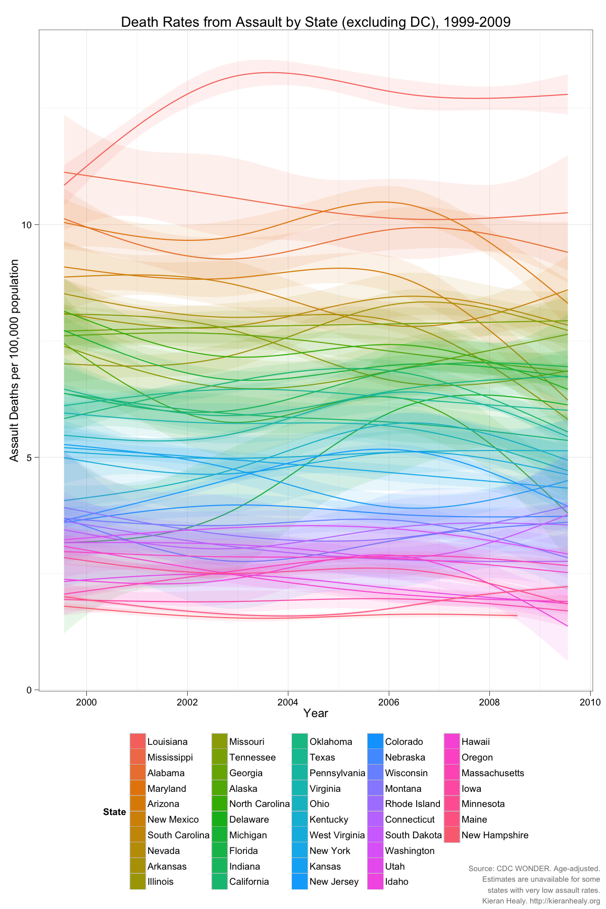
Notables
- ~640 word narrative
- Captures change nicely
- Trivariate (assault deaths, states, and years)
- Data are one year more current than Dr. Florida’s (last entry being 2009); all data are age adjusted and explicitly sourced
- Display seems non-traditional, as we might say “in Minnesotan” (after a long, reflective pause), “that’s different” (meaning “perhaps it is innovative, perhaps not”). A blogger complimented Dr. Healy on his use of GGPlot software, so presumably that was what he employed. Dr. Healy also gave us access to an alternative “high resolution” PDF of his display (here)
Caveats
- The absence of some kind of map format seemed to be a downside: wouldn’t a reader prefer seeing the data atop states? That said, multivariate data is never easy to present if and when spatial data is one of the variables
- Innovative display can have downside, e.g. curved data lines are beautiful but the alternative – broken lines – would both denote and connote the exactness of the assault data collected
- Pertaining more to Dr. Healy’s narrative than his geovisualization, its relationship to the Aurora massacre seemed a bit vague; says he: “[My chart] ‘America is a Violent Country’ has been getting a lot of circulation. Time to follow up with more data.” Was it “time” because of the Aurora event? Tell us at least a little more!
Commentary
Dr. Florida’s visualization, being bivariate, needed a strong narrative, and I feel he delivered on this. Dr. Healy’s treatment was trivariate, so less narrative seemed required, i.e., with more variables on display interesting patterns stand out, no pressing need for paragraph after paragraph
Researchers often have good data at hand but they sometimes ignore other important qualities or criteria (such as timeliness); are we willing and able to put in the work to revisit and update old data? Side note: it is now 2012, yet have you noticed how so many data visualizations today still use 2000 census data?
Bloggers, at or near a hundred in number, responded to Drs. Florida and Healy’s postings. That’s a lot, any many are well worth a read. One blogger commented on Dr. Healy’s article, then included his own datagraphic, almost in response: “Given [your] data by region and ethnicity, it would be interesting to see assault violence by median income and/or income inequality. Quickly playing around on Gapminder produces this…”

I don’t know in what direction the blogger’s Gapminder visualization moved the winds of the debate, but I do like the clever idea of a dataviz “dialog” or “cardgame” (“here’s a GGPlot; ok, I’ll raise you one Gapminder”)!
Questions That Nag
“There were 10.3 deaths by firearms per 100,000 people in Colorado in 2008, exactly the same as the national average,” notes Dr. Florida. It turns out Mr. Holmes, though now living in Colorado, was raised in California. So, how might we factor in migration of murderers as we 1) ponder implications, then 2) analyze and geovisualize, at the state scale? Worded another way, a mass murderer is not a whole state; if and when we work at large-area/small-scale (for example, state scale), something tells me that we should take care that our generalizations not grow to be scientifically silly (or worse, quite wrong-headed) due to either poor “data granularity,” sampling misfits, or both.
Another nag has to do with science’s reliability criterion…

One current trend among data analysts and visualizers is to make all the data used available to the reader in the event s/he wants to replicate the study (i.e., confirm reproducibility). Both authors did due diligence by sourcing their metadata. An ideal next step might be for yours truly (along, perhaps, with you, the reader) to find and offload the data used by Drs. Florida and Healy. I could then give my favorite method (parallel-coordinates analysis) a shot at it (at least with Dr. Healy’s data, which is multivariate, or Dr. Florida’s variable-rich data alternative), while you might use it to head down your own “special path” of data analysis and visualization. Some classic tools for that (updated for Javascript-enabled web implementation) are at a gallery here.
Lastly, nobody says authors or bloggers such as Drs. Florida and Healy have to endlessly tease out implications and ask questions (especially in 600 words) unless that is their stated goal. That can merely muddy the water. As one blogger responded to Dr. Florida, “[Your] map and the statistics only brings up more questions, therefore the root cause has not been determined.” On the other hand, data patterns that work to interest or surprise us are, in fact, often the central goal of EDA or ESDA. So, a final question, more “me thinking out loud” than a nag or critique, is this: can and should we holistically applaud these two posts as the right mix of verbal-visual logic, relevant and quickly delivered on the heels of a tragedy, having featured innovative and useful geodata patterns? (Or not?) Really good answers to this will not be found with more narrative from me, but rather in the comments section below!
Editing assistance courtesy Brendan J. Byrne