We use cookies, including third-party cookies from Google to serve personalized ads through AdSense, to operate this site and understand how it is used. By continuing to browse, you accept this use. See our Privacy Policy and Terms of Use for details, including how to opt out of personalized advertising.
Accept
SmartData CollectiveSmartData Collective
  • Analytics
    AnalyticsShow More
    chatgpt image jul 21, 2026, 04 34 30 pm
    4 Core Benefits of Predictive Maintenance after Vibration Analysis
    10 Min Read
    How Does Data Mining Boost Customer Satisfaction in Logistics? Harnessing Analytics for Results -- AI-generated illustration
    How Does Data Mining Boost Customer Satisfaction in Logistics? Harnessing Analytics for Results
    11 Min Read
    chatgpt image jul 13, 2026, 04 23 45 pm
    How Data Analytics Helps Companies Improve User Engagement
    19 Min Read
    chatgpt image jul 13, 2026, 03 59 46 pm
    How Data Analytics Improves Multi-Location Search Strategies
    10 Min Read
    cybersecurity efforts
    How Behavioral Analytics and AI Are Redefining Cybersecurity for Boca Raton Businesses
    14 Min Read
  • Big Data
  • BI
  • Exclusive
  • IT
  • Marketing
  • Software
Search
© 2008-25 SmartData Collective. All Rights Reserved.
Reading: BI Dashboard: Tips for Learning to Use the Tool
Share
Notification
Font ResizerAa
SmartData CollectiveSmartData Collective
Font ResizerAa
Search
  • About
  • Help
  • Privacy
Follow US
© 2008-23 SmartData Collective. All Rights Reserved.
SmartData Collective > Data Management > Best Practices > BI Dashboard: Tips for Learning to Use the Tool
Best PracticesBusiness Intelligence

BI Dashboard: Tips for Learning to Use the Tool

Tricia Aanderud
Tricia Aanderud
4 Min Read
BI Dashboard: Tips for Learning to Use the Tool
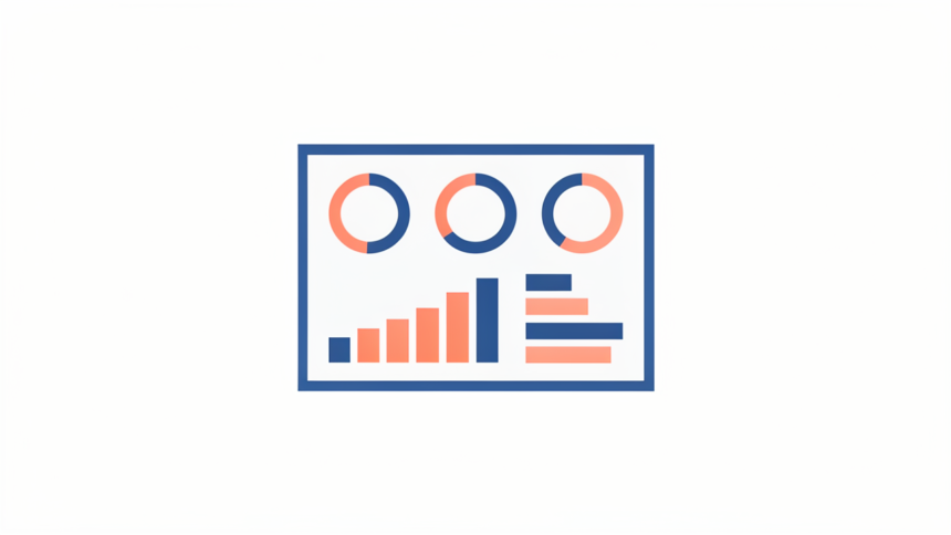
Illustration generated with FLUX.2 [Klein 9B] via local ComfyUI.
SHARE

When you start to learn how to work with the BI Dashboard tool – the blank slate can be the scariest single element you face.  What goes where? How can I make it look better?  Here’s some suggestions I have used.

Contents
  • Review Dashboard Sources
  • Recreate What You See For Fun!
  • Your Turn

Review Dashboard Sources

Use Google Images to find examples of what other designers have created.  When you can see an overview of dashboards as thumbnail images, the better ones are more apparent.  Study the colors and graphics used.  Note what really makes the data communicate its message versus what looks like a cool concept for the designer, such as putting a steering wheel on the dashboard! 

From the Google homepage, type dashboard or dashboard design or dashboard examples and select Images from the bar, as shown below.   You can then click on the more interesting ones to see a close up.  Also notice how the data is visualized – was the bar graph or the gauge more effective.  Can you understand within a few moments what the dashboard is measuring?

 dashboard google 011 BI Dashboard: Tips for Learning to Use the Tool

More Read

Quest for knowledge
Quest for knowledge
“Analytics are defined as the extensive use of data, statistical and quantitative analysis,…”
5 Lessons Social CRM can Learn from CRM
Out from behind the 8 ball with decisions
Embedded BI Tools Bring Huge Benefits to Business Applications

Recreate What You See For Fun!

Once you find some dashboards you admire, recreate the information using the BI Dashboard.  By using data that is not meaningful to you, its easier to work with the indicators to determine what patterns emerge based on how the data is presented.  Yes little data geek – do it for fun on Saturday nights!

Here’s one that a hotel management company could use to determine how the regional groups were performing.   The drop down on the right side changes the data view to show how each region performed. Looks like July 11 was a rough day.  I don’t like the way the Customer Satisfaction Ratings appear with the dots – probably I would change that to arrows.

dashboard google 021 BI Dashboard: Tips for Learning to Use the Tool

 This dashboard is for a lower level of management. I imagine a Call Center Manager using this dashboard to manage what is going on hour by hour across several locations.  I re-used the Locations indicator but I was really thinking it might be by product line or something more specific. 

The Call Arrival would allow the manager to predict if the call traffic was rising and this would be based on the average traffic from the past 7 days. The Agent Performance is based on how many calls the agent is able handle in an hour and the duration of the call.  The expectation being that newer agents would be slower and thus take more time to process the call.  However, if an experienced agent is taking longer the manager would want to know if the agent was getting more difficult calls that were taking longer to process or maybe the agent is spending too long at break time.  The agent may need a pep talk or time off.

dashboard google 03 BI Dashboard: Tips for Learning to Use the Tool

Your Turn

If you have a dashboard you want to show off – send me a screenshot and I’ll share them in a later post.

Related content:

  1. SAS BI Dashboard: Measuring the Conversion Rate with Google Analytics
  2. SAS BI Dashboard Rocks My Google Analytics Data Analysis
  3. SAS BI Dashboard: Google Analytics Dashboard Kicked Up a Notch
  4. What Can I Do With a Stored Process?
  5. Ready for the Next Generation of SAS?
TAGGED:BI dashboard
Share This Article
Facebook Pinterest LinkedIn
Share

Follow us on Facebook

Latest News

How Search Engine Indexing Lags Behind Large-Scale Website Domain Migrations -- AI-generated illustration
How Search Engine Indexing Lags Behind Large-Scale Website Domain Migrations
News
How Great Content Moves Through A Marketing Ecosystem -- AI-generated illustration
How Great Content Moves Through A Marketing Ecosystem
Exclusive Infographic Marketing
What Your Brand Misses That Data Reveals -- AI-generated illustration
What Your Brand Misses That Data Reveals
Big Data Exclusive Infographic
5 Common Mistakes Businesses Make During the Risk Assessment Process -- AI-generated illustration
5 Common Mistakes Businesses Make During the Risk Assessment Process
Business Intelligence Exclusive Risk Management

Stay Connected

1.2KFollowersLike
33.7KFollowersFollow
222FollowersPin

You Might also Like

Mobile Business Intelligence
Business IntelligenceSoftware

Mobile Business Intelligence: Strategies, Trends and Pitfalls

6 Min Read
SAS Portal and BI Dashboard: Customizing the Tabs
Business Intelligence

SAS Portal and BI Dashboard: Customizing the Tabs

3 Min Read

3 Practical Tips for Effective BI Dashboard Design and Implementation

18 Min Read

SmartData Collective is one of the largest & trusted community covering technical content about Big Data, BI, Cloud, Analytics, Artificial Intelligence, IoT & more.

ai chatbot
How AI Website Chatbots Improve Customer Support and Lead Generation
Chatbots Exclusive
The Art of Conversation: Enhancing Chatbots with Advanced AI Prompts
Chatbots

Quick Link

  • About
  • Contact
  • Privacy
Follow US
© 2008-26 SmartData Collective. All Rights Reserved.
Welcome Back!

Sign in to your account

Username or Email Address
Password

Lost your password?