We use cookies, including third-party cookies from Google to serve personalized ads through AdSense, to operate this site and understand how it is used. By continuing to browse, you accept this use. See our Privacy Policy and Terms of Use for details, including how to opt out of personalized advertising.
Accept
SmartData CollectiveSmartData Collective
  • Analytics
    AnalyticsShow More
    chatgpt image jul 21, 2026, 04 34 30 pm
    4 Core Benefits of Predictive Maintenance after Vibration Analysis
    10 Min Read
    How Does Data Mining Boost Customer Satisfaction in Logistics? Harnessing Analytics for Results -- AI-generated illustration
    How Does Data Mining Boost Customer Satisfaction in Logistics? Harnessing Analytics for Results
    11 Min Read
    chatgpt image jul 13, 2026, 04 23 45 pm
    How Data Analytics Helps Companies Improve User Engagement
    19 Min Read
    chatgpt image jul 13, 2026, 03 59 46 pm
    How Data Analytics Improves Multi-Location Search Strategies
    10 Min Read
    cybersecurity efforts
    How Behavioral Analytics and AI Are Redefining Cybersecurity for Boca Raton Businesses
    14 Min Read
  • Big Data
  • BI
  • Exclusive
  • IT
  • Marketing
  • Software
Search
© 2008-25 SmartData Collective. All Rights Reserved.
Reading: Because It’s the Weekend: Visualizing Ocean Currents
Share
Notification
Font ResizerAa
SmartData CollectiveSmartData Collective
Font ResizerAa
Search
  • About
  • Help
  • Privacy
Follow US
© 2008-23 SmartData Collective. All Rights Reserved.
SmartData Collective > Big Data > Data Visualization > Because It’s the Weekend: Visualizing Ocean Currents
Collaborative DataData Visualization

Because It’s the Weekend: Visualizing Ocean Currents

DavidMSmith
DavidMSmith
1 Min Read
Because It's the Weekend: Visualizing Ocean Currents
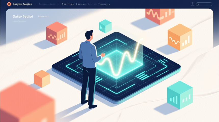
Illustration generated with qwen-image-Q4_K_M + Lightning LoRA (local ComfyUI).
SHARE

In yesterday’s post about the visualization of sailing ship data, some of the commenters (and me, too!) wondered about the routes the ships took; for example, giving the west coast of Africa a wide berth just to round the Cape of Good Hope. This NASA visualization of simulated ocean currents, thought it’s for the years 2005-2007, provides some perspective.


It’s a shame the video isn’t set to music: it’s both mesmerizing and relaxing to watch. More details about the simulation (including some very cool animations of surface temperatures, which sadly don’t appear to be on YouTube) at the link below.

NASA: Perpetual Ocean
More Read

Are You Reporting What You Can?...Or What You Should?
Are You Reporting What You Can?…Or What You Should?
How Data Analytics Helps Sports Teams Win
Design Thinking and Process – Is It In You?
Google+ User Statistics Part II – How Have the Demographics Shifted Since G+ Came Out of Beta?
What does Whale Vomit have in Common with Big Data and Analytics?
Share This Article
Facebook Pinterest LinkedIn
Share

Follow us on Facebook

Latest News

Emergency responder and nurse reviewing tablet with data dashboards
Evaluating Workforce Assessment Tools: Looking Beneath the Dashboard at Psychometric Data
Exclusive Software
Flat editorial illustration: The article's core relationship is the brand protection response workflow: detection of a phishing o
Data & AI Architecture Focus: 6 Best Brand Protection Tools for Phishing and Impersonation
IT Security
Server racks with cloud and user interface panels
Cloud Infrastructure and Workload Migration: A Data-Driven Look at VMware Alternatives in Europe
Cloud Computing Exclusive
Synthetic Data vs Real Web Data: Comparison, Limitations, and Collection Methods  -- AI-generated illustration
Synthetic Data vs Real Web Data: Comparison, Limitations, and Collection Methods 
Big Data Exclusive

Stay Connected

1.2KFollowersLike
33.7KFollowersFollow
222FollowersPin

You Might also Like

SAS ODS Report Writing Interface: A Quick Demo
Big DataData VisualizationSoftware

SAS ODS Report Writing Interface: A Quick Demo

5 Min Read
Survey Shows Business Intelligence Wants and Struggles of SMBs
AnalyticsBusiness IntelligenceCollaborative DataData VisualizationExclusivePredictive AnalyticsSocial Data

Survey Shows Business Intelligence Wants and Struggles of SMBs

5 Min Read
Analytics, Rules and Visualizations Changing Global Finance Companies
Data Visualization

Analytics, Rules and Visualizations Changing Global Finance Companies

5 Min Read
Information, Intelligence and Process:  Combining Forces to Better Answer Business Needs
Business IntelligenceData MiningData QualityData VisualizationPolicy and Governance

Information, Intelligence and Process: Combining Forces to Better Answer Business Needs

16 Min Read

SmartData Collective is one of the largest & trusted community covering technical content about Big Data, BI, Cloud, Analytics, Artificial Intelligence, IoT & more.

ai chatbot
How AI Website Chatbots Improve Customer Support and Lead Generation
Chatbots Exclusive
AI chatbots
AI Chatbots Can Help Retailers Convert Live Broadcast Viewers into Sales!
Chatbots

Quick Link

  • About
  • Contact
  • Privacy
Follow US
© 2008-26 SmartData Collective. All Rights Reserved.
Welcome Back!

Sign in to your account

Username or Email Address
Password

Lost your password?