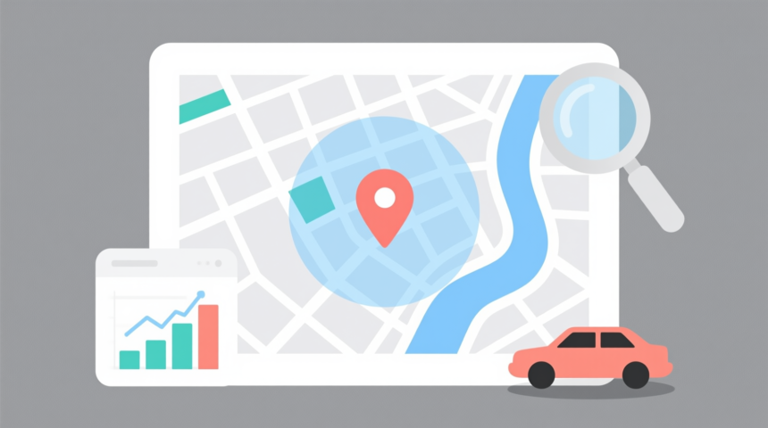
Data precision has completely revamped our understanding of geography in countless ways. We also use big data to facilitate navigation.
One of the tools that utilizes big data is Google Maps. Anish Nahar of Harvard Business School has gone so far as to state that Google Maps is the world’s most expansive big data machine.
Google has expanded the range of features that it provides through Google Maps these days. One new feature is the ability to create a radius, which wouldn’t be possible without the highly refined data mining and analytics features embedded in the core of the Google Maps algorithm.
The Emerging Role of Big Data with Google Analytics
Maps can be a useful tool for both individual use and sharing critical information about your business or organization. In addition to establishing a precise location, you can use mapping tools to compile and share data more efficiently.

There are a handful of reasons you may need to designate a radial distance around a particular destination. Whether you’re locating parks within a five-mile radius or visually communicating the areas in which your business provides service, a radius tool can provide additional organization to your search. The highly intuitive data interface provided by Google Maps can be very helpful. In 2012, Google boasted about its capabilities of using big data to create storytelling via interactive maps.
Using a custom mapping tool will enable you to create visually informative and functional maps for both personal and business use. Google My Maps allows users to customize their maps to organize their favorite destinations and communicate data analysis visually. However, Google Maps does not yet have an easy-to-use feature that enables users to draw a radius around a location. This is where web-based map developers such as maptive.com have tools that can help.
When to use a radius on a map
Radii can be a helpful visualization tool to evaluate an area and track demographic data throughout the world. There are many reasons for which one might consider utilizing a radius on their custom map:
- Quickly identify trends and patterns in demographic data, sales rankings, or business proximities
- Establish a purposeful area of coverage without over occupying a single location
- Keep transport costs low and make distribution more efficient
- Assign employees to clients within a specific radius to increase response time and minimize commute costs
- Discover new potential clients by focusing on consumers within the closest proximity to your business
- Demonstrate professionalism with maps that more effectively communicate business initiatives to your clients and partners
Creating a radius for custom maps
Establishing a radius can help both businesses and individuals compile more specific information about their surrounding areas. This feature enables you to determine how far one point is from another, how many points lie within a certain distance, and where each location is within the perimeter. Visual proximity can help determine which business locations are within a particular drive time or how many storefronts exist within a specific geographical space.
Programs like Maptive allow users to easily create a perimeter within a geographical location by selecting the radius and proximity tool:
- Create your map and select which base you’d like to use for navigation (satellite, terrain, or roadmap)
- Choose between the distance radius generator or a drive time polygon
- Enter your locations and how far you’d like the radius or polygon to extend out from the center of the marker
- Label the locations
Additional customization features allow you to adjust the color and categorization of each radius circle. Add detailed information about the radius using a pop-up element when viewers click on the data point. Maptive also allows users to save the radii for future use so that you can precisely utilize the same measurement multiple times on one map.
Grouping radii can serve to visually demonstrate a cluster of comparative data within a particular location. Use Maptive’s layers to toggle specific demographics, sales rankings, or consumer behaviors. The grouping tool can easily select all data points within a state or zip code with a single click. Additionally, you can place multiple radii around one marker to compare sections of the same location.
Leverage Data Analytics to Create Custom Mapping with Google Analytics
Custom mapping is beneficial both for business strategy and consumer relations in that organized and visually captivating navigation provides clarity and efficiency. Help your clients get to know your day-to-day operations while also making things more functional for you and your employees behind the scenes. Consider which aspects of your business may benefit from further analysis and communicate this to your team with useful and engaging custom mapping tools.