We use cookies, including third-party cookies from Google to serve personalized ads through AdSense, to operate this site and understand how it is used. By continuing to browse, you accept this use. See our Privacy Policy and Terms of Use for details, including how to opt out of personalized advertising.
Accept
SmartData CollectiveSmartData Collective
  • Analytics
    AnalyticsShow More
    chatgpt image jul 21, 2026, 04 34 30 pm
    4 Core Benefits of Predictive Maintenance after Vibration Analysis
    10 Min Read
    How Does Data Mining Boost Customer Satisfaction in Logistics? Harnessing Analytics for Results -- AI-generated illustration
    How Does Data Mining Boost Customer Satisfaction in Logistics? Harnessing Analytics for Results
    11 Min Read
    chatgpt image jul 13, 2026, 04 23 45 pm
    How Data Analytics Helps Companies Improve User Engagement
    19 Min Read
    chatgpt image jul 13, 2026, 03 59 46 pm
    How Data Analytics Improves Multi-Location Search Strategies
    10 Min Read
    cybersecurity efforts
    How Behavioral Analytics and AI Are Redefining Cybersecurity for Boca Raton Businesses
    14 Min Read
  • Big Data
  • BI
  • Exclusive
  • IT
  • Marketing
  • Software
Search
© 2008-25 SmartData Collective. All Rights Reserved.
Reading: 8 Features of Successful Real-time Dashboards
Share
Notification
Font ResizerAa
SmartData CollectiveSmartData Collective
Font ResizerAa
Search
  • About
  • Help
  • Privacy
Follow US
© 2008-23 SmartData Collective. All Rights Reserved.
SmartData Collective > Business Intelligence > 8 Features of Successful Real-time Dashboards
Business Intelligence

8 Features of Successful Real-time Dashboards

JuiceAnalytics
JuiceAnalytics
5 Min Read
SHARE

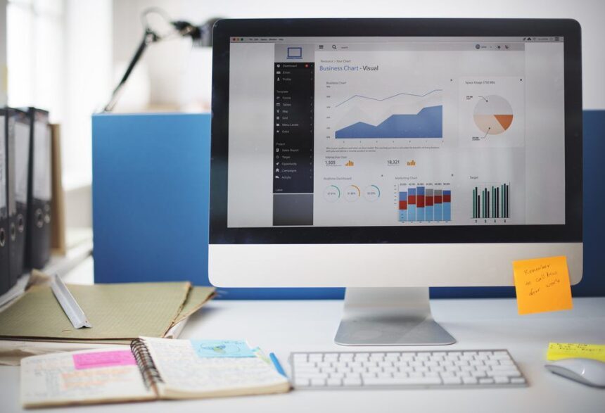
Real-time dashboards — the kind that show up on a big screen in a call center — are an entirely different beast than your standard management dashboard. Their job is to support immediate decision-making. As a result, the information must be easy to interpret, alert users to problems, and make the next action obvious. In addition to key success metrics, real-time dashboards may show detailed data about the action “on the ground.”

There are a lot of ways this technology can be employed. It can work with LED technology, which is one of the reasons ledscreenrentals.net is thriving. However, there are other benefits as well.

Here are eight characteristics that can make a real-time dashboard effective:

  1. A summary status that indicates how things stand overall. Users need to be able to tell at a glance whether they should worry or not. Here’s a great example from the folks at Superblock. The “Is it going to rain?” site tells you the single most important thing you need from a weather report.
  2. Reflect a well-understood structure of the business. By the time you design a real-time dashboard, you should have a strong theory for how the pieces of the business fit together (i.e. the relationships between key measures, drivers, and available actions). For example, in the call center business, there are clearly defined success measures (e.g. wait time), a mathematical relationship between these measures and their underlying drivers (e.g. call volume), and known levers to address problems (e.g. staffing levels).
  3. Support quick diagnosis of problems. The data presentation should point directly to the likely source of the problem. Real-time dashboards aren’t the place for deep analysis or introspection into the drivers of the business.
  4. Simple data presentation. In my view, real-time dashboards aren’t the place for complex or advanced data visualizations. Imagine you were Napoleon and you had to use a half-completed version of this chart to make a battlefield decision in the next 5 minutes.
  5. Granular view of the “unit of action.” Real-time dashboards are often about tracking activity. It may be useful to show the raw data around these events in the form of a ticker, scroll or RSS feed. We use at a real-time tracker for our website called Sitemeter. It does a nice job of tracking the basic unit of action — visitors.
  6. Appropriate time window. Getting time right on an operational dashboard is critical. If the measures and trends represent too long a time period, users may not react to changes quickly enough. On the other hand, very small-time windows encourage frantic reactions to changes that may not represent real trends. Ideally, the dashboard should offer the ability to configure this time range and “freeze” a moment in time.
  7. Prominent but balanced alerts. Naturally, alerting users to problems is a central mission for real-time dashboards. The challenge (as always with alerts) is to balance between “the sky is falling” hysteria and “don’t worry, be happy” apathy. I’ve written before about alerts, but one item to emphasize is the need to show a sense of relative importance. Not all problems have the same impact on the business, and finding a way to communicate this relative importance is valuable.
  8. Point to specific action. If real-time dashboards are about identifying and responding to issues, the tool should point users to what they can do about a problem. This can be as simple as displaying the phone number of the right person to call.

Real-time dashboards can be ignorable, create mayhem, or drive great behavior in an organization. Thinking carefully about the design and functionality will make a huge difference.

More Read

Great illustration of the hierarchy of analytical BI techniques
In Search of Horribly Low Response Rates
#4: Here’s a thought…
Seven Questions That Make Analytics Smarter
ML And AI Drive Impressive Improvements In Background Checks

Original Post Source.

Share This Article
Facebook Pinterest LinkedIn
Share

Follow us on Facebook

Latest News

How Search Engine Indexing Lags Behind Large-Scale Website Domain Migrations -- AI-generated illustration
How Search Engine Indexing Lags Behind Large-Scale Website Domain Migrations
News
How Great Content Moves Through A Marketing Ecosystem -- AI-generated illustration
How Great Content Moves Through A Marketing Ecosystem
Exclusive Infographic Marketing
What Your Brand Misses That Data Reveals -- AI-generated illustration
What Your Brand Misses That Data Reveals
Big Data Exclusive Infographic
5 Common Mistakes Businesses Make During the Risk Assessment Process -- AI-generated illustration
5 Common Mistakes Businesses Make During the Risk Assessment Process
Business Intelligence Exclusive Risk Management

Stay Connected

1.2KFollowersLike
33.7KFollowersFollow
222FollowersPin

You Might also Like

Smarter Agent Performance Management
AnalyticsBest PracticesBig DataBusiness IntelligenceCRMInside CompaniesPolicy and GovernanceWorkforce Analytics

Smarter Agent Performance Management

7 Min Read
Big Data For Big Weather
AnalyticsData MiningData VisualizationDecision ManagementPredictive AnalyticsRisk Management

Big Data For Big Weather

4 Min Read
Chatting with Albert Einstein about Business Intelligence
Business Intelligence

Chatting with Albert Einstein about Business Intelligence

18 Min Read

How BI Can Help Enterprises Overcome The Effects Of The Pandemic

6 Min Read

SmartData Collective is one of the largest & trusted community covering technical content about Big Data, BI, Cloud, Analytics, Artificial Intelligence, IoT & more.

From Bolts to Bots: How AI Is Fortifying the Automotive Industry
Artificial Intelligence
The Art of Conversation: Enhancing Chatbots with Advanced AI Prompts
Chatbots

Quick Link

  • About
  • Contact
  • Privacy
Follow US
© 2008-26 SmartData Collective. All Rights Reserved.
Welcome Back!

Sign in to your account

Username or Email Address
Password

Lost your password?