So you are all set to design a swanky new dashboard that would be your next masterpiece? Have you already started dreaming about the accolades that will come your way once the project reaches its fruition? But wait…here comes the spoiler alert! Most business dashboards designed today fail or only partially perform the function they are designed for. Are you sure yours is not headed the same way?
So you are all set to design a swanky new dashboard that would be your next masterpiece? Have you already started dreaming about the accolades that will come your way once the project reaches its fruition? But wait…here comes the spoiler alert! Most business dashboards designed today fail or only partially perform the function they are designed for. Are you sure yours is not headed the same way?
The raison d’etre of a dashboard is to present the right information, in the right form at the right time. Most dashboards fail because they lack in one, two or all of these 3 parameters.
Right Information

Dashboards are primarily information display systems―a place where you can get access to all the relevant information. A sales manager’s needs are very different from that of a doctor monitoring his patients. So before you even start designing a dashboard, you should have a thorough knowledge of your end user, his needs and requirements from the dashboard. Only then will you be able to boil down a list of relevant metrics.
 Image Source: FusionCharts Sales Dashboard
 Image Source: FusionCharts Patient Monitoring Dashboard
Notice how the metrics change when the end user changes. A Sales dashboard has metrics like Revenue and Gross Profit whereas a Patient Monitoring dashboard for a hospital has metrics like pulse rate, blood pressure, blood sugar, etc. These metrics are very role-dependant. One-size-fits-all strategy does not work in dashboard design.
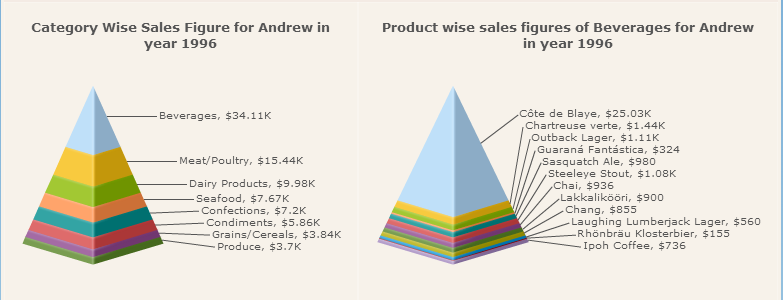
Another aspect of presenting the right information is to present the complete information. Incomplete information hampers effective decision making. A dashboard essentially provides an overview of the key metrics. However, if a user is looking for more information about a specific metric and needs to drill down to further details, the dashboard should allow that. Consider this Sales by Employee chart from a Sales Dashboard.

This chart shows the overview of sales done by the Top 10 employees. One can click on a specific employee (slice) to know the category wise sales he has achieved.
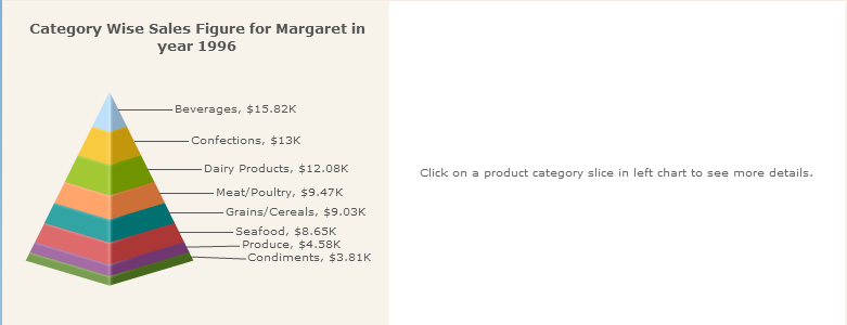
If the user wants to further drill down into the sales of each product for a category, he can easily get the information with just another click.
Right Form
Dashboards necessarily display relevant information on a single screen. The single screen display of key metrics within our eye span ensures that nothing of importance is forgotten or left out. The more you add scrolling or pages to a dashboard, the more you are defeating its purpose. The dashboard real estate is precious and should be utilized wisely.
The layout of a dashboard can roughly be divided into 4 quadrants based on the importance it accords to its respective content.
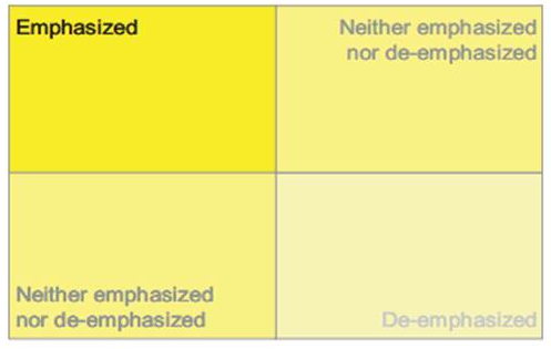
Image Source: Stephen Few, With Dashboards Formatting & Layout Definitely Matter
The top-left quadrant is the section that gains the maximum attention from the user so the most important metrics should occupy this section. The other metrics should then be distributed based on their order of importance.
Graphs, tables, color, size of individual elements, thickness of bounding boxes as well as presence or absence of an icon―all add up to the form of your dashboard.
Highlight what is important, exclude what is not required and create a harmonious visual story.
Right Time
Situation Awareness is an important element in dashboard design. Situation Awareness is being aware of what is happening around you and understanding what that information means to you now and in the future.
Let’s say you are designing a dashboard for a busy CEO who amongst other things has to keep a check on the various functions in the organization. An ideal dashboard should give him an at-a-glance knowledge of the various functions as well as alert him, in case of any deviations from the trend. This alert should essentially come to him at the right time so that he can plan accordingly and avoid any catastrophes.
 Image Source: FusionCharts Company Monitor Dashboard
Right Information, Right Form and Right Time―these are three factors that can distinguish a good dashboard from a mediocre one.
What are your ingredients for a successful dashboard design?