
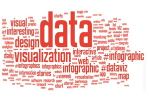
 Data visualization is a term mostly associated with big brands and corporations. Companies like Target, Deloitte, GitHub and Time Warner Cable all use data visualization tools to analyze and interpret information about their customers, allowing them to better target their marketing and sales efforts, improve internal processes.
Data visualization is a term mostly associated with big brands and corporations. Companies like Target, Deloitte, GitHub and Time Warner Cable all use data visualization tools to analyze and interpret information about their customers, allowing them to better target their marketing and sales efforts, improve internal processes.
For many small businesses, data visualization is still a foreign concept, more of a buzz word than a reality. Most of these companies don’t realize they are probably already utilizing data visualization. Anytime you turn information into some visual concept, like a bar graph or pie chart, you are creating data visualizations. Excel is capable of creating basic visualizations from user data, like the examples listed above. In addition to these basic displays, many tools include powerful visualization features that can create detailed maps, histograms, charts, and more.
Until recently, the primary barrier to entry with advanced data visualization tools has been cost. Companies that specialize in creating dashboards and maps can be expensive, which has left the technology out of reach for small to mid-sized businesses.
More Read

Fortunately, this is changing. New players entering the data visualization market are creating systems that are cost effective and well within the reach of smaller companies.
Why should I care about data visualization?
Simply put – data visualization is a better way of displaying the information that you and others are gathering. Instead of looking at a long sheet of numbers and information, it adds visual meaning to the data – whether it’s highlighting areas on a map, creating intuitive charts, or showcasing trends via interactive graphs.
For your organization, data visualizations can provide you with the information you need to take sales, operations, manufacturing, and a number of other departments to the next level. Sales managers can use visualization tools to easily observe changes in key performance indicators (KPI) among their team. Visualizations can help operations quickly observe and improve any bottlenecks, while manufacturing can use them to effectively measure and observe defects and variance in products.
In essence, data visualizations provide real insight into complex information in a way that is both practical and appealing.
While this article is intended to explain how small businesses have access to and can benefit from data visualizations, looking at how large corporations are currently utilizing solutions can provide insight into the ways such technology can be used. For example, General Electric (GE) has devoted an entire website to displaying data from their research and studies. These advanced, interactive visualizations take massive amounts of data and present them in a way that is not only aesthetically pleasing, but informative to outside observers.
While GE most likely uses an in-house designer for their visualizations, the good news is that there are a wide variety of online products and service offerings to help small businesses perform similar analysis in a cost effective manner. Instead of having to hire a data analyst, online tools allow employees access to powerful data functions.
What do I need to create data visualizations?
In essence, all you need prior to investing in visualization software is workable data. This can mean many different things depending on the purpose of your visualizations. Common data sets include sales numbers, market demographic information, performance statistics, and company success data, like profits and losses. Beyond that, there are virtually limitless possibilities of data sets that can be turned into visualizations.
Many small businesses assume they are unable to create data visualization because they don’t have employees with the necessary technical experience to manipulate data in this way. While some complex programs require experienced personnel, a growing number of vendors offer intuitive, user-friendly tools that inexperienced employees can learn and understand.
What services are available for small businesses?
The number of vendors offering data visualization solutions is constantly growing. This means more products in a greater number of price ranges. The following are a couple examples of visualization tools that other small businesses are using to get more from their information.
Tableau is probably right on the line of being within a small business’ reach, but it offers a wealth of data display options. Additionally, Tableau designed its system for inexperienced users and experts alike, with ease of use that includes intuitive drag and drop modules for quick and easy analysis.
While it’s used by some of the largest brands in the country, it’s also been publicly used by a small agency in the Cincinnati area to help show one client how Facebook messages were affecting sales, and another to show how checkout lines could be improved.
GoodData is used by over 40,000 companies to display data that affects sales, marketing, and customer service. It is cloud-based, which allows you to access it from any device, and it works with a wide variety of data sources including social media sites, CRM tools, and survey providers.
The cloud-based performance management software Allocadia utilized GoodData’s visualization solutions to deliver top of the line analytics to their customer base. Because of the simplicity of visualizations, Allocadia was able to build a more personal relationship with their customers, who now have a resource to gain a better understanding of their information.
With a variety of offerings for any price range, from free individual users to large commercial organizations, QlikView is the comprehensive visualization tool for inexperienced users and data experts alike. A number of companies have utilized QlikView for data insight that would otherwise be unavailable, including the team at HealthSouth.
HealthSouth Corporation is the largest inpatient rehabilitation company in the country, with over 100 hospitals. The HealthSouth team was looking for a way to improve their business intelligence insight, without needing to hire additional IT experts. With QlikView, they’re no longer just looking at data; they’re discovering information. This has helped streamline analysis and save valuable resources. The leadership team is no longer spending its time manipulating spreadsheets in Excel, and can now spend more time working to improve functions around the hospital.
Regardless of which tool or platform you choose, the biggest thing to remember about data visualization is that it’s up to you to determine what to do with the insight you’ve gained. Don’t just look at the information (although it will be very pretty). Think about it. Take action. And then, repeat the process all over again. It’s only through a reiterative process that you’ll truly find value, but it can be done. And if it’s done well by the team behind your small business, you can find the insight necessary to improve operations and gain a competitive advantage.


