Cookies help us display personalized product recommendations and ensure you have great shopping experience.

By using this site, you agree to the Privacy Policy and Terms of Use.
Accept
SmartData CollectiveSmartData Collective
  • Analytics
    AnalyticsShow More
    data analytics for pharmacy trends
    How Data Analytics Is Tracking Trends in the Pharmacy Industry
    5 Min Read
    car expense data analytics
    Data Analytics for Smarter Vehicle Expense Management
    10 Min Read
    image fx (60)
    Data Analytics Driving the Modern E-commerce Warehouse
    13 Min Read
    big data analytics in transporation
    Turning Data Into Decisions: How Analytics Improves Transportation Strategy
    3 Min Read
    sales and data analytics
    How Data Analytics Improves Lead Management and Sales Results
    9 Min Read
  • Big Data
  • BI
  • Exclusive
  • IT
  • Marketing
  • Software
Search
© 2008-25 SmartData Collective. All Rights Reserved.
Reading: Five More Top Data Visualizations that Persuade
Share
Notification
Font ResizerAa
SmartData CollectiveSmartData Collective
Font ResizerAa
Search
  • About
  • Help
  • Privacy
Follow US
© 2008-23 SmartData Collective. All Rights Reserved.
SmartData Collective > Big Data > Data Visualization > Five More Top Data Visualizations that Persuade
Data Visualization

Five More Top Data Visualizations that Persuade

Brett Stupakevich
Brett Stupakevich
4 Min Read
SHARE

Last summer, we discussed the increasing popularity of data visualization to communicate complex information in business and media.

Last summer, we discussed the increasing popularity of data visualization to communicate complex information in business and media. The trend has exploded and since our first post on this topic, we’ve seen the launch of several visualization communities and I’ve seen regular listings for data designers on job boards (especially contractors).

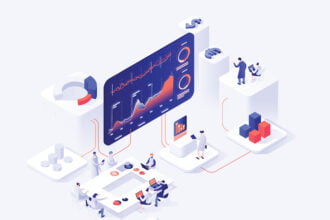
Here are five top examples of data-driven infographics that speak to how you can visualize information to persuade:

Facebook’s Timeline – Infographic Inspired

More Read

The Big Question In Big Data Is…What’s The Question?
Visualizing the census
Deloitte’s Top Technology Trends for 2011: Data Visualization and Real Analytics
Social Network Analyzer Download Available
Visualizing droughts with R

In Facebook’s upcoming major redesign called Timeline, the inspiration began with two infographic designers named Nicholas Felton and Ryan Case. Well known for their data-driven designs, the duo joined the Facebook team in April of this year. According to FastcoDesign.com, Felton’s annual report designs were a major inspiration in the site redesign. The persuasive factor of the new Timeline is that it stands to impact the rest of the web’s info presentation from scrolling down the screen to a more tablet-friendly horizontal, tiled layout. Here’s a video demo of the new Facebook profile design that’s set to hit your profile in the next two to four weeks.

How Men And Women Make Buying Decisions

The thought process of a woman persuading herself to buy something is on target and entertaining, but what’s persuasive about this infographic is the trigger words at the bottom of the each image. GoBankingRates.com has compiled a list of the top triggers to get a buyer thinking about a purchase. Use these words in your marketing and hello persuasion.

thedifferencebetweenmenandwomenthoughtprocessofbuying 4e613937272a2 w550 photo (data visualization)

Persuading the “Techies” 

If you’ve got a computer science degree and tech development skills, get ready to be persuaded. Apparently, there are two or three jobs for every computer science grad, according to an MIT professor quoted in this persuasive infographic from Udemy.com, an online course provider. This visualization shows just how much persuasion is going on in the tech industry. For instance, when Digg.com laid off 25 employees last year, almost all of them were snapped up by big tech brands including Groupon and Twitter. The perks are high and so are the salaries. Anyone need a career change? This infographic may persuade you.

infographicwhoiswinningandlosinginthetechtalentwars 4e612e2057927 w525 photo (data visualization)

Does It Really Cost More to Die?
Not only does it cost more to live today with record gas prices and healthcare costs, it also costs more to die. According to this infographic designed by Gerardo Obieta (@g_obieta), several reputable resources including CBS News, the National Association of Funeral Directors and the Federal Trade Commission say you need to save more for your demise. The average casket and funeral (not including the plot) cost you an average of $10,000. Simple cremation costs right around $1,000 and includes the urn. The numbers are persuasive to say the least, but we’ll leave it up to you to make this final decision.

Theincreasingcostofdying 4e24afb696e00 w525 photo (data visualization)

How CEOs Spend Their Day
This infographic from Inc. shows how a CEO’s time is divided over 24 hours. From a persuasive point of view, the CEO has to be judicious in the way she spends her day to make sure all audiences (employees, customers, family, etc.) are served. This infographic also shares some insider viewpoints on CEOs’ personal preferences – cereal, wine, driving. Anyone smell a marketing campaign? And now we all know how little time the boss really has for herself.
day in the life inc 500 ceo photo (data visualization)
Stay tuned to the Spotfire blog as we’ll be bringing you a monthly roundup of the most persuasive data visualizations.

Share This Article
Facebook Pinterest LinkedIn
Share

Follow us on Facebook

Latest News

intersection of data and patient care
How Healthcare Careers Are Expanding at the Intersection of Data and Patient Care
Big Data Exclusive
dedicated servers for ai businesses
5 Reasons AI-Driven Business Need Dedicated Servers
Artificial Intelligence Exclusive News
data analytics for pharmacy trends
How Data Analytics Is Tracking Trends in the Pharmacy Industry
Analytics Big Data Exclusive
ai call centers
Using Generative AI Call Center Solutions to Improve Agent Productivity
Artificial Intelligence Exclusive

Stay Connected

1.2kFollowersLike
33.7kFollowersFollow
222FollowersPin

You Might also Like

Tips for Developing a BI Roadmap

5 Min Read

Tufte Shares Wisdom for Data Presenters

4 Min Read
python best language for big data
Artificial IntelligenceBig DataBlockchainBusiness IntelligenceData ManagementData MiningData QualityData ScienceData VisualizationHadoopITMachine LearningUnstructured Data

Here’s Why Python Is The Top Programming Language For Big Data

6 Min Read

Tabled: Is R the Solution?

12 Min Read

SmartData Collective is one of the largest & trusted community covering technical content about Big Data, BI, Cloud, Analytics, Artificial Intelligence, IoT & more.

ai in ecommerce
Artificial Intelligence for eCommerce: A Closer Look
Artificial Intelligence
ai chatbot
The Art of Conversation: Enhancing Chatbots with Advanced AI Prompts
Chatbots

Quick Link

  • About
  • Contact
  • Privacy
Follow US
© 2008-25 SmartData Collective. All Rights Reserved.
Go to mobile version
Welcome Back!

Sign in to your account

Username or Email Address
Password

Lost your password?