Cookies help us display personalized product recommendations and ensure you have great shopping experience.

We use cookies, including third-party cookies from Google to serve personalized ads through AdSense, to operate this site and understand how it is used. By continuing to browse, you accept this use. See our Privacy Policy and Terms of Use for details, including how to opt out of personalized advertising.
Accept
SmartData CollectiveSmartData Collective
  • Analytics
    AnalyticsShow More
    chatgpt image jul 21, 2026, 04 34 30 pm
    4 Core Benefits of Predictive Maintenance after Vibration Analysis
    10 Min Read
    How Does Data Mining Boost Customer Satisfaction in Logistics? Harnessing Analytics for Results -- AI-generated illustration
    How Does Data Mining Boost Customer Satisfaction in Logistics? Harnessing Analytics for Results
    11 Min Read
    chatgpt image jul 13, 2026, 04 23 45 pm
    How Data Analytics Helps Companies Improve User Engagement
    19 Min Read
    chatgpt image jul 13, 2026, 03 59 46 pm
    How Data Analytics Improves Multi-Location Search Strategies
    10 Min Read
    cybersecurity efforts
    How Behavioral Analytics and AI Are Redefining Cybersecurity for Boca Raton Businesses
    14 Min Read
  • Big Data
  • BI
  • Exclusive
  • IT
  • Marketing
  • Software
Search
© 2008-25 SmartData Collective. All Rights Reserved.
Reading: 3 Easy Checks to Ensure Quality Analytics Reporting
Share
Notification
Font ResizerAa
SmartData CollectiveSmartData Collective
Font ResizerAa
Search
  • About
  • Help
  • Privacy
Follow US
© 2008-23 SmartData Collective. All Rights Reserved.
SmartData Collective > Uncategorized > 3 Easy Checks to Ensure Quality Analytics Reporting
Uncategorized

3 Easy Checks to Ensure Quality Analytics Reporting

DataQualityEdge
DataQualityEdge
5 Min Read
SHARE

Are you new to business intelligence, predictive analytics or analysis in general. With all the talk about data visualization and how effective it is in telling a story… well, it’s grand!

Here’s another way of looking at it – really: data visualization allows your VP to review the report over a cappuccino and reading emails on their Blackberry, while talking on the phone, and waving in the admin assistant (I believe that’s the politically correct term).

So how often are decisions made based on bad reports. Or bad decisions based on good reports.

Let’s just say the data is 100% accurate: is it still possible to have less than stellar reports (I was going to use a word that rhymes with ‘happy’, but “less than stellar” – works as well)?

More Read

Why I Don’t Hate Facebook Anymore
The Importance of BI Specific Skill Sets
Empowering Business Users To Embrace Change
Media Cloud: Watch, Analyze, Learn
I Gotta “Hunch” You’ll Wanna Check This Out

Here are three simple things you can do to make sure your reports are good quality reports.

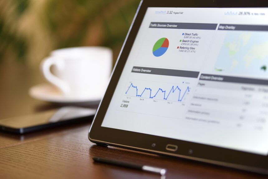
  1. Pie charts: they are suppose to equal 100%, so if you have a chart that totals 103%, ask yourself what happened and fix the calculations.
  2. Rounding Issues: Some old applications and databases drop the full value of the numbers so that they may round the value, and some modern day applications as well (depending on your settings). If this is the case, remember to .. …


Are you new to business intelligence, predictive analytics or analysis in general. With all the talk about data visualization and how effective it is in telling a story… well, it’s grand!

Here’s another way of looking at it – really: data visualization allows your VP to review the report over a cappuccino and reading emails on their Blackberry, while talking on the phone, and waving in the admin assistant (I believe that’s the politically correct term).

So how often are decisions made based on bad reports. Or bad decisions based on good reports.

Let’s just say the data is 100% accurate: is it still possible to have less than stellar reports (I was going to use a word that rhymes with ‘happy’, but “less than stellar” – works as well)?

Here are three simple things you can do to make sure your reports are good quality reports.

  1. Pie charts: they are suppose to equal 100%, so if you have a chart that totals 103%, ask yourself what happened and fix the calculations.
  2. Rounding Issues: Some old applications and databases drop the full value of the numbers so that they may round the value, and some modern day applications as well (depending on your settings). If this is the case, remember to sum your columns to ensure that the value you are reporting as the total is the actual total. The other problem with rounding is lost data, and increased values. Your 6.25 or 5.87 value can each be rounded to 6. So be careful. Choose wisely!
  3. Decimal point: If you’re doing a report on the amount of sales you perform on your products, or services, just make sure the decimal place is where it should be. Having the decimal place in the incorrect position will ruin everything! You don’t want to say your selling Widget ABC for $1.10, when it’s actually $0.11.

Decimal Point Facts:

Remember for doctors, pharmacists, nurses entering the decimal point in the wrong place can actually kill someone (i.e., incorrect dosage).

We all know that Popeye’s spinach fetish had more to do with the decimal point then with actual iron content (How often did you hear, “Eat your spinach, it’ll make you strong like Popeye” when you were young, when all you wanted was a nice juicy steak).

How often do banks withdraw 5500.00$ instead of 55.00$?

Something else to think about.

If you’ve checked the above three points in a report that has been produced for eons, and these errors are happening, and no one has said anything, not a word, nothing! Then there’s two things going on… no one is using that report (imagine that for a moment, no one is using your report, what a waste of resources). Or your organization will eventually feel the effects of bad reporting in the financials or other areas of the organization.


Share This Article
Facebook Pinterest LinkedIn
Share

Follow us on Facebook

Latest News

Best Age Estimation Software in 2026: Which Facial Age Providers Actually Hold Up -- AI-generated illustration
Best Age Estimation Software in 2026: Which Facial Age Providers Actually Hold Up
Artificial Intelligence Exclusive Machine Learning
Top 8 Multi-Cloud Architecture Tools for Automated Infrastructure Design in 2026 -- AI-generated illustration
Top 8 Multi-Cloud Architecture Tools for Automated Infrastructure Design in 2026
Cloud Computing Exclusive IT
6 Top Agentic SDLC Platforms for Enterprise Engineering Organizations -- AI-generated illustration
6 Top Agentic SDLC Platforms for Enterprise Engineering Organizations
Artificial Intelligence Exclusive
6 Best Runtime Intelligence Tools for Debugging AI-Generated Code in 2026 -- AI-generated illustration
6 Best Runtime Intelligence Tools for Debugging AI-Generated Code in 2026
Artificial Intelligence Exclusive

Stay Connected

1.2KFollowersLike
33.7KFollowersFollow
222FollowersPin

You Might also Like

Engineering Your Own Discounts and Incentives with Social Media

4 Min Read

Federal Government Technology Directions and the Fed CTO

4 Min Read

Failing Faster

5 Min Read
secrets to accurate sales forecasting
Uncategorized

Accurate Sales Forecasting: 4 Secrets

5 Min Read

SmartData Collective is one of the largest & trusted community covering technical content about Big Data, BI, Cloud, Analytics, Artificial Intelligence, IoT & more.

ai chatbot
The Art of Conversation: Enhancing Chatbots with Advanced AI Prompts
Chatbots
ai in ecommerce
Artificial Intelligence for eCommerce: A Closer Look
Artificial Intelligence

Quick Link

  • About
  • Contact
  • Privacy
Follow US
© 2008-26 SmartData Collective. All Rights Reserved.
Welcome Back!

Sign in to your account

Username or Email Address
Password

Lost your password?