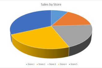
Take a look at this dreadful chart from BusinessInsider.com and see if you can figure out what it’s trying to say:
Take a look at this dreadful chart from BusinessInsider.com and see if you can figure out what it’s trying to say:
Hint: while it looks kinda like a pie chart, it’s not representing proportions of any kind. Junk Charts has a much better representation of these data, when you check it out, it’ll become perfectly clear what this chart is trying to convey. And that, ladies and gentlemen, is the sign of a terrible, terrible chart.
Business Insider: Here Are The 10 Highest-Paying Jobs At Google (via David Gerbino)


