Cookies help us display personalized product recommendations and ensure you have great shopping experience.

By using this site, you agree to the Privacy Policy and Terms of Use.
Accept
SmartData CollectiveSmartData Collective
  • Analytics
    AnalyticsShow More
    data analytics
    How Data Analytics Can Help You Construct A Financial Weather Map
    4 Min Read
    financial analytics
    Financial Analytics Shows The Hidden Cost Of Not Switching Systems
    4 Min Read
    warehouse accidents
    Data Analytics and the Future of Warehouse Safety
    10 Min Read
    stock investing and data analytics
    How Data Analytics Supports Smarter Stock Trading Strategies
    4 Min Read
    predictive analytics risk management
    How Predictive Analytics Is Redefining Risk Management Across Industries
    7 Min Read
  • Big Data
  • BI
  • Exclusive
  • IT
  • Marketing
  • Software
Search
© 2008-25 SmartData Collective. All Rights Reserved.
Reading: Data Presentation: A Picture is Worth Far More Than Words
Share
Notification
Font ResizerAa
SmartData CollectiveSmartData Collective
Font ResizerAa
Search
  • About
  • Help
  • Privacy
Follow US
© 2008-23 SmartData Collective. All Rights Reserved.
SmartData Collective > Data Management > Best Practices > Data Presentation: A Picture is Worth Far More Than Words
AnalyticsBest PracticesData VisualizationStatistics

Data Presentation: A Picture is Worth Far More Than Words

Connie Bensen
Connie Bensen
3 Min Read
SHARE

Over the years I have presented many new ideas. It’s always a challenge to offer new methodologies along with compelling reasons for adoption of them. With social media this usually requires the implementation of a pilot on a small scale. For some the ideas are threats and for others the concept of change and the related fear is more than they can handle.

Over the years I have presented many new ideas. It’s always a challenge to offer new methodologies along with compelling reasons for adoption of them. With social media this usually requires the implementation of a pilot on a small scale. For some the ideas are threats and for others the concept of change and the related fear is more than they can handle.

Over time I heard myself repeating key concepts. Combine this with my habit of providing mentorship sessions and I happened upon the solution to more effective presentation of ideas. It requires the creation of charts and diagrams to structure the presentation of your material. Executives and managers want to see the ideas presented in a simple straightforward manner. This affords the highest probability that your proposal will be understood, well-received and adopted.

More Read

Battling Data Silos: 3 Tips to Finance and Operations Integration
Take the Predictive Analytics in the Cloud survey
Digital Transformation: Does The Retail Industry Follow Technology, Or Vice Versa?
The Business of Sales and Marketing – Our Research Agenda for 2013
Recommended read: The Predictioneer’s Game

I came to this realization during the sessions when I provide mentorship. I sit with paper and pen and talk through my methodologies and philosophy. It allows an interactive approach as well as pushes me to structure the conversation. The result is a much more compelling story for the listener and has greatly improved my presentations.

The following show two concepts that I have expressed in charts to show how marketing has changed:

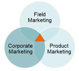
My role is the convergence of Corporate, Field marketing (lead gen) and product marketing. I work to span these three areas and interconnect them.

image

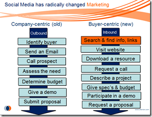
This chart shows a concept that has been expressed in a number of ways:

old (push marketing, outbound marketing) and new (pull marketing, inbound marketing)

But what does that mean? How has it changed and how does it affect the marketing organization overall?

image 

Here are some tips on how you can do this:

1. Make an outline of the concept

2. Talk through the steps and jot them down using scratch paper

3. Explain them to someone else and start with the first point and work through to the last (this is where it falls into place in a more graphic manner)

4. Over time the refinement will become apparent

5. Remember that less is more!

Share This Article
Facebook Pinterest LinkedIn
Share

Follow us on Facebook

Latest News

protecting patient data
How to Protect Psychotherapy Data in a Digital Practice
Big Data Exclusive Security
data analytics
How Data Analytics Can Help You Construct A Financial Weather Map
Analytics Exclusive Infographic
AI use in payment methods
AI Shows How Payment Delays Disrupt Your Business
Artificial Intelligence Exclusive Infographic
financial analytics
Financial Analytics Shows The Hidden Cost Of Not Switching Systems
Analytics Exclusive Infographic

Stay Connected

1.2KFollowersLike
33.7KFollowersFollow
222FollowersPin

You Might also Like

Data Visualization a Big Winner in Knight Challenge

2 Min Read

Would Beethoven Have Given a Rat’s Ass about Business Analytics?

5 Min Read

The 4 Biggest Problems with Big Data

4 Min Read
big data insights
AnalyticsBest PracticesBig DataBusiness IntelligenceCRMCulture/LeadershipData ManagementInside CompaniesITMarket ResearchMobilitySocial Data

Valuable Big Data Insights via Nike+ Gamification Platform

7 Min Read

SmartData Collective is one of the largest & trusted community covering technical content about Big Data, BI, Cloud, Analytics, Artificial Intelligence, IoT & more.

giveaway chatbots
How To Get An Award Winning Giveaway Bot
Big Data Chatbots Exclusive
data-driven web design
5 Great Tips for Using Data Analytics for Website UX
Big Data

Quick Link

  • About
  • Contact
  • Privacy
Follow US
© 2008-25 SmartData Collective. All Rights Reserved.
Go to mobile version
Welcome Back!

Sign in to your account

Username or Email Address
Password

Lost your password?