We use cookies, including third-party cookies from Google to serve personalized ads through AdSense, to operate this site and understand how it is used. By continuing to browse, you accept this use. See our Privacy Policy and Terms of Use for details, including how to opt out of personalized advertising.
Accept
SmartData CollectiveSmartData Collective
  • Analytics
    AnalyticsShow More
    chatgpt image jul 21, 2026, 04 34 30 pm
    4 Core Benefits of Predictive Maintenance after Vibration Analysis
    10 Min Read
    How Does Data Mining Boost Customer Satisfaction in Logistics? Harnessing Analytics for Results -- AI-generated illustration
    How Does Data Mining Boost Customer Satisfaction in Logistics? Harnessing Analytics for Results
    11 Min Read
    chatgpt image jul 13, 2026, 04 23 45 pm
    How Data Analytics Helps Companies Improve User Engagement
    19 Min Read
    chatgpt image jul 13, 2026, 03 59 46 pm
    How Data Analytics Improves Multi-Location Search Strategies
    10 Min Read
    cybersecurity efforts
    How Behavioral Analytics and AI Are Redefining Cybersecurity for Boca Raton Businesses
    14 Min Read
  • Big Data
  • BI
  • Exclusive
  • IT
  • Marketing
  • Software
Search
© 2008-25 SmartData Collective. All Rights Reserved.
Reading: Birthday Probabilities: Heat Map vs. R
Share
Notification
Font ResizerAa
SmartData CollectiveSmartData Collective
Font ResizerAa
Search
  • About
  • Help
  • Privacy
Follow US
© 2008-23 SmartData Collective. All Rights Reserved.
SmartData Collective > Big Data > Data Visualization > Birthday Probabilities: Heat Map vs. R
CommentaryData VisualizationPredictive AnalyticsR Programming Language

Birthday Probabilities: Heat Map vs. R

DavidMSmith
DavidMSmith
2 Min Read
Birthday Probabilities: Heat Map vs. R
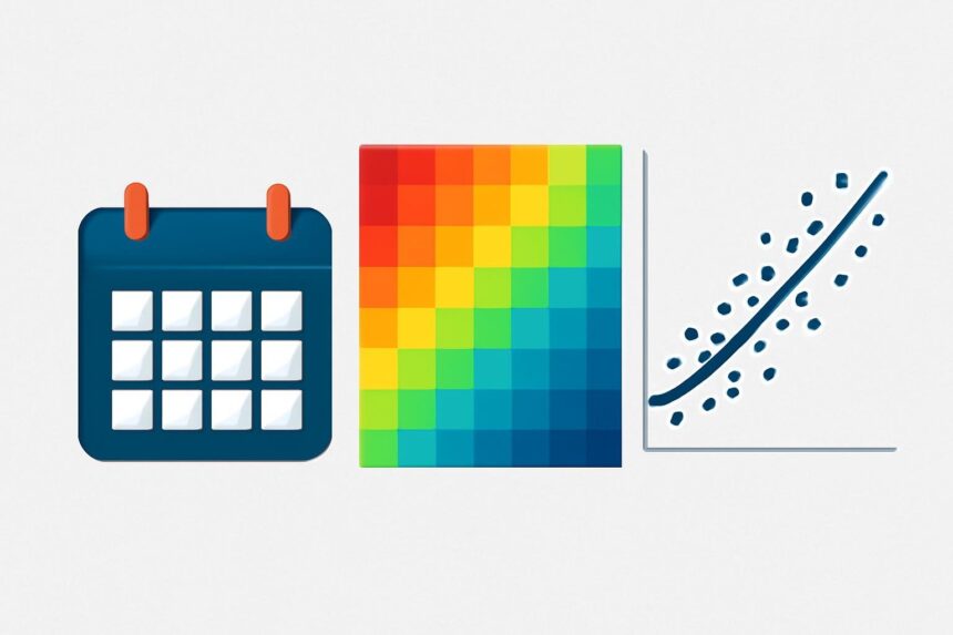
Illustrative image generated with OpenAI gpt-image-1.
SHARE

Last week, Joe Rickert used R and four years of US Census data to create an image plot of the relative probabilities of being born on a given day of the year.

Chris Mulligan also tackled this problem with R, but this time using 20 years of Census data from 1969 to 1988. Chris extracted the birthday frequencies using Google BigQuery, and charted the results with the time series below using this R script.


HeatMapofProbs


More Read

More Matlab/IB Code
More Matlab/IB Code
Web 3.0 – Semantic Web | Twine
How Big Data Will Change Marketing Forever
No single lever, by itself, will switch on the low carbon…
The Viability of Big Data [INFOGRAPHIC]

Birthday probabilities

My apologies to Joe, but I much prefer this representation to the heat map. Not only is the February 29 frequency multiplied by 4 (where we see that it’s not a particularly surprising birthday to have given the overall seasonal trend), but the unusual days really stand out (and are annotated). You’re relatively unlikely to find someone born on January 1, July 4 or Christmas Eve or Christmas Day (most likely because fewer Caesarian births happen, or more induced natural births are avoided, on those days). December 30 is a more likely birthday that you’d otherwise expect (maybe this has something to do with getting kids into an earlier school year?). Andrew Gelman shares a model of the seasonal trend that defines these outliers.

chmullig.com: Births by Day of Year

TAGGED:heat map
Share This Article
Facebook Pinterest LinkedIn
Share

Follow us on Facebook

Latest News

How Search Engine Indexing Lags Behind Large-Scale Website Domain Migrations -- AI-generated illustration
How Search Engine Indexing Lags Behind Large-Scale Website Domain Migrations
News
How Great Content Moves Through A Marketing Ecosystem -- AI-generated illustration
How Great Content Moves Through A Marketing Ecosystem
Exclusive Infographic Marketing
What Your Brand Misses That Data Reveals -- AI-generated illustration
What Your Brand Misses That Data Reveals
Big Data Exclusive Infographic
5 Common Mistakes Businesses Make During the Risk Assessment Process -- AI-generated illustration
5 Common Mistakes Businesses Make During the Risk Assessment Process
Business Intelligence Exclusive Risk Management

Stay Connected

1.2KFollowersLike
33.7KFollowersFollow
222FollowersPin

You Might also Like

Data Visualization: Why (1 of 2)
Data Visualization

Data Visualization: Why (1 of 2)

8 Min Read

SmartData Collective is one of the largest & trusted community covering technical content about Big Data, BI, Cloud, Analytics, Artificial Intelligence, IoT & more.

Artificial Intelligence for eCommerce: A Closer Look
Artificial Intelligence
5 Great Tips for Using Data Analytics for Website UX
Big Data

Quick Link

  • About
  • Contact
  • Privacy
Follow US
© 2008-26 SmartData Collective. All Rights Reserved.
Welcome Back!

Sign in to your account

Username or Email Address
Password

Lost your password?