We use cookies, including third-party cookies from Google to serve personalized ads through AdSense, to operate this site and understand how it is used. By continuing to browse, you accept this use. See our Privacy Policy and Terms of Use for details, including how to opt out of personalized advertising.
Accept
SmartData CollectiveSmartData Collective
  • Analytics
    AnalyticsShow More
    chatgpt image jul 21, 2026, 04 34 30 pm
    4 Core Benefits of Predictive Maintenance after Vibration Analysis
    10 Min Read
    How Does Data Mining Boost Customer Satisfaction in Logistics? Harnessing Analytics for Results -- AI-generated illustration
    How Does Data Mining Boost Customer Satisfaction in Logistics? Harnessing Analytics for Results
    11 Min Read
    chatgpt image jul 13, 2026, 04 23 45 pm
    How Data Analytics Helps Companies Improve User Engagement
    19 Min Read
    chatgpt image jul 13, 2026, 03 59 46 pm
    How Data Analytics Improves Multi-Location Search Strategies
    10 Min Read
    cybersecurity efforts
    How Behavioral Analytics and AI Are Redefining Cybersecurity for Boca Raton Businesses
    14 Min Read
  • Big Data
  • BI
  • Exclusive
  • IT
  • Marketing
  • Software
Search
© 2008-25 SmartData Collective. All Rights Reserved.
Reading: Dancing With Dirty Data Thanks to SAP Visual Intelligence
Share
Notification
Font ResizerAa
SmartData CollectiveSmartData Collective
Font ResizerAa
Search
  • About
  • Help
  • Privacy
Follow US
© 2008-23 SmartData Collective. All Rights Reserved.
SmartData Collective > Big Data > Data Quality > Dancing With Dirty Data Thanks to SAP Visual Intelligence
AnalyticsData QualityData Visualization

Dancing With Dirty Data Thanks to SAP Visual Intelligence

Timo Elliott
Timo Elliott
2 Min Read
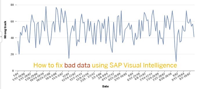
Dancing With Dirty Data Thanks to SAP Visual Intelligence
Illustration generated with FLUX.2 [Klein 9B] via local ComfyUI.
SHARE

bad data fixing

bad data fixing

Here’s my entry for the SAP Ultimate Data Geek Challenge, a contest designed to “show off your inner geek and let the rest of world know your data skills are second to none.” There have already been lots of great submissions with people using the new SAP Visual Intelligence data discovery product.

I thought I’d focus on one of the things I find most powerful: the ability to create visualizations quickly and easily even from real-life, messy data sources. Since it’s election season in the US, I thought I’d use some polling data on whether voters believe the country is “headed in the right direction.” There is lots of different polling data on this (and other topics) available at pollingreport.com.

More Read

Don’t Forget
Don’t Forget
What Is Your Dashboard Telling You?
The Truth about Social Media Analytics
Stop Guessing! Here’s How to Use Data to Power Your Content Marketing Strategy
The Science of Crisis Communication

Below you can see the data set I grabbed: as you can see, the polling date field is particularly messy, since it has extra letters (e.g. RV for “registered voter”), includes polls that were carried out over several days, and is not consistent (the month is not always included, sometimes spaces around the middle dash, sometimes not…).
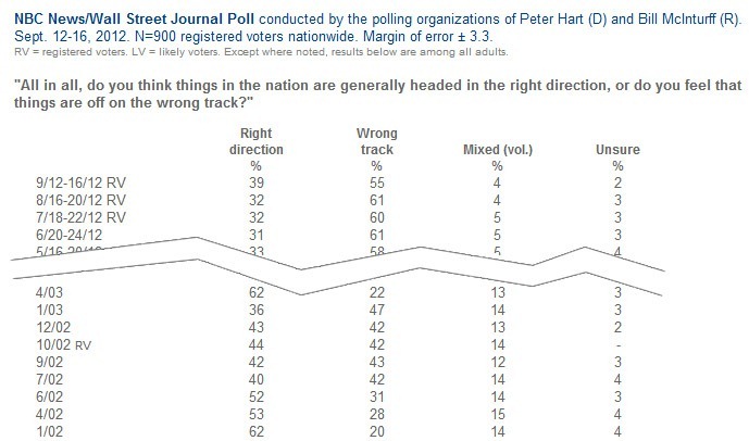
poll data sample

If you take this data and try to paste it into Excel, it automatically converts numbers like “6/02” into the 2nd of June, further scrambling the analysis, so instead I put it directly into a text file.

To see how you can easily take the messy data and turn it into shareable analysis, I recorded a short demonstration of the steps involved:

If you’d like to try the product, you can download it for a free trial at sap.com/tryvisualintelligence. The product is undergoing very rapid iteration cycles, so please give your feedback and feature requests at the SAP Community Network Ideas Place.

Share and Enjoy

• Facebook • Twitter • Delicious • LinkedIn • StumbleUpon • Add to favorites • Email • RSS

Share This Article
Facebook Pinterest LinkedIn
Share

Follow us on Facebook

Latest News

8 MCP Tools for Market and Consumer Intelligence Workflows -- AI-generated illustration
8 MCP Tools for Market and Consumer Intelligence Workflows
Artificial Intelligence Exclusive
How Local Service Businesses Can Map Which Neighborhoods Generate the Most Revenue -- AI-generated illustration
How Local Service Businesses Can Map Which Neighborhoods Generate the Most Revenue
Business Intelligence
Best VMware Alternatives in Thailand for Private Cloud and HCI Deployments -- AI-generated illustration
Best VMware Alternatives in Thailand for Private Cloud and HCI Deployments
Cloud Computing Exclusive IT
Using Safety Metrics and Incident Data to Reduce Construction Risk and Insurance Costs -- AI-generated illustration
Using Safety Metrics and Incident Data to Reduce Construction Risk and Insurance Costs
Big Data Exclusive

Stay Connected

1.2KFollowersLike
33.7KFollowersFollow
222FollowersPin

You Might also Like

Condé Nast Portfolio Article
Predictive Analytics

Condé Nast Portfolio Article

2 Min Read
SumTotal Systems Sums Up Human Capital Management
AnalyticsCollaborative DataInside Companies

SumTotal Systems Sums Up Human Capital Management

7 Min Read
A New Generation of Analytics Offers Help for Sales
Analytics

A New Generation of Analytics Offers Help for Sales

10 Min Read
Analytics Continue to Make Waves in Marketing
AnalyticsText Analytics

Analytics Continue to Make Waves in Marketing

3 Min Read

SmartData Collective is one of the largest & trusted community covering technical content about Big Data, BI, Cloud, Analytics, Artificial Intelligence, IoT & more.

Chatbots and SEO: How Can Chatbots Improve Your SEO Ranking?
Artificial Intelligence Chatbots Exclusive
The Art of Conversation: Enhancing Chatbots with Advanced AI Prompts
Chatbots

Quick Link

  • About
  • Contact
  • Privacy
Follow US
© 2008-26 SmartData Collective. All Rights Reserved.
Welcome Back!

Sign in to your account

Username or Email Address
Password

Lost your password?