We use cookies, including third-party cookies from Google to serve personalized ads through AdSense, to operate this site and understand how it is used. By continuing to browse, you accept this use. See our Privacy Policy and Terms of Use for details, including how to opt out of personalized advertising.
Accept
SmartData CollectiveSmartData Collective
  • Analytics
    AnalyticsShow More
    chatgpt image jul 21, 2026, 04 34 30 pm
    4 Core Benefits of Predictive Maintenance after Vibration Analysis
    10 Min Read
    How Does Data Mining Boost Customer Satisfaction in Logistics? Harnessing Analytics for Results -- AI-generated illustration
    How Does Data Mining Boost Customer Satisfaction in Logistics? Harnessing Analytics for Results
    11 Min Read
    chatgpt image jul 13, 2026, 04 23 45 pm
    How Data Analytics Helps Companies Improve User Engagement
    19 Min Read
    chatgpt image jul 13, 2026, 03 59 46 pm
    How Data Analytics Improves Multi-Location Search Strategies
    10 Min Read
    cybersecurity efforts
    How Behavioral Analytics and AI Are Redefining Cybersecurity for Boca Raton Businesses
    14 Min Read
  • Big Data
  • BI
  • Exclusive
  • IT
  • Marketing
  • Software
Search
© 2008-25 SmartData Collective. All Rights Reserved.
Reading: Data Visualization – One City at a Time
Share
Notification
Font ResizerAa
SmartData CollectiveSmartData Collective
Font ResizerAa
Search
  • About
  • Help
  • Privacy
Follow US
© 2008-23 SmartData Collective. All Rights Reserved.
SmartData Collective > Big Data > Data Visualization > Data Visualization – One City at a Time
Data Visualization

Data Visualization – One City at a Time

PaulBarsch1
PaulBarsch1
6 Min Read
Data Visualization – One City at a Time
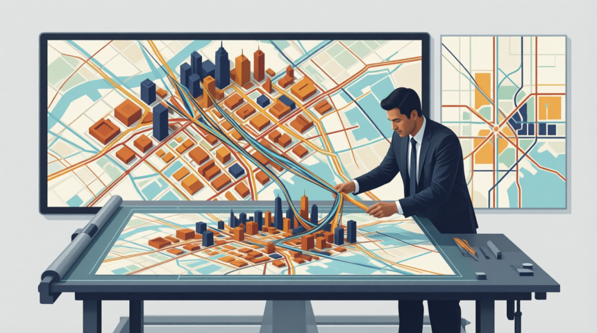
Illustration generated with Qwen Image.
SHARE
Ever wondered what the “rhythm” of your city looks like? In cities like Rome and New York, aggregated real-time data from mobile providers is helping government officials monitor traffic flows, efficiently utilize transportation networks, and even plan for large-scale events helping to improve overall “citizen satisfaction.” Is real-time data visualization coming to a city near you?

The proliferation of mobile and GPS technologies (sometimes in the same handset), are making it possible for city planners, government officials, and even businesses to gain a pulse of the daily movements of entire populations.

An article in the Wall Street Journal, “Cellphone Data Track Our Migration Patterns”, June 10, 2008, mentions how mobile providers are allowing access of anonymized and aggregated location data to social scientists, physicists and urban planners.

The article notes, “More than 3.3 billion wireless-phone subscribers world-wide have, in effect, voluntarily adopted devices that record their daily movements in the same way satellite sensors monitor migrating birds, whales, bears and other wildlife.”

Indeed, network physicist Albert-Laszlo Barabasi says that since practically everyone has a mobile phone, “Everything we do leaves an electronic fingerprint somewhere.”

While the concept of tracking human movement raises the eyebrows of many privacy advocates, the benefits to exploratory analysis of GPS and mobile data—according to the article—are myriad including, “aid(ing) emergency relief efforts in natural disasters, as well as improving urban planning, public transportation and traffic control.”

The Wall Street Journal article also mentions another case study where MIT and Telecom Italia have teamed through Project “Real Time Rome” to help its citizens and officials make better decisions regarding resource utilization.

Overlaying telecommunications data and Google Earth allows Project “Real Time Rome” to dynamically reveal “the rhythm of the city” through six visualizations:

• Pulse – helps determine commuting patterns and patterns of use for transportation networks
• Connectivity—ensures public transportation is located near populations
• Flow—helps answer the question, “Where is traffic moving or flowing to?”
• Icons— helps answer the question, “Which landmarks in Rome attract more people”?
• Visitors—discovers where tourists congregate
• Gathering—during special events (i.e. Madonna concert), helps determine how people occupy and move through different parts of Rome

Sophisticated analytical applications and data warehousing technologies are helping “bring data to life” for governments, citizens and businesses. I’ve also thought of some other ways this mobile/GPS data could create advantages:

• Businesses could examine historical patterns of people movement to decide where to open their next store/branch
• Real estate agents (commercial and residential) could use the data to determine migration patterns over time
• Businesses could examine the data to determine staffing and inventory levels by day or even hour based on historical traffic patterns in their vicinity
• Variable pricing could be enacted for access to roads or public transportation based on peak-demand usage (ex: toll roads into a city could charge more for drivers during peak hours much like London is doing)
• Chambers of commerce and city officials could use the data to steer promotions/traffic towards a new downtown renovation, places of interest, less frequently visited tourist attractions.
• Special events—mid-city concerts for example—can be modeled based on historical data of traffic, pedestrian flow etc, to ensure future events are more accessible

Through the use of powerful data-visualization applications, government agencies, businesses and citizens are able to explore data to uncover mathematical patterns and connections to help improve the lives of everyone concerned.

So, the next time you visit a major city, hit all the tourist attractions in a timely fashion, avoid the crowds and notice that trains, buses, and taxis run on time and are conveniently located, remember it’s probably not an accident. Good service rarely is.

What are your thoughts?

Share This Article
Facebook Pinterest LinkedIn
Share

Follow us on Facebook

Latest News

Illustration of mobile analytics dashboards with ad performance charts connected to backend databases
11 Best Sisense Alternatives for Embedded Analytics
Business Intelligence Exclusive
Analyst points at colorful circular data dashboard on screen - information technology business metrics
How Fragmented Workplace Tech Undermines Reliable Business Metrics and Reporting
Cloud Computing Exclusive Infographic IT
Using Multi-Source Data and Analytics to Detect Operational Drift Across Franchise Networks -- AI-generated illustration
Using Multi-Source Data and Analytics to Detect Operational Drift Across Franchise Networks
Exclusive Infographic
Beyond The First Impression: The Long-Lasting Impact Of Sensory Marketing -- AI-generated illustration
Beyond The First Impression: The Long-Lasting Impact Of Sensory Marketing
Infographic Marketing

Stay Connected

1.2KFollowersLike
33.7KFollowersFollow
222FollowersPin

You Might also Like

How to Create an OBIEE Dashboard Tutorial
AnalyticsBig DataBusiness IntelligenceData VisualizationDecision ManagementPredictive Analytics

How to Create an OBIEE Dashboard Tutorial

6 Min Read
Data Management and the Navy: The Navy Virtualizes
Data QualityData Visualization

Data Management and the Navy: The Navy Virtualizes

3 Min Read
Google's Year in Local Search
Data Visualization

Google’s Year in Local Search

3 Min Read
A Deep Dive in Big Data
Big DataCloud ComputingData QualityData VisualizationSoftware

A Deep Dive in Big Data

7 Min Read

SmartData Collective is one of the largest & trusted community covering technical content about Big Data, BI, Cloud, Analytics, Artificial Intelligence, IoT & more.

ai chatbot
How AI Website Chatbots Improve Customer Support and Lead Generation
Chatbots Exclusive
Artificial Intelligence for eCommerce: A Closer Look
Artificial Intelligence

Quick Link

  • About
  • Contact
  • Privacy
Follow US
© 2008-26 SmartData Collective. All Rights Reserved.
Welcome Back!

Sign in to your account

Username or Email Address
Password

Lost your password?