Cookies help us display personalized product recommendations and ensure you have great shopping experience.

By using this site, you agree to the Privacy Policy and Terms of Use.
Accept
SmartData CollectiveSmartData Collective
  • Analytics
    AnalyticsShow More
    big data analytics in transporation
    Turning Data Into Decisions: How Analytics Improves Transportation Strategy
    3 Min Read
    sales and data analytics
    How Data Analytics Improves Lead Management and Sales Results
    9 Min Read
    data analytics and truck accident claims
    How Data Analytics Reduces Truck Accidents and Speeds Up Claims
    7 Min Read
    predictive analytics for interior designers
    Interior Designers Boost Profits with Predictive Analytics
    8 Min Read
    image fx (67)
    Improving LinkedIn Ad Strategies with Data Analytics
    9 Min Read
  • Big Data
  • BI
  • Exclusive
  • IT
  • Marketing
  • Software
Search
© 2008-25 SmartData Collective. All Rights Reserved.
Reading: Paul Murrell on Incorporating Images in R Charts
Share
Notification
Font ResizerAa
SmartData CollectiveSmartData Collective
Font ResizerAa
Search
  • About
  • Help
  • Privacy
Follow US
© 2008-23 SmartData Collective. All Rights Reserved.
SmartData Collective > Big Data > Data Visualization > Paul Murrell on Incorporating Images in R Charts
Data VisualizationR Programming Language

Paul Murrell on Incorporating Images in R Charts

DavidMSmith
DavidMSmith
3 Min Read
SHARE

Thanks to everyone at who attended this week’s Bay Area R User Group meeting, and a special thanks to our hosts Socialize (a company that makes a mobile SDK for application developers that increases user engagement) who were very generous in letting the group use their San Francisco digs for the meeting. Reflexive thanks also go to the Revolution Analytics community team for spons

Thanks to everyone at who attended this week’s Bay Area R User Group meeting, and a special thanks to our hosts Socialize (a company that makes a mobile SDK for application developers that increases user engagement) who were very generous in letting the group use their San Francisco digs for the meeting. Reflexive thanks also go to the Revolution Analytics community team for sponsoring BARUG and providing refreshments.

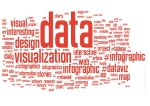
At the meeting, R core member Paul Murrell gave a wonderful talk about the new raster image support available in recent versions of R (since version 2.11.0). Raster graphics support makes it easy in R to incorporate images into charts created like R. So if you want to incorporate a photo background into an infographic, or connect a series of PNG icons into a network diagram, or use an image as a scatterplot mark, all of that is now possible in R. You lay out images any way you like, in fact, as Paul showed:

Photo album in R

More Read

Storytelling with Data to Rally Support for Your Position
Because it’s Friday: The dating equation
An Analysis of the R-help Mailing List
Are You Reporting What You Can?…Or What You Should?
Watch 131 Years of Global Warming in 26 Seconds | Climate…

(Paul’s slides aren’t on-line yet, hence the phone camera shot above. I’ll link to his slides here when they’re available.) As an added bonus, raster images are much more efficient than the “old” way of doing things in R (by drawing lots of little squares, one by one). As a result, plots that contain raster images — like image plots and heatmaps — render much faster in R, and create smaller and higher-quality exported image files. (If you’re a regular user of the image function in R, for example, you should make a habit of using the new useRaster=TRUE option.)

The ‘a-ha’ moment for me in the talk, though, was that these facilities now make R a scriptable alternative to image editors like ImageMagick or GIMP. Paul showed a great example of producing an infographic by defining an area to cut-and-paste out using a polygonal mask, and then colour-correcting the image within that shape (to create a transparent overlay). Sure, all of these things are easy to do in image-processing tools, but by doing it in an R script it makes the process automated and repeatable — perfect if you want to recreate an infographic on a daily basis with updated data, for example.

You can see some code examples working with images in R from Chapter 18 of the forthcoming second edition of Paul’s book, R Graphics.

Share This Article
Facebook Pinterest LinkedIn
Share

Follow us on Facebook

Latest News

data intelligence in healthcare
How Data Is Powering Real-Time Intelligence in Health Systems
Big Data Exclusive
intersection of data
The Intersection of Data and Empathy in Modern Support Careers
Big Data Exclusive
blockchain for ICOs
The Role of Blockchain in ICO Fundraising
Blockchain Exclusive
ai in business
How AI Helps Businesses Discover Specialized Niches
Exclusive Marketing

Stay Connected

1.2kFollowersLike
33.7kFollowersFollow
222FollowersPin

You Might also Like

ASCII Data Modeling Tool – Amazing Stuff!

2 Min Read

Why IT Doesn’t “Get” Analytics (and Why the Time is Right for Change)

8 Min Read

Discussion of Big Data in the Geospatial Intelligence Domain

3 Min Read

From Master Data to Master Graph

16 Min Read

SmartData Collective is one of the largest & trusted community covering technical content about Big Data, BI, Cloud, Analytics, Artificial Intelligence, IoT & more.

data-driven web design
5 Great Tips for Using Data Analytics for Website UX
Big Data
AI and chatbots
Chatbots and SEO: How Can Chatbots Improve Your SEO Ranking?
Artificial Intelligence Chatbots Exclusive

Quick Link

  • About
  • Contact
  • Privacy
Follow US
© 2008-25 SmartData Collective. All Rights Reserved.
Go to mobile version
Welcome Back!

Sign in to your account

Username or Email Address
Password

Lost your password?