
We use cookies, including third-party cookies from Google to serve personalized ads through AdSense, to operate this site and understand how it is used. By continuing to browse, you accept this use. See our Privacy Policy and Terms of Use for details, including how to opt out of personalized advertising.
Accept
SmartData CollectiveSmartData Collective
  • Analytics
    AnalyticsShow More
    chatgpt image jul 21, 2026, 04 34 30 pm
    4 Core Benefits of Predictive Maintenance after Vibration Analysis
    10 Min Read
    How Does Data Mining Boost Customer Satisfaction in Logistics? Harnessing Analytics for Results -- AI-generated illustration
    How Does Data Mining Boost Customer Satisfaction in Logistics? Harnessing Analytics for Results
    11 Min Read
    chatgpt image jul 13, 2026, 04 23 45 pm
    How Data Analytics Helps Companies Improve User Engagement
    19 Min Read
    chatgpt image jul 13, 2026, 03 59 46 pm
    How Data Analytics Improves Multi-Location Search Strategies
    10 Min Read
    cybersecurity efforts
    How Behavioral Analytics and AI Are Redefining Cybersecurity for Boca Raton Businesses
    14 Min Read
  • Big Data
  • BI
  • Exclusive
  • IT
  • Marketing
  • Software
Search
© 2008-25 SmartData Collective. All Rights Reserved.
Reading: Infographic: The Relationship between Business Professionals and KPIs
Share
Notification
Font ResizerAa
SmartData CollectiveSmartData Collective
Font ResizerAa
Search
  • About
  • Help
  • Privacy
Follow US
© 2008-23 SmartData Collective. All Rights Reserved.
SmartData Collective > Big Data > Data Visualization > Infographic: The Relationship between Business Professionals and KPIs
AnalyticsData Visualization

Infographic: The Relationship between Business Professionals and KPIs

Eran Levy
Eran Levy
2 Min Read
Infographic: The Relationship between Business Professionals and KPIs
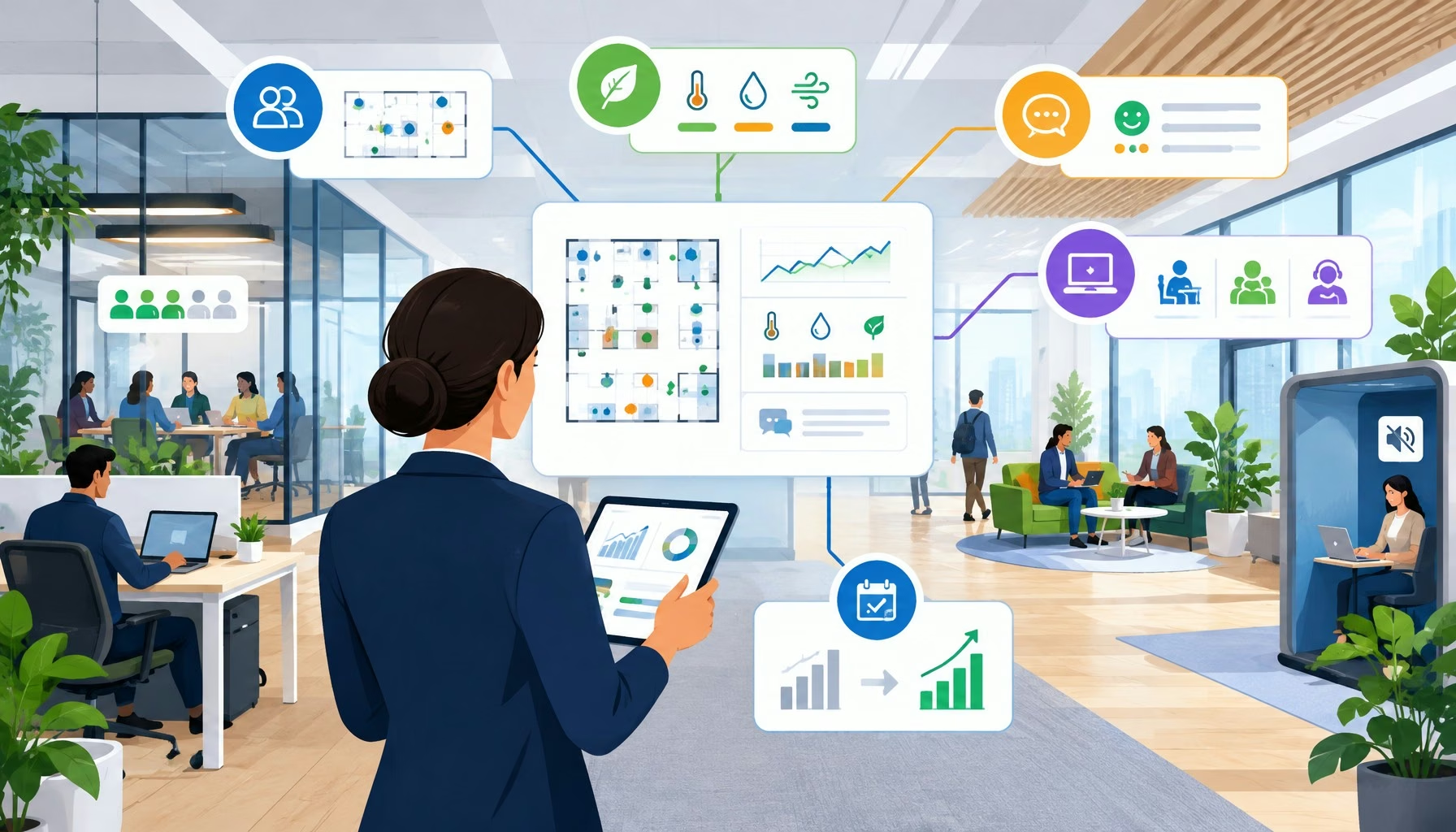
Illustration generated with FLUX.2 [klein 4B] via Cloudflare Workers AI.
SHARE

In preparation for launching our BI Virtually Everywhere program, we ran a quick survey (comprised mostly of participants from within our user base) aiming to understand how various business professionals interact with their KPIs, as well as how they would like to consume data in the future. The results are summarized in this infographic:

As you can see, out of the hundreds of respondents, nearly half (48%) reported checking their KPIs daily, with 17% reporting checking them hourly. Since the majority reported visual triggers being the most effective alerting method, it’s no surprise that color coding was also popular among respondents. It was also interesting to see that while theoretically one might expect to see many different KPIs, professionals in similar roles tended to look at the same metrics across companies and industries. As for the future, many respondents were excited about the possibility of communicating with their data systems via voice activation or Siri-like virtual assistants, while team collaboration tools were also popular.

We believe BI Virtually Everywhere addresses both the present and future of data consumption – with ambient smart lights giving business KPIs a real-life representation, and Amazon Echo devices enabling business users to communicate with data using voice commands. By the way – you can still apply to join the beta.

Share This Article
Facebook Pinterest LinkedIn
Share

Follow us on Facebook

Latest News

Analyst points at colorful circular data dashboard on screen - information technology business metrics
How Fragmented Workplace Tech Undermines Reliable Business Metrics and Reporting
Cloud Computing Exclusive Infographic IT
Using Multi-Source Data and Analytics to Detect Operational Drift Across Franchise Networks -- AI-generated illustration
Using Multi-Source Data and Analytics to Detect Operational Drift Across Franchise Networks
Exclusive Infographic
Beyond The First Impression: The Long-Lasting Impact Of Sensory Marketing -- AI-generated illustration
Beyond The First Impression: The Long-Lasting Impact Of Sensory Marketing
Infographic Marketing
The Infrastructure Gap Slowing Data Center Growth -- AI-generated illustration
The Infrastructure Gap Slowing Data Center Growth
Big Data Cloud Computing Exclusive Infographic IT

Stay Connected

1.2KFollowersLike
33.7KFollowersFollow
222FollowersPin

You Might also Like

The Viability of Big Data [INFOGRAPHIC]
Big DataData MiningData QualityData Visualization

The Viability of Big Data [INFOGRAPHIC]

2 Min Read
Add Branded and Non-Branded Keywords separately in Google Analytics Dashboard
AnalyticsMarket ResearchMarketing

Add Branded and Non-Branded Keywords separately in Google Analytics Dashboard

4 Min Read
5 Innovative and Diverse Uses of Big Data
Big DataCloud ComputingExclusiveInside CompaniesITModelingPredictive Analytics

5 Innovative and Diverse Uses of Big Data

8 Min Read
Big Data Analytics Touching Our Lives Everyday
AnalyticsBig Data

Big Data Analytics Touching Our Lives Everyday

6 Min Read

SmartData Collective is one of the largest & trusted community covering technical content about Big Data, BI, Cloud, Analytics, Artificial Intelligence, IoT & more.

5 Great Tips for Using Data Analytics for Website UX
Big Data
ai chatbot
How AI Website Chatbots Improve Customer Support and Lead Generation
Chatbots Exclusive

Quick Link

  • About
  • Contact
  • Privacy
Follow US
© 2008-26 SmartData Collective. All Rights Reserved.
Welcome Back!

Sign in to your account

Username or Email Address
Password

Lost your password?