Cookies help us display personalized product recommendations and ensure you have great shopping experience.

By using this site, you agree to the Privacy Policy and Terms of Use.
Accept
SmartData CollectiveSmartData Collective
  • Analytics
    AnalyticsShow More
    data mining to find the right poly bag makers
    Using Data Analytics to Choose the Best Poly Mailer Bags
    12 Min Read
    data analytics for pharmacy trends
    How Data Analytics Is Tracking Trends in the Pharmacy Industry
    5 Min Read
    car expense data analytics
    Data Analytics for Smarter Vehicle Expense Management
    10 Min Read
    image fx (60)
    Data Analytics Driving the Modern E-commerce Warehouse
    13 Min Read
    big data analytics in transporation
    Turning Data Into Decisions: How Analytics Improves Transportation Strategy
    3 Min Read
  • Big Data
  • BI
  • Exclusive
  • IT
  • Marketing
  • Software
Search
© 2008-25 SmartData Collective. All Rights Reserved.
Reading: How Pictographs Make Technical Data More User Friendly
Share
Notification
Font ResizerAa
SmartData CollectiveSmartData Collective
Font ResizerAa
Search
  • About
  • Help
  • Privacy
Follow US
© 2008-23 SmartData Collective. All Rights Reserved.
SmartData Collective > Big Data > How Pictographs Make Technical Data More User Friendly
Big DataExclusive

How Pictographs Make Technical Data More User Friendly

Discover how pictographs can make complex technical data more user friendly and easier to understand. Learn the power of visual communication today!

Albert Smith
Albert Smith
5 Min Read
technical data importance
Shutterstock Licensed Photo - 1115081195 | By PopTika
SHARE

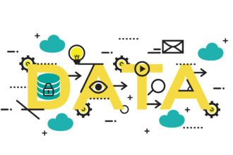
A pictograph is a symbol that represents a word or a phrase. They were used in the earliest forms of writing and are still helpful for explaining complicated concepts quickly. One of these concepts includes technical data, information that isn’t typically user-friendly or easy to read.

Contents
  • 10 Ways Pictographs Help Make Sense of Technical Data
    • 1. Enhance Clarity
    • 2. Make Comparisons
    • 3. Visualize Trends
    • 4. Understand Patterns
    • 5. Simplify Complex Data
    • 6. Identify Outliers
    • 7. Saves Time
    • 8. Communicate Data
    • 9. Provide Context
    • 10. Make Better Decisions
    • In Conclusion…

10 Ways Pictographs Help Make Sense of Technical Data

Pictographs are graphical representations of data that can help you visualize trends and patterns. Here are 10 ways that pictographs can make technical data more user-friendly. 

1. Enhance Clarity

Pictographs make it easier to understand data at a glance. By condensing multiple values into a single image, you can quickly identify trends and draw conclusions. This can be especially helpful for small businesses, freelancers, or entrepreneurs who need to make decisions quickly. 

2. Make Comparisons

Pictographs can also make it easier to compare different sets of data. With pictographs, you can easily spot similarities and differences between different values. If you create an aesthetic photo collage with BeFunky, you can understand the impact of decisions and trends over a set period.

More Read

BI and a different type of outsourcing
The Commoditization of Analytics
Monitoring Data Without Turning into Big Brother
Reference Domains Part III: Collecting Classifications
3 Big Data Use Cases to Kickstart Your Data-Driven Initiatives

3. Visualize Trends

As stated, pictographs are perfectly designed to help you visualize trends. By plotting values on a graph, you can spot trends and make predictions. Many small businesses need this level of transparency to anticipate customer behavior and adapt to market changes in their industry. 

4. Understand Patterns

Without a visual representation of your data, it will be hard to understand why customers prefer one product or service over the other. Since pictographs can help you identify patterns in data, you can instantly see how different factors interact and how to pivot to suit your customers. 

5. Simplify Complex Data

Businesses typically gather a lot of data, but if they don’t make sense of it, it’s going to be useless. Pictographs can make it easier to understand complex data. This is especially true if you use your pictographs in an infographic, as it combines visuals and interpretable data. 

6. Identify Outliers

Since pictographs are capable of detecting trends, they’re also great at finding outliers. There will always be customers that make decisions outside of typical trends, but this data doesn’t always belong in your dataset. A pictograph will help you see that data and dispose of it.

7. Saves Time

By condensing multiple values into a single image, you can quickly identify trends and draw conclusions. Thus, it makes sense that pictographs would allow you to make decisions quickly. It can also make outsiders who don’t understand the data come to an informed conclusion.

8. Communicate Data

It’s not always easy for businesses to communicate data effectively, especially to people who exist outside of your organization. Pictographs can help small businesses communicate data to just about anyone more effectively by conveying complex information into one single picture.

9. Provide Context

Pictographs can provide context to data by showing an overview of the data. Businesses can show stakeholders exactly why this data was collected and what it means for them and the organization. They can use pictographs to connect hard-to-understand concepts effortlessly. 

10. Make Better Decisions

In the end, pictographs can help small business owners make better decisions. By visualizing data, pictographs allow people to make snap conclusions, but not in a bad way. The format simply makes it easier for people to see what they need to make the best decision possible.

In Conclusion…

By using pictographs to visualize data, small businesses can make sense of complex data quickly and accurately. Pictographs can help you identify trends, understand patterns, and make better decisions. They help you communicate complex data to stakeholders quickly and easily.

TAGGED:big datatechnical data
Share This Article
Facebook Pinterest LinkedIn
Share
ByAlbert Smith
Follow:
Albert Smith is a Digital Marketing Manager with Hidden Brains, a leading IT company specializing in enterprise and emerging technology solutions such as Blockchain development , IoT, Cloud, Chatbot and Big Data. He provides innovative ways to help tech companies, startups and large enterprises build their brand.

Follow us on Facebook

Latest News

data mining to find the right poly bag makers
Using Data Analytics to Choose the Best Poly Mailer Bags
Analytics Big Data Exclusive
data science importance of flexibility
Why Flexibility Defines the Future of Data Science
Big Data Exclusive
payment methods
How Data Analytics Is Transforming eCommerce Payments
Business Intelligence
cybersecurity essentials
Cybersecurity Essentials For Customer-Facing Platforms
Exclusive Infographic IT Security

Stay Connected

1.2kFollowersLike
33.7kFollowersFollow
222FollowersPin

You Might also Like

increasing hospital profit margins
AnalyticsExclusive

Are Advances In Analytics The Key To Increasing Hospital Profit Margins?

5 Min Read

Best Thinkers Webinar Series: Liberating Big Data

2 Min Read
Hospitality Industry
AnalyticsBig Data

The Hospitality Industry Benefits From the Emergence of Big Data

5 Min Read
free best big data source top
Big Data

Big Data: 20 Free Big Data Sources Everyone Should Know

5 Min Read

SmartData Collective is one of the largest & trusted community covering technical content about Big Data, BI, Cloud, Analytics, Artificial Intelligence, IoT & more.

giveaway chatbots
How To Get An Award Winning Giveaway Bot
Big Data Chatbots Exclusive
ai is improving the safety of cars
From Bolts to Bots: How AI Is Fortifying the Automotive Industry
Artificial Intelligence

Quick Link

  • About
  • Contact
  • Privacy
Follow US
© 2008-25 SmartData Collective. All Rights Reserved.
Go to mobile version
Welcome Back!

Sign in to your account

Username or Email Address
Password

Lost your password?