Cookies help us display personalized product recommendations and ensure you have great shopping experience.

By using this site, you agree to the Privacy Policy and Terms of Use.
Accept
SmartData CollectiveSmartData Collective
  • Analytics
    AnalyticsShow More
    unusual trading activity
    Signal Or Noise? A Decision Tree For Evaluating Unusual Trading Activity
    3 Min Read
    software developer using ai
    How Data Analytics Helps Developers Deliver Better Tech Services
    8 Min Read
    ai for stock trading
    Can Data Analytics Help Investors Outperform Warren Buffett
    9 Min Read
    media monitoring
    Signals In The Noise: Using Media Monitoring To Manage Negative Publicity
    5 Min Read
    data analytics
    How Data Analytics Can Help You Construct A Financial Weather Map
    4 Min Read
  • Big Data
  • BI
  • Exclusive
  • IT
  • Marketing
  • Software
Search
© 2008-25 SmartData Collective. All Rights Reserved.
Reading: Data Visualizations: This Isn’t 1996
Share
Notification
Font ResizerAa
SmartData CollectiveSmartData Collective
Font ResizerAa
Search
  • About
  • Help
  • Privacy
Follow US
© 2008-23 SmartData Collective. All Rights Reserved.
SmartData Collective > Uncategorized > Data Visualizations: This Isn’t 1996
Uncategorized

Data Visualizations: This Isn’t 1996

MIKE20
MIKE20
4 Min Read
SHARE

During the summer of 1996, I interned at a high-tech company near Boston, MA. I played with data for most of the day, occasionally sneaking in looks at these cool new things called web sites. Rather than presenting my data in basic spreadsheets, I would throw it into a graph or chart. In Microsoft Excel, that was easy enough to do.

Contents
  • Simon Says
  • Feedback

Fast forward 17 years and the state of data visualization is orders of magnitude more advanced. Yet, many presentations still contain slides like this one:

During the summer of 1996, I interned at a high-tech company near Boston, MA. I played with data for most of the day, occasionally sneaking in looks at these cool new things called web sites. Rather than presenting my data in basic spreadsheets, I would throw it into a graph or chart. In Microsoft Excel, that was easy enough to do.

Fast forward 17 years and the state of data visualization is orders of magnitude more advanced. Yet, many presentations still contain slides like this one:

More Read

Program Language with Agile Syntax to Achieve Better Efficiency and Performance
Functional Requirements for Bibliographic Records
Writing a Book on Faceted Search
Real-Time But Not Ready For Prime Time
People, Process & Politics: Business & Integration

In a word, yuck.

The vast majority of the time, spreadsheets make for truly awful slides. What’s more, as I write in Too Big to Ignore, today there are so many neat ways to visualize data. Forget basic pie charts and bar graphs. They’re better than the slide above, but we’re not limited to Excel when telling our stories. It’s not 1996 anymore.

I recently started playing with Easel.ly, a drag-and-drop tool that allows users to create sunning, visually compelling infographics. You can see from the objects above that customization is very WISYWIG. See below:

easelly-infographics

Why should we spend the time sexifying our data? Many reasons come to mind. For one, infographics let you’ll tell a much better story with data. And let’s not forget our ever-declining attention spans. When we see hard-to-read (let alone understand) slides like the spreadsheet above, how many of us just tune out? I’ll cop to it. We’re carrying around mini-computers in the way of tablets and smart phones. It’s not difficult for us to sneak a peak at our e-mail or text someone if a slide bores or confuses us, especially in at a conference.

Bottom line: it’s just plain lazy to present data like this–whether or not that data is structured or not. Lamentably, though, that doesn’t stop making that mistake. The result: people look down at their devices, not up at the speaker. Is that really what you want?

Simon Says

Some people say that you shouldn’t include data in presentations, period. They cite horrible slides and tables like the one above.

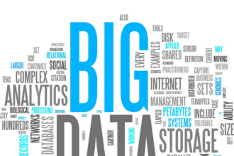
While I concur about ugly slides, I couldn’t disagree with the “no data in presentations” argument more. We live in an era of Big Data. If you want to make an argument to do–or not do–something, data can certainly help, with one major caveat: that data needs to be presented in a compelling fashion. Confusing your attendees or colleagues with impenetrable spreadsheets and tables is unlikely to achieve the desired results.

Feedback

What say you?

Share This Article
Facebook Pinterest LinkedIn
Share

Follow us on Facebook

Latest News

0622cae5 f7d7 4f74 84b5 eabd1a823dca
How Data-Driven Grocery Recommendations Help Shoppers Eat Better With Less Effort
Big Data Exclusive
business recovering from data loss
How Data-Driven Businesses Protect MySQL Databases from Shutdown
Big Data Exclusive
ai driven task management
Reducing “Work About Work” with AI Task Managers
Artificial Intelligence Exclusive
data center uptime
Why Rodent-Resistant Conduits Are Critical for Data Center Uptime
Big Data Data Management Exclusive Risk Management

Stay Connected

1.2KFollowersLike
33.7KFollowersFollow
222FollowersPin

You Might also Like

LinkedIn Rolling Out Faceted Search!

3 Min Read

The only college major that matters

3 Min Read

From e2.0 to Social Business

5 Min Read

Top Technology Considerations When Opening a New Office

5 Min Read

SmartData Collective is one of the largest & trusted community covering technical content about Big Data, BI, Cloud, Analytics, Artificial Intelligence, IoT & more.

giveaway chatbots
How To Get An Award Winning Giveaway Bot
Big Data Chatbots Exclusive
AI chatbots
AI Chatbots Can Help Retailers Convert Live Broadcast Viewers into Sales!
Chatbots

Quick Link

  • About
  • Contact
  • Privacy
Follow US
© 2008-25 SmartData Collective. All Rights Reserved.
Welcome Back!

Sign in to your account

Username or Email Address
Password

Lost your password?