Cookies help us display personalized product recommendations and ensure you have great shopping experience.

By using this site, you agree to the Privacy Policy and Terms of Use.
Accept
SmartData CollectiveSmartData Collective
  • Analytics
    AnalyticsShow More
    data analytics for pharmacy trends
    How Data Analytics Is Tracking Trends in the Pharmacy Industry
    5 Min Read
    car expense data analytics
    Data Analytics for Smarter Vehicle Expense Management
    10 Min Read
    image fx (60)
    Data Analytics Driving the Modern E-commerce Warehouse
    13 Min Read
    big data analytics in transporation
    Turning Data Into Decisions: How Analytics Improves Transportation Strategy
    3 Min Read
    sales and data analytics
    How Data Analytics Improves Lead Management and Sales Results
    9 Min Read
  • Big Data
  • BI
  • Exclusive
  • IT
  • Marketing
  • Software
Search
© 2008-25 SmartData Collective. All Rights Reserved.
Reading: Visualizing Data Correlation Using an XY Chart
Share
Notification
Font ResizerAa
SmartData CollectiveSmartData Collective
Font ResizerAa
Search
  • About
  • Help
  • Privacy
Follow US
© 2008-23 SmartData Collective. All Rights Reserved.
SmartData Collective > Statistics > Visualizing Data Correlation Using an XY Chart
Statistics

Visualizing Data Correlation Using an XY Chart

exploreanalytics
exploreanalytics
2 Min Read
SHARE

The XY chart is great for visualizing relationships between numerical data and finding correlations. Data can be presented as a scatter plot or a bubble chart. Let’s start with a scatter plot using an example.

The XY chart is great for visualizing relationships between numerical data and finding correlations. Data can be presented as a scatter plot or a bubble chart. Let’s start with a scatter plot using an example.

More Read

excel model failure
Don’t Gloat Over Excel Model Failures
Better than Brute Force: Big Data Analytics Tips
Talk Analytics with Executives – Revisited
No Smokescreen Area: Tips for Hiring Analysts
Guns, States, and Death (Illustrated Comments on Aurora)

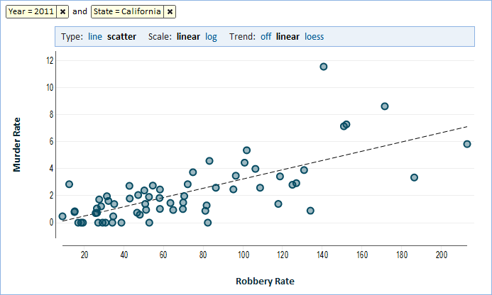
Our example is based on a table of crime rates in US cities of 100,000 people or more. In this scatter plot, we have a point for every city in California in 2011. We also drew a linear trend line to visualize the possible correlation. As you can see, there is some correlation between the two types of crimes. Cities with a higher robbery rate tend to also have a higher murder rate. Nevertheless, the correlation is not very strong with some points far from the trend line indicating cities where one rate fails to predict the other rate.

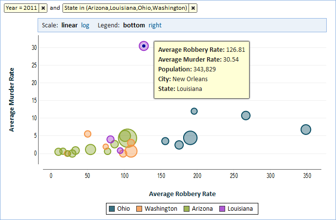
The next XY chart is a bubble chart. In a bubble chart we show a third numerical value, in this case population. We represent this third value by varying the size of each point which we now call a bubble. We make the area of the bubble proportional to the value and therefore larger bubbles represent cities with larger populations.

The chart also demonstrates the capability to examine outliers. In our chart, we see one bubble with an exceptionally high murder rate. When we hover the mouse over it (or touch it on a touch device) we see more detail. In our example we see that the city is New Orleans.

We show you how to create an XY Chart and show you more capabilities in the following video:

Share This Article
Facebook Pinterest LinkedIn
Share

Follow us on Facebook

Latest News

dedicated servers for ai businesses
5 Reasons AI-Driven Business Need Dedicated Servers
Artificial Intelligence Exclusive News
data analytics for pharmacy trends
How Data Analytics Is Tracking Trends in the Pharmacy Industry
Analytics Big Data Exclusive
ai call centers
Using Generative AI Call Center Solutions to Improve Agent Productivity
Artificial Intelligence Exclusive
warehousing in the age of big data
Top Challenges Of Product Warehousing In The Age Of Big Data
Big Data Exclusive

Stay Connected

1.2kFollowersLike
33.7kFollowersFollow
222FollowersPin

You Might also Like

big data
AnalyticsBig DataBusiness IntelligenceDecision ManagementStatisticsUnstructured DataWorkforce Data

Analytics at Google: Great Example of Data-Driven Decision-Making

8 Min Read

Freakonomics and Your Data

6 Min Read

Are Only Crazy People Commenting About Brands in Social Media?

2 Min Read

Really Simple Statistics: What is Interval Data?

2 Min Read

SmartData Collective is one of the largest & trusted community covering technical content about Big Data, BI, Cloud, Analytics, Artificial Intelligence, IoT & more.

ai in ecommerce
Artificial Intelligence for eCommerce: A Closer Look
Artificial Intelligence
ai chatbot
The Art of Conversation: Enhancing Chatbots with Advanced AI Prompts
Chatbots

Quick Link

  • About
  • Contact
  • Privacy
Follow US
© 2008-25 SmartData Collective. All Rights Reserved.
Go to mobile version
Welcome Back!

Sign in to your account

Username or Email Address
Password

Lost your password?