We use cookies, including third-party cookies from Google to serve personalized ads through AdSense, to operate this site and understand how it is used. By continuing to browse, you accept this use. See our Privacy Policy and Terms of Use for details, including how to opt out of personalized advertising.
Accept
SmartData CollectiveSmartData Collective
  • Analytics
    AnalyticsShow More
    chatgpt image jul 21, 2026, 04 34 30 pm
    4 Core Benefits of Predictive Maintenance after Vibration Analysis
    10 Min Read
    How Does Data Mining Boost Customer Satisfaction in Logistics? Harnessing Analytics for Results -- AI-generated illustration
    How Does Data Mining Boost Customer Satisfaction in Logistics? Harnessing Analytics for Results
    11 Min Read
    chatgpt image jul 13, 2026, 04 23 45 pm
    How Data Analytics Helps Companies Improve User Engagement
    19 Min Read
    chatgpt image jul 13, 2026, 03 59 46 pm
    How Data Analytics Improves Multi-Location Search Strategies
    10 Min Read
    cybersecurity efforts
    How Behavioral Analytics and AI Are Redefining Cybersecurity for Boca Raton Businesses
    14 Min Read
  • Big Data
  • BI
  • Exclusive
  • IT
  • Marketing
  • Software
Search
© 2008-25 SmartData Collective. All Rights Reserved.
Reading: Art and Science of Data Visualization
Share
Notification
Font ResizerAa
SmartData CollectiveSmartData Collective
Font ResizerAa
Search
  • About
  • Help
  • Privacy
Follow US
© 2008-23 SmartData Collective. All Rights Reserved.
SmartData Collective > Big Data > Data Visualization > Art and Science of Data Visualization
Data Visualization

Art and Science of Data Visualization

Jim MacLennan
Jim MacLennan
4 Min Read
SHARE

“Data Visualization” has been an extremely active and popular topic for a few years – we can use Google’s Timeline search feature to see the growth in interest since 1980:
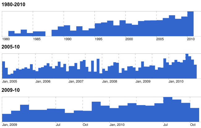
That local high in July of this year was due in no small part to David McCandless’ Information is Beautiful talk at TED this past summer. It appeared in my RSS stream here, here, and here, so I got the hint, spent 18 minutes watching it, and got suitably jazzed on the power and potential of visualizations.

McCandless uses a variety of visualization techniques to generate insight into a wide range of topics ..

More Read

Data Visualization – One City at a Time
How to Stay Out of Cash Flow Crises Using Cash Position Analysis
SDC @ Strata – Edd Dumbill – Rockstar Unicorns
This is Why UX Design and Big Data Need Each Other
Futuristic BI: Are We Smart Enough?
  • Mountains out of Molehills – what are we afraid of? Funny stuff, but hidden patterns that jump out at you with just a little extra context.
  • Facebook break-ups – at 6:15, the roller-coaster graph of predictable relationship demise, recently Slashdotted
  • Military Budgets – a digression into the knack we all have of misunderstanding / misrepresenting that facts via statistics. Did you know that Myanmar is the world’s biggest war machine (as a percent of GDP)?

An important section comes when McCandless talks about the start of his work in design of data visualizations. Note that he’s not had any formal training – it was just sort of dormant within – and is very probably there within all of us, practically forced on us with the information overload of the web-enabled era. The bulk of your sensory input is visual, and the majority of our perception is happening unconsciously.

… the eye is exquisitely sensitive to patterns and variations … [it’s] the Language of the Eye. And if you combine the Language of the Eye with the Language of the Mind – which is about words and numbers and concepts – you start speaking two languages simultaneously, each enhancing the other …

I do agree with his point that an effective visualization is self-evident, and appreciated by many – but I do not think it’s easy for the average Data Consumer to see themselves as a Data Artist, one who can conjure the magic on command. I have noticed that most of the data visualizations catching the public’s eye are not the ones you can easily generate with Excel (data navigation and manipulation tool for the masses. McCandless’ “balloon race” interactive diagram of health supplements is sublimely useful, easy to understand – and beyond the tool- and skill-sets of most of us.

Nevertheless – the inspiration, the examples, and tools are out there, and I am convinced that there are more Data Artists among us – they just don’t know it yet. I’m starting a series of posts today – I’ve been following many blogs and writing about this topic for some time – but it’s been a few years, and I’ve got a big backlog of topics to cover.

So check out the McCandless video; be prepared to get psyched, and then carve out some time to join me in this review. Data is the new soil, as McCandless points out – and just like good writing, those who can effectively help other visualize data and have their own insights will harvest some interesting insights, for themselves and their employers.


TAGGED:science
Share This Article
Facebook Pinterest LinkedIn
Share
ByJim MacLennan
Follow:
Jim MacLennan is Senior Vice President and Chief Information Officer at IDEX Corporation, a Fortune 1000 manufacturer that sells highly engineered products in a variety of markets worldwide. MacLennan has responsibility for Corporate IT services for all IDEX business units, and also drives innovation through initiatives that leverage Information and Technology as growth drivers for the industrial manufacturing space. He regularly publishes his observations and insights on the intersection of business and technology - check out his work at www.cazh1.com.

Follow us on Facebook

Latest News

Best Age Estimation Software in 2026: Which Facial Age Providers Actually Hold Up -- AI-generated illustration
Best Age Estimation Software in 2026: Which Facial Age Providers Actually Hold Up
Artificial Intelligence Exclusive Machine Learning
Top 8 Multi-Cloud Architecture Tools for Automated Infrastructure Design in 2026 -- AI-generated illustration
Top 8 Multi-Cloud Architecture Tools for Automated Infrastructure Design in 2026
Cloud Computing Exclusive IT
6 Top Agentic SDLC Platforms for Enterprise Engineering Organizations -- AI-generated illustration
6 Top Agentic SDLC Platforms for Enterprise Engineering Organizations
Artificial Intelligence Exclusive
6 Best Runtime Intelligence Tools for Debugging AI-Generated Code in 2026 -- AI-generated illustration
6 Best Runtime Intelligence Tools for Debugging AI-Generated Code in 2026
Artificial Intelligence Exclusive

Stay Connected

1.2KFollowersLike
33.7KFollowersFollow
222FollowersPin

You Might also Like

Big Data is Critical to the DoD Science and Technology Investment Agenda

3 Min Read

The “decline effect,” random variation, and evidence-based marketing

7 Min Read

The Trouble with Big Data

6 Min Read
data science in scheduling solutions
Big DataData ScienceExclusive

Data Science Offers Fascinating New Scheduling Solutions

6 Min Read

SmartData Collective is one of the largest & trusted community covering technical content about Big Data, BI, Cloud, Analytics, Artificial Intelligence, IoT & more.

data-driven web design
5 Great Tips for Using Data Analytics for Website UX
Big Data
ai chatbot
The Art of Conversation: Enhancing Chatbots with Advanced AI Prompts
Chatbots

Quick Link

  • About
  • Contact
  • Privacy
Follow US
© 2008-26 SmartData Collective. All Rights Reserved.
Welcome Back!

Sign in to your account

Username or Email Address
Password

Lost your password?