
We use cookies, including third-party cookies from Google to serve personalized ads through AdSense, to operate this site and understand how it is used. By continuing to browse, you accept this use. See our Privacy Policy and Terms of Use for details, including how to opt out of personalized advertising.
Accept
SmartData CollectiveSmartData Collective
  • Analytics
    AnalyticsShow More
    chatgpt image jul 21, 2026, 04 34 30 pm
    4 Core Benefits of Predictive Maintenance after Vibration Analysis
    10 Min Read
    How Does Data Mining Boost Customer Satisfaction in Logistics? Harnessing Analytics for Results -- AI-generated illustration
    How Does Data Mining Boost Customer Satisfaction in Logistics? Harnessing Analytics for Results
    11 Min Read
    chatgpt image jul 13, 2026, 04 23 45 pm
    How Data Analytics Helps Companies Improve User Engagement
    19 Min Read
    chatgpt image jul 13, 2026, 03 59 46 pm
    How Data Analytics Improves Multi-Location Search Strategies
    10 Min Read
    cybersecurity efforts
    How Behavioral Analytics and AI Are Redefining Cybersecurity for Boca Raton Businesses
    14 Min Read
  • Big Data
  • BI
  • Exclusive
  • IT
  • Marketing
  • Software
Search
© 2008-25 SmartData Collective. All Rights Reserved.
Reading: BI FAIL #2
Share
Notification
Font ResizerAa
SmartData CollectiveSmartData Collective
Font ResizerAa
Search
  • About
  • Help
  • Privacy
Follow US
© 2008-23 SmartData Collective. All Rights Reserved.
SmartData Collective > Business Intelligence > BI FAIL #2
Business Intelligence

BI FAIL #2

Timo Elliott
Timo Elliott
3 Min Read
BI FAIL #2
Photo by arielnunezg on Pixabay (https://pixabay.com/photos/white-darts-diana-black-target-5179448/)
SHARE

Seth Grimes of Alta Plana gives us a great example of business intelligence failure this week on the site USAspending.gov.

I wrote about this site and others in a post in July, Great Examples of US Government BI Transparency. Unfortunately, it turns out that it’s not so great, in that some of the data shown was completely false… (this is generally considered a reasonable baseline of things to avoid).

Seth gave the example of the graphic on the left below: “The Green and Purple segments are approximately equally sized even though the green segment should be 25% larger than the purple segment.” Thankfully the problem has now been corrected, and the site now shows what the chart should look like (with the data values now slightly updated) – see how much larger the “grants” area is now.
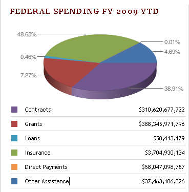

USAspending.gov graphic

More Read

The Power of Cloud-based BI and Analytics
Benefits of Having AI-Powered Software Solutions for Expense Management
On-Demand Supercomputing
Social Business and Digital Strategy
How Retailers are Harnessing Machine Learning and Predictive Analytics

The problem turned out to be with the way the site calls the Google Chart API. The values passed to the engine for display were absolute values, not percentages, so they are being truncated. (I’m biased, of course, but to me, that sounds like a good reason to rely on a full BI solution, rather than the Google Chart API… )

The real big cause for concern is that it was apparently only when the webmasters read Seth’s blog posting that they realized they had a problem…

Was this interesting? Share with others on Twitter with automatic URL shortening! 

Share This Article
Facebook Pinterest LinkedIn
Share

Follow us on Facebook

Latest News

Illustration of mobile analytics dashboards with ad performance charts connected to backend databases
11 Best Sisense Alternatives for Embedded Analytics
Business Intelligence Exclusive
Analyst points at colorful circular data dashboard on screen - information technology business metrics
How Fragmented Workplace Tech Undermines Reliable Business Metrics and Reporting
Cloud Computing Exclusive Infographic IT
Using Multi-Source Data and Analytics to Detect Operational Drift Across Franchise Networks -- AI-generated illustration
Using Multi-Source Data and Analytics to Detect Operational Drift Across Franchise Networks
Exclusive Infographic
Beyond The First Impression: The Long-Lasting Impact Of Sensory Marketing -- AI-generated illustration
Beyond The First Impression: The Long-Lasting Impact Of Sensory Marketing
Infographic Marketing

Stay Connected

1.2KFollowersLike
33.7KFollowersFollow
222FollowersPin

You Might also Like

Top 10 Excuses to Avoid Business Rules: #3 Takes too long.
Best PracticesBusiness Rules

Top 10 Excuses to Avoid Business Rules: #3 Takes too long.

5 Min Read
4 Ways Your Digital Business Can Benefit From Big Data
AnalyticsBig DataBusiness Intelligence

4 Ways Your Digital Business Can Benefit From Big Data

5 Min Read
5 Causes Of Cumbersome Corporate Reporting
AnalyticsBusiness Intelligence

5 Causes Of Cumbersome Corporate Reporting

5 Min Read
Why Businesses Can No Longer Ignore Social Media Listening…
AnalyticsCRMMarket Research

Why Businesses Can No Longer Ignore Social Media Listening…

6 Min Read

SmartData Collective is one of the largest & trusted community covering technical content about Big Data, BI, Cloud, Analytics, Artificial Intelligence, IoT & more.

ai chatbot
How AI Website Chatbots Improve Customer Support and Lead Generation
Chatbots Exclusive
AI chatbots
AI Chatbots Can Help Retailers Convert Live Broadcast Viewers into Sales!
Chatbots

Quick Link

  • About
  • Contact
  • Privacy
Follow US
© 2008-26 SmartData Collective. All Rights Reserved.
Welcome Back!

Sign in to your account

Username or Email Address
Password

Lost your password?