Cookies help us display personalized product recommendations and ensure you have great shopping experience.

By using this site, you agree to the Privacy Policy and Terms of Use.
Accept
SmartData CollectiveSmartData Collective
  • Analytics
    AnalyticsShow More
    big data analytics in transporation
    Turning Data Into Decisions: How Analytics Improves Transportation Strategy
    3 Min Read
    sales and data analytics
    How Data Analytics Improves Lead Management and Sales Results
    9 Min Read
    data analytics and truck accident claims
    How Data Analytics Reduces Truck Accidents and Speeds Up Claims
    7 Min Read
    predictive analytics for interior designers
    Interior Designers Boost Profits with Predictive Analytics
    8 Min Read
    image fx (67)
    Improving LinkedIn Ad Strategies with Data Analytics
    9 Min Read
  • Big Data
  • BI
  • Exclusive
  • IT
  • Marketing
  • Software
Search
© 2008-25 SmartData Collective. All Rights Reserved.
Reading: Design for Information
Share
Notification
Font ResizerAa
SmartData CollectiveSmartData Collective
Font ResizerAa
Search
  • About
  • Help
  • Privacy
Follow US
© 2008-23 SmartData Collective. All Rights Reserved.
SmartData Collective > Big Data > Data Visualization > Design for Information
Data Visualization

Design for Information

Editor SDC
Editor SDC
4 Min Read
SHARE

All to often reports are designed to provide data, not information.  There are charts and tables with little intrepretation, or description.  While I am not great fan of PowerPoint, it can often make up for Enterprise BI limitations.  We can call out certain areas within the charts and graphs, as well as add the commentary to help us communicate our point.

A safe assumption is that the person reading the report will not have the same understanding of the material as the report designer, or analyst.  It is then our job to make sure that the report communicates the point clearly.  The last thing you want is to hear “what are you trying to show me?”

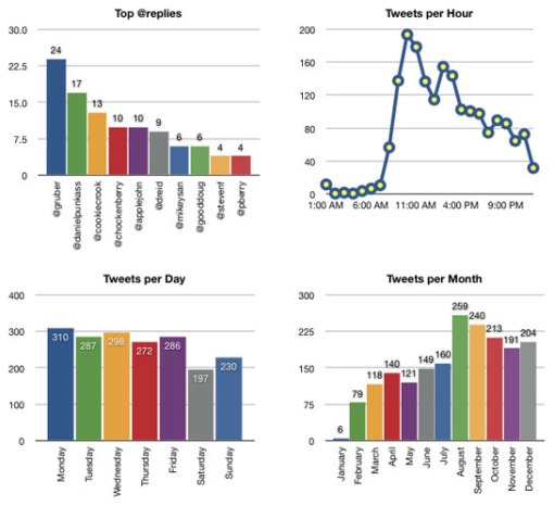
Below is a good example of presenting data, while not telling us much.  Here we see that he/she has a few fans that are frequent contributors, and that tweet volume picks up around the lunch hour.  There is not variation for the days of the week, with a little drop off for the weekend.  August is also the most popular month.

twitter2008-1

What would be helpful to know is why this data is important to us.  What perhaps would be the most important is to know the subject material, so we could do things like tweet just before lunch as that seems to be the …

All to often reports are designed to provide data, not information.  There are charts and tables with little intrepretation, or description.  While I am not great fan of PowerPoint, it can often make up for Enterprise BI limitations.  We can call out certain areas within the charts and graphs, as well as add the commentary to help us communicate our point.

A safe assumption is that the person reading the report will not have the same understanding of the material as the report designer, or analyst.  It is then our job to make sure that the report communicates the point clearly.  The last thing you want is to hear “what are you trying to show me?”

Below is a good example of presenting data, while not telling us much.  Here we see that he/she has a few fans that are frequent contributors, and that tweet volume picks up around the lunch hour.  There is not variation for the days of the week, with a little drop off for the weekend.  August is also the most popular month.

twitter2008-1

What would be helpful to know is why this data is important to us.  What perhaps would be the most important is to know the subject material, so we could do things like tweet just before lunch as that seems to be the most popular time to inspire reaction.  Or that August tweets were up due to an embarassing grammatical error.

As we are designing reports, make sure that the information has a purpose.  Most specifically, know the audience and know the potential actions the information is going to inspire.

Posted in Analytics, Analytics & Business Intelligence, Communication Tagged: Actionable Information, Analytics, Business Intelligence, Clarity, Report Design


Link to original post

TAGGED:analyticsgraphs
Share This Article
Facebook Pinterest LinkedIn
Share

Follow us on Facebook

Latest News

big data analytics in transporation
Turning Data Into Decisions: How Analytics Improves Transportation Strategy
Analytics Big Data Exclusive
AI and fund manager software
AI And The Acceleration Of Information Flows From Fund Managers To Investors
Artificial Intelligence Exclusive
sales and data analytics
How Data Analytics Improves Lead Management and Sales Results
Analytics Big Data Exclusive
ai in marketing
How AI and Smart Platforms Improve Email Marketing
Artificial Intelligence Exclusive Marketing

Stay Connected

1.2kFollowersLike
33.7kFollowersFollow
222FollowersPin

You Might also Like

big data in preventative care
AnalyticsBig DataExclusive

Big Data For Preventative Care In The Healthcare Field

4 Min Read

Analytics: Not About Saving Time

7 Min Read

Social Media Marketers Should Get Ahead of the Curve

9 Min Read

Business Intelligence or Business Analytics?

3 Min Read

SmartData Collective is one of the largest & trusted community covering technical content about Big Data, BI, Cloud, Analytics, Artificial Intelligence, IoT & more.

ai in ecommerce
Artificial Intelligence for eCommerce: A Closer Look
Artificial Intelligence
giveaway chatbots
How To Get An Award Winning Giveaway Bot
Big Data Chatbots Exclusive

Quick Link

  • About
  • Contact
  • Privacy
Follow US
© 2008-25 SmartData Collective. All Rights Reserved.
Go to mobile version
Welcome Back!

Sign in to your account

Username or Email Address
Password

Lost your password?