
Scientists must utilize the top data visualization tools for research projects to uncover the next groundbreaking discoveries. These tools transform overwhelming information into clear narratives, making it easier to identify interesting patterns and details within. The trick is to find a platform with ample features and capabilities to drive your data home.
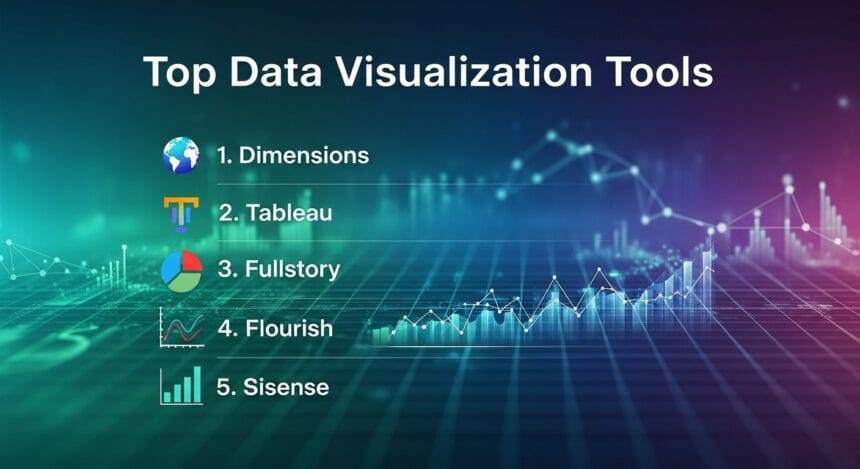
- 1. Dimensions
- 2. Tableau
- 3. Fullstory
- 4. Flourish
- 5. Sisense
- Choosing the Top-Rated Data Visualization Tool for Research Projects
- Why Is Data Visualization Crucial for Modern Research?
- Do You Need Programming and Design Experience to Use Data Visualization Platforms?
- What Is the Difference Between Exploratory and Explanatory Data Visualization?
1. Dimensions
Dimensions is an advanced digital science intelligence platform that delivers a complete picture of the research landscape. In addition to providing a vast collection of linked insights, the VOSviewer software tool integration enables you to construct and envision bibliometric networks from up to 25,000 publications.
With VOSviewer, users can implement co-authorship and citation analysis directly in the application. The platform also allows you to customize results by the number of researchers you want displayed or the network’s appearance.
Use its interactive features to reveal important details about specific researchers or the extent of their collaboration. You can also zoom in and out of the data or view the networks in full-screen mode to spot key data trends more easily. For research projects, Dimensions has proven itself invaluable in performing literature reviews, identifying key opinion leaders and contextualizing broader topics.
2. Tableau
Tableau is another versatile and powerful tool for data visualization, empowering researchers to discover and understand their statistics. Its intuitive platform allows you to drag and drop information to create interactive and shareable dashboards.
What makes this brand stand out is its ability to connect, blend and analyze numerous data sources. For research projects, it offers exceptional exploratory capabilities and creates compelling visualizations that effectively communicate your findings to colleagues.
Tableau also encourages learning and collaboration with a robust online community and technical resources. Users can develop and share their visualizations for free on the site and participate in various training sessions, courses and video tutorials. Additionally, the Tableau Neighborhood lets you communicate directly with fellow researchers.
3. Fullstory
Fullstory is among the top-rated data visualization tools for research projects because it delivers deep insights into user behavior across websites and smartphone applications. Although it isn’t ideal for all types of research, you can utilize it for visualizing customer behaviors, human-computer interaction and product development.
It is ideal for creating a comprehensive story of the user experience in the hospitality, retail, e-commerce, food and beverage, gaming and financial services sectors, uncovering bottlenecks and areas for improvement.
The Session Replay tool allows you to watch a pixel-perfect recreation of the user journey. It captures what they see and do, including their mouse movements, scrolling activity and keyword inputs. Essentially, it tells you why someone might do something and the issues that affect key metrics.
4. Flourish
Flourish offers user-friendly visualization capabilities that encompass interactive charts, maps and data stories. You don’t need a coding background to employ this tool, and it provides over 50 ready-made templates to get you started.
The platform’s primary focus is on data storytelling, which allows you to develop narratives around your research and enhance comprehension. It’s an ideal choice for communicating your findings to broad audiences and may be utilized for creative and engaging presentations, publications and online content.
Various industry use cases include elections and polling, sports and competition, maps, survey responses and scrollytelling. You can also deep dive into its many learning resources, training, webinars and datasets to enhance your final visualization.
5. Sisense
Sisense is an AI-powered analytics platform, providing a flexible and scalable data visualization solution. Build your dashboard without any coding experience, and explore insights through charts, maps and widgets.
Product teams can uncover trends and patterns with real-time, interactive interfaces. With Model Context Protocol, JavaScript and other external libraries, you can match your data visuals to your product’s aesthetic and functionality.
Sisense stands out for research projects because of its ease of embedding analytics and its ability to handle large datasets for enterprises and smaller businesses alike. If you’re looking for a high level of customization, this is a particularly composable platform.
Leverage its helpful customer support team, as well as a multitude of online resources, training sessions and webinars to maximize data visibility and uncover critical insights.
Choosing the Top-Rated Data Visualization Tool for Research Projects
The top-rated data visualization tools for research projects enhance the narrative you create, ensuring that the audience fully understands your findings. To ensure you’re employing the best platform, remember to consider the following criteria:
- Data handling and compatibility: You should be able to integrate data from uploaded files and research databases, and the platform should handle large datasets effectively.
- Visualization and analytical capabilities: Determine if there are numerous visualization types with ample customization options, built-in AI and analytics features, and if you can develop interactive dashboards.
- Ease of use and resources: Ensure the platform delivers an intuitive interface with no coding required, along with comprehensive resources and training support to optimize your data presentation.
- Audience and sharing: Ask yourself how well the tools help you communicate your findings with your audience. Guarantee that you can easily export high-resolution images, embed data stories on websites and blog posts, and share them via public and private links.
- Cost and scalability: Check if there’s a free version for public and academic use, and if the platform can scale for large research projects.
Why Is Data Visualization Crucial for Modern Research?
Data visualization has revolutionized modern research by turning complex datasets into digestible insights. With research becoming more data-intensive, these tools enable researchers to accelerate the identification of patterns, trends and outliers.
It also serves as a powerful communication tool, helping you better explain your findings to key stakeholders, including product development teams, corporate leadership, policymakers and the public.
Do You Need Programming and Design Experience to Use Data Visualization Platforms?
The top-rated data visualization tools for research projects take care of the complex programming for you. Most platforms offer no-code, user-friendly interfaces that let you create attractive, interactive visuals with ease.
You can often drag and drop data or utilize prebuilt templates. Even though you don’t need a background in web design, a basic understanding of its principles — such as choosing the correct chart and color scheme — will help you achieve the results you’re looking for.
What Is the Difference Between Exploratory and Explanatory Data Visualization?
While exploratory data visualization is for the researcher, explanatory data visualization is for the audience. At the exploratory stage, you are analyzing your findings using charts, maps and other visualization tools. The process usually involves creating many presentations to uncover intriguing patterns and to test hypotheses.
At the explanatory level, you are articulating key findings with persuasive data stories. It’s a much more simplified and well-crafted narrative that is easy to comprehend.
Effective Data Visualization Is the New Standard for Research
Cutting-edge data visualization drives impact by improving the deliverability of research. As datasets become more complex, visuals help provide the clarity needed to communicate findings with ease and speed. These tools evolve insights from passive, static displays into dynamic, unforgettable experiences that resonate with a wider audience.


