
As a follow up to the article “3 Practical Tips for Effective BI Dashboard Design and Implementation” written a few weeks back, I think it’d be beneficial to closely focus on how to most effectively communicate your data using different visual forms. The previous article went into great depth on business context, purpose and overall implementation of visual metrics, but now I’d like to take a more granular approach in analyzing dashboard design—why, when and how to choose from the options afforded to you in many of the BI tools on the market. If you can master the simple techniques to best visualize your data using lines, bars, points and text, then you’re likely already ahead of most professionals in your industry. As you probably already know, business is becoming more and more data-driven and basic chart literacy is becoming as important as good writing for communication. Your visualization should show the information in a clear way that can lead to action on the data. That’s the whole point of business intelligence. Without these skills you’ll miss vital insights that could be gained from your data and you simply won’t be able to convey to others the message you want to tell. Tell me, can you accurately tell which store out of 3 & 4 has more sales? 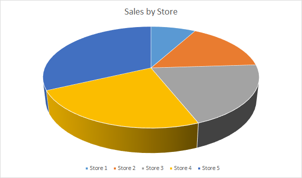 What about now?
 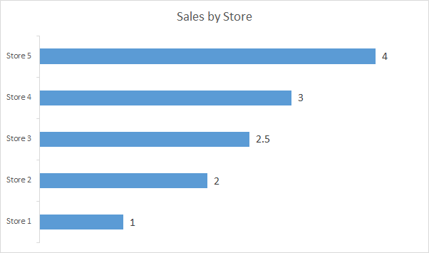 Thought so.
Chart design matters
Once you’ve decided what you want to measure, and the actions it drives, then next is how to display data in the best way. The main aspects of this are: chart type selection, basic chart design (axes, legends, colors, chart specific options) and chart design techniques. It’s a rather big topic, and for the basics of chart design I highly recommend The Wall Street Journal Guide to Information Graphics by Dona Wong as a primer. However, you may need something that’s more actionable and easier to execute upon, and that’s what I’ve attempted to do. The purpose of this post is to provide a comprehensive visual cheat sheet for deciding which chart type to use. An additional section, which will be released as part two next week, provides techniques for extending your visualization with additional dimensions of data. To make selecting the chart type as clear as possible, the ZAP BI Chart Type Cheat Sheet below explains when to use each of the different chart types and provides simple examples. The most commonly used chart types are at the top. I recommend reading from left to right, top to bottom to obtain an overview. Then in the future you can use it as a reference. You can click on the image to enlarge it and print! 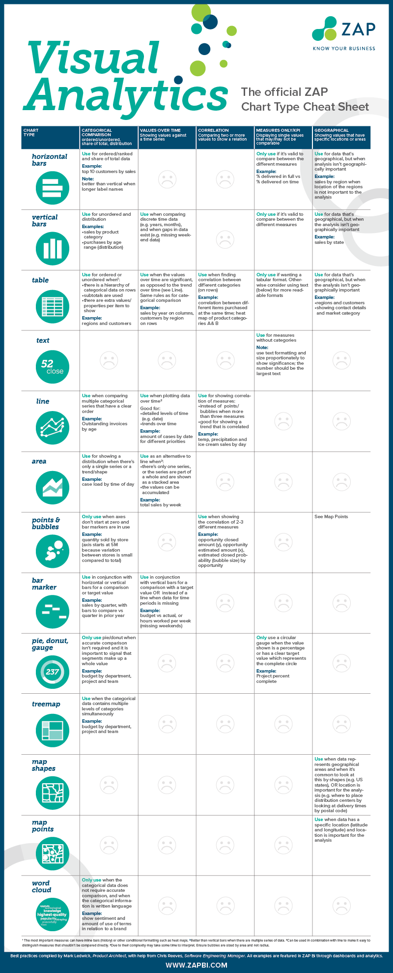


