To succeed at Six Sigma or any process improvement effort, you’ll often have to analyze and summarize text data. Most companies have lots of transaction data from “flat files” like the one shown below, but because the data consists of text and raw numbers, they sometimes have a hard time figuring out what to do with it. These examples use Excel along with QI Macros for Excel:
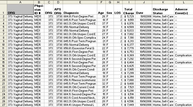
To succeed at Six Sigma or any process improvement effort, you’ll often have to analyze and summarize text data. Most companies have lots of transaction data from “flat files” like the one shown below, but because the data consists of text and raw numbers, they sometimes have a hard time figuring out what to do with it. These examples use Excel along with QI Macros for Excel:
To summarize and analyze this data, you will want to learn how to use Excel’s PivotTable tool. In past incarnations it was known as Crosstab (for cross tabulation). With Pivot Tables and the file above you could:
- Count the number of deliveries all doctors performed.
- Count the number of times each doctor had a “Complication” during delivery.
- Sum or average the charges per delivery by doctor.
- Count the number of deliveries for each diagnosis.
And do it easily.
Pivot Tables are a Great Tool, but the User Interface is Awkward
I have found that few people know how to use Excel’s PivotTable function to analyze this kind of data. I have to believe that it’s because the user interface isn’t intuitive. But here’s how you do it step by step:
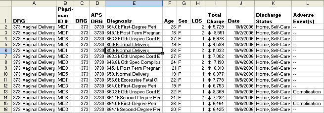
Step 1: Your Data Must Have Column Headings!
As you can see in this data sheet, each column has a heading. The Pivot Table will not run if there is a blank cell in any heading. One of the first mistakes people make is inserting blank columns to make the file more readible, and then they wonder why the Pivot Table won’t work.
Avoid Mistakes: No Blanks In Column Headings!
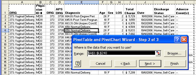
Step 2: Select The Data
You can select the data using your mouse or you can click on any cell in the data and the PivotTable will automatically select all of the data. Below I clicked on E6.
Then when I click on Data-PivotTable to start the Pivot Table wizard, the wizard will automatically select all of the surrounding data. But I’m getting ahead of myself. To initiate the PivotTable, click on Data and select PivotTable and PivotChart Report:
This will launch the PivotTable Wizard:
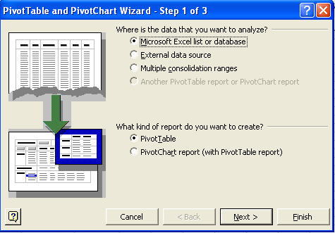
The most common defaults are selected: Microsoft Excel list or database and PivotTable. You could also pull in data from an external data source like Microsoft Access or you could summarize multiple ranges (i.e., more than one column contains words that you want to aggregate into one count).
I invariably just click Next > which leads us to Step 2 of the Wizard, selecting your data. If you’ve already clicked on a cell in the center of your data as I suggested, Excel will select everything around it. In this case A1:L240.
Again, I usually just click Next > to go to Step 3 of the Wizard where I can choose to put the summaries in a new worksheet or the current worksheet.
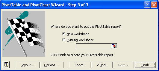
Again, I usually just click Finish! If you know what you’re doing, you can usually use the Layout and Options to specify how you want the summaries to appear, but it’s usually easier to work from the default table and field list:
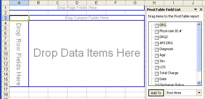
Step 2: Picking the Best Layout for Your Data
The PivotTable works on a “drag-and-drop” interface. Just click on a field and drag it into one of the four boxes:
- Page Fields for higher level summaries (e.g., facility or location names)
- Row Fields should have the most frequent heading (often dates)
- Column Fields should contain less frequently used headings (Excel only has 256 columns available). If you select a column with too many unique words in the cells, the PivotTable will overflow.
- Data Items are where you drag and drop the words or numbers you want to count or summarize.
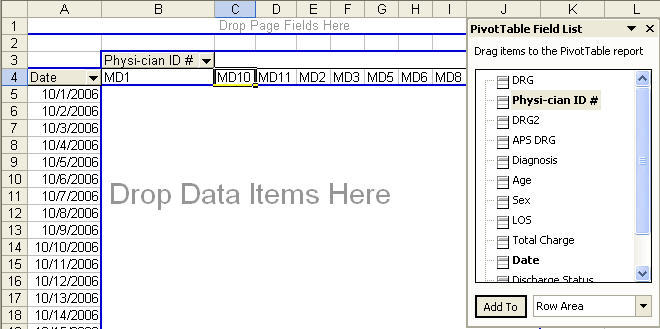
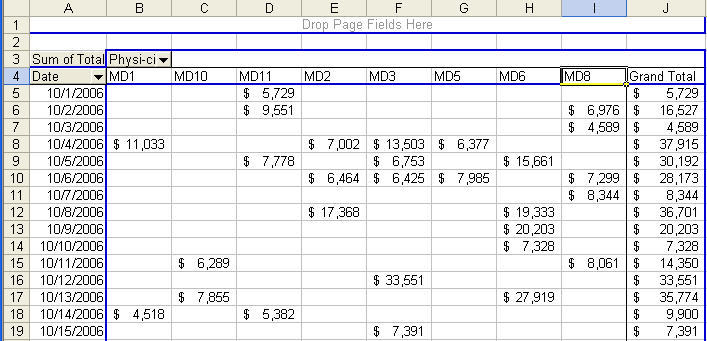
If I want to know how things add up by date, I usually drag the Date field into the Row Fields. Putting the dates down the left side prevents overflows and makes it easier to run a control chart with the QI Macros:

Then I might want to look at the results by Physician. So I drag Physician into the Column Fields:
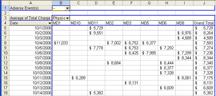
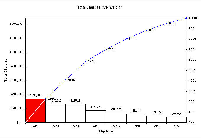
Then, maybe I want to summarize the Total Charges by physician by day. So I drag Total Charges into the Data Item Box which gives me totals by day and physician as well as some insight into how often the doctors work:
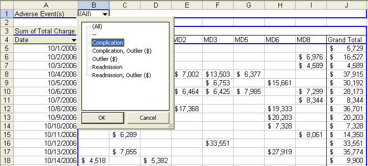
Now let’s say that I wanted to analyze the charges in terms of adverse events (pregnancy didn’t go as planned). I’d just drag and drop Adverse Events into the Page Fields. The Pivot Table gives me a choice of viewing all charges or just the charges with the key word complication, Outlier, Readmission, etc.:
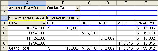
If I select Outlier, I get some insight into the cost of complications. The costs are almost 50% higher than a normal delivery:
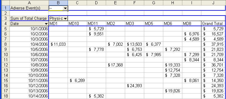
I could also use the “-” to evaluate all pregnancies with no complications:
If you double click on “Sum of Total Charge” and change it to Average, you get the average:
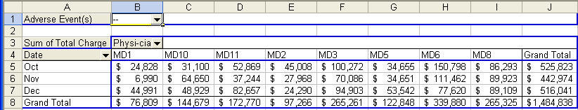
I could also change it back and group all of the charges into monthly charges.
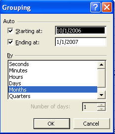
How to: Just Right click on any date and select Group and Show Detail/Group/Months:
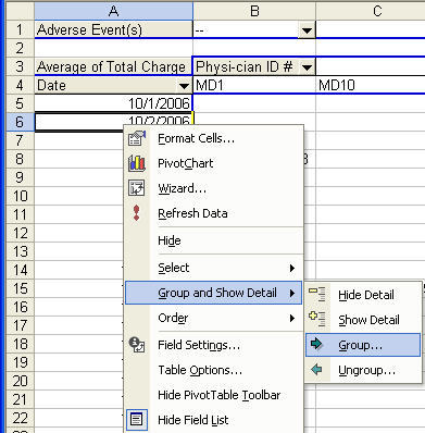
The Pivot Table will group the months.
Warning! Bonehead Excel Behavior: Grouping dates will not work if there is even a single blank or text cell where there should be a date.
Now I can select B4:I4, hold down the control key to select B8:I8 and run a pareto chart:
Changing The Focus
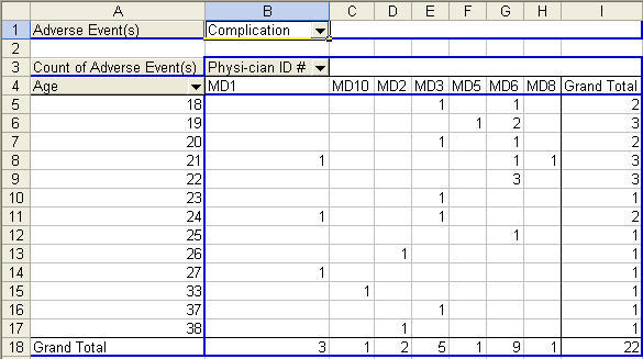
What if I wanted to change this table to count adverse events by Physician and by age of patient? Hint: It’s easy with drag and drop.
1. Just click on date and pull it out of the table.
2. Click on Sum of total Charge and pull it out of the table.
3. Drag Adverse events down into Data Fields.
4. Then click on the Age field and drag it into the Row Fields:
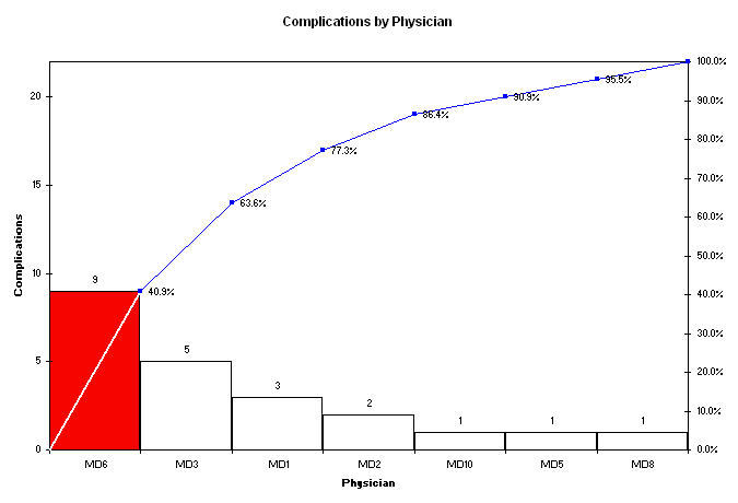
Are there more younger women with complications or are there just more younger women giving birth? Does one physician have more complications than the others? We could run a pareto chart to show complications by physican (MD6 is 40% of total complications, almost twice as high as his or her peers):
What Else?
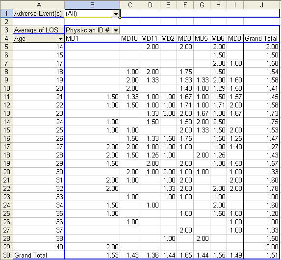
Maybe I’d like to evaluate average length of stay (LOS) for all deliveries. Just pull the adverse events out of the table and drop in LOS (change it to an average). Not much going on here. The youngest and the oldest had a slightly longer length of stay:
Get the Idea?
There’s a wealth of information hiding in these dense flat files of words and numbers. Start using Excel’s Pivot Table function to slice and dice your files (no matter how large). Then use the QI Macros to graph the results. You’ll find it easy to find the 4-50 and start making breakthrough improvements. Go to www.qimacros.com for more information.