Cookies help us display personalized product recommendations and ensure you have great shopping experience.

By using this site, you agree to the Privacy Policy and Terms of Use.
Accept
SmartData CollectiveSmartData Collective
  • Analytics
    AnalyticsShow More
    predictive analytics risk management
    How Predictive Analytics Is Redefining Risk Management Across Industries
    7 Min Read
    data analytics and gold trading
    Data Analytics and the New Era of Gold Trading
    9 Min Read
    composable analytics
    How Composable Analytics Unlocks Modular Agility for Data Teams
    9 Min Read
    data mining to find the right poly bag makers
    Using Data Analytics to Choose the Best Poly Mailer Bags
    12 Min Read
    data analytics for pharmacy trends
    How Data Analytics Is Tracking Trends in the Pharmacy Industry
    5 Min Read
  • Big Data
  • BI
  • Exclusive
  • IT
  • Marketing
  • Software
Search
© 2008-25 SmartData Collective. All Rights Reserved.
Reading: Stunning Business Intelligence Visualizations… from 1830
Share
Notification
Font ResizerAa
SmartData CollectiveSmartData Collective
Font ResizerAa
Search
  • About
  • Help
  • Privacy
Follow US
© 2008-23 SmartData Collective. All Rights Reserved.
SmartData Collective > Big Data > Data Visualization > Stunning Business Intelligence Visualizations… from 1830
Business IntelligenceData Visualization

Stunning Business Intelligence Visualizations… from 1830

Timo Elliott
Timo Elliott
2 Min Read
SHARE

FastCompany has a great article this week on the results of the 1830 census, and the hand-made graphics (“BI –2.0”?) that were made from the data (thanks to RadicalCartography.net and the Library of Congress).

Here’s a selection of my favorites – click on each one to get the full graphic.

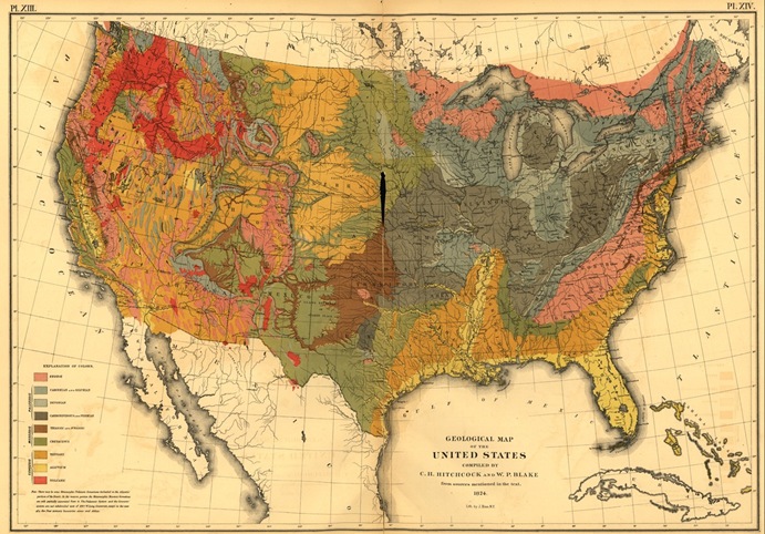
US geology – the hand-shading is so much nicer to look at than computer-generated graphics:

1830 census map

More Read

big data strategy
Finding the Right Sponsor for Your Big Data Project
Putting Data in the Middle
10 Best Practices For Business Intelligence Dashboards
Business Intelligence? Yes Minister!
Getting Value from Your Social Projects?

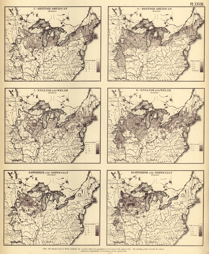
Nationality data mapped:

9th27

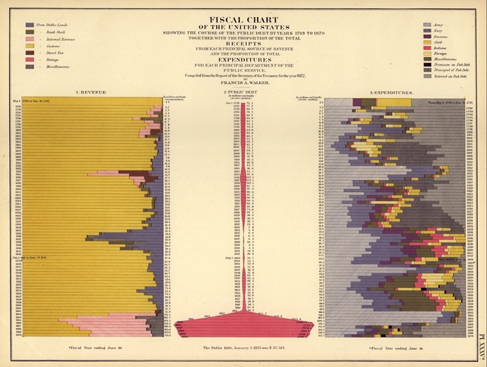
Here’s a chart that would have looked good on a 19th century Recovery.org website (where, incidentally, data visualization guru Edward Tufte is now a Presidential Advisor). There’s a lot of history illustrated here:

  • The light blue spike in the lower right is the US Civil War (1861-1865), which prompted the introduction of a “temporary” progressive income tax (the light pink blob in the lower left) that was originally supposed to expire in 1866!
  • The pink blobs on the right are a record of expenditures on the US Indian wars
  • The dark blue spike in the middle of the left-hand chart shows land sales in the West – which may have caused the collapse of the banking system in 1837

1830censusfiscalchart

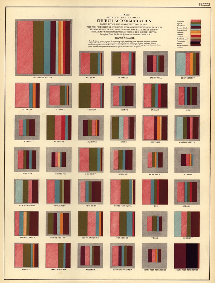
This is a beautiful rendering of church-going in the US. Interestingly, rather than show non-churchgoers as separate bar, they are relegated to a grey box around the outside.

1830censuschurch

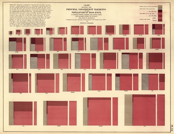
Here’s a nice example of showing data through proportions.

1830shading

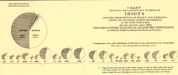
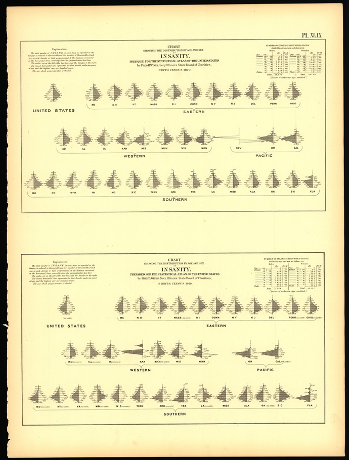
And here’s proof that men are bigger idiots than women! (of course, they meant what we’d call “mentally ill” these days)

1830census pie idiocy

1830census insanity

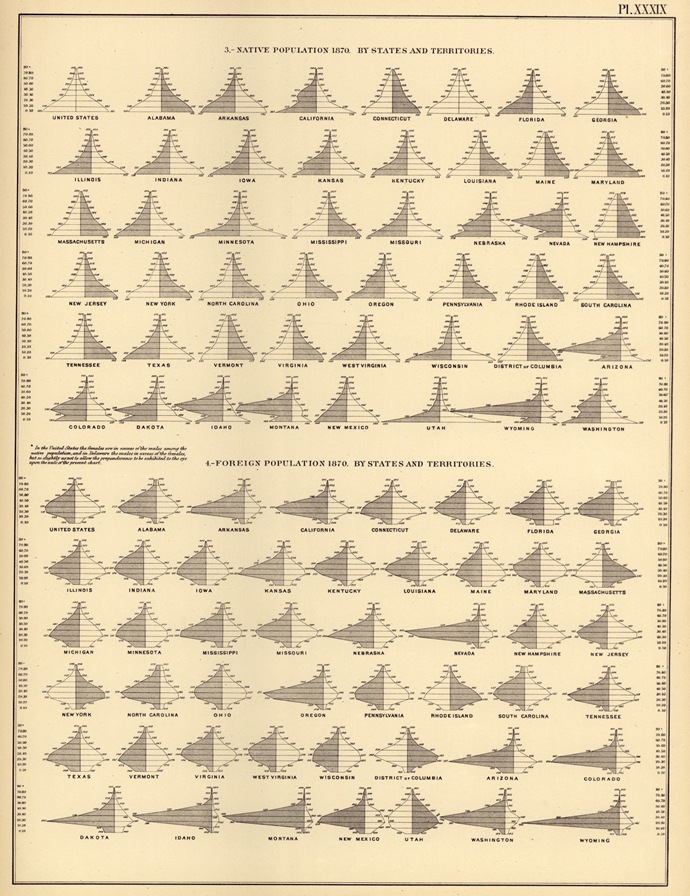
Population charts showing that the “cowboy states” (e.g. Wyoming, Nevada, Montana) were populated by young male foreigners, while Utah had LOTS of children.

1830censuspopulation

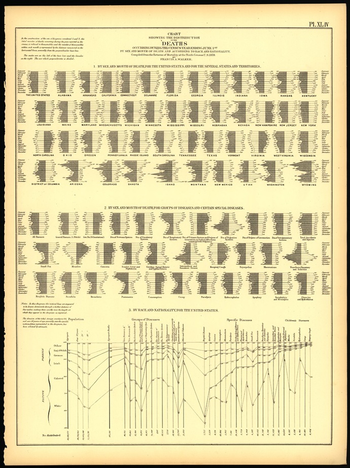
This chart is a good example of something that hasn’t changed much in the last couple of centuries – the notion that you should show data just because you have it. For example, Chart 1 below show deaths per month per state. Is this data actionable in any way?

1830censusdeaths

TAGGED:bidata visualizationus census data
Share This Article
Facebook Pinterest LinkedIn
Share

Follow us on Facebook

Latest News

microsoft 365 data migration
Why Data-Driven Businesses Consider Microsoft 365 Migration
Big Data Exclusive
real time data activation
How to Choose a CDP for Real-Time Data Activation
Big Data Exclusive
street address database
Why Data-Driven Companies Rely on Accurate Street Address Databases
Big Data Exclusive
predictive analytics risk management
How Predictive Analytics Is Redefining Risk Management Across Industries
Analytics Exclusive Predictive Analytics

Stay Connected

1.2KFollowersLike
33.7KFollowersFollow
222FollowersPin

You Might also Like

A review of “The History of Business Intelligence” by Nic Smith

7 Min Read

Blurring the Line Between SOA and BI

5 Min Read

Why Use Reporting Repositories for Business Intelligence?

6 Min Read

The scope of IT’s responsibility when businesses go bad

12 Min Read

SmartData Collective is one of the largest & trusted community covering technical content about Big Data, BI, Cloud, Analytics, Artificial Intelligence, IoT & more.

ai is improving the safety of cars
From Bolts to Bots: How AI Is Fortifying the Automotive Industry
Artificial Intelligence
ai chatbot
The Art of Conversation: Enhancing Chatbots with Advanced AI Prompts
Chatbots

Quick Link

  • About
  • Contact
  • Privacy
Follow US
© 2008-25 SmartData Collective. All Rights Reserved.
Go to mobile version
Welcome Back!

Sign in to your account

Username or Email Address
Password

Lost your password?