Cookies help us display personalized product recommendations and ensure you have great shopping experience.

By using this site, you agree to the Privacy Policy and Terms of Use.
Accept
SmartData CollectiveSmartData Collective
  • Analytics
    AnalyticsShow More
    data analytics
    How Data Analytics Can Help You Construct A Financial Weather Map
    4 Min Read
    financial analytics
    Financial Analytics Shows The Hidden Cost Of Not Switching Systems
    4 Min Read
    warehouse accidents
    Data Analytics and the Future of Warehouse Safety
    10 Min Read
    stock investing and data analytics
    How Data Analytics Supports Smarter Stock Trading Strategies
    4 Min Read
    predictive analytics risk management
    How Predictive Analytics Is Redefining Risk Management Across Industries
    7 Min Read
  • Big Data
  • BI
  • Exclusive
  • IT
  • Marketing
  • Software
Search
© 2008-25 SmartData Collective. All Rights Reserved.
Reading: Brain Scans Show No Difference Between Pie Chart and Bar Chart Perception?
Share
Notification
Font ResizerAa
SmartData CollectiveSmartData Collective
Font ResizerAa
Search
  • About
  • Help
  • Privacy
Follow US
© 2008-23 SmartData Collective. All Rights Reserved.
SmartData Collective > Big Data > Data Visualization > Brain Scans Show No Difference Between Pie Chart and Bar Chart Perception?
Data Visualization

Brain Scans Show No Difference Between Pie Chart and Bar Chart Perception?

Timo Elliott
Timo Elliott
3 Min Read
SHARE

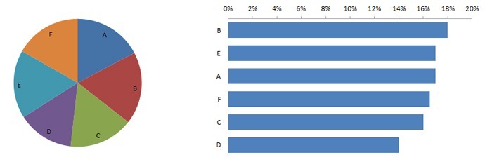
Which is better for communicating information: pie charts or bar charts? “Pie charts communicate information poorly… Our visual perception is not designed to accurately assign quantitative values to 2-D areas” says visualization expert Stephen Few in his book “Show Me The Numbers.”

The book backs up the claim with a compelling example that I’ve attempted to recreate below — which of these two charts do you find easier to interpret?

More Read

raw data to visualization
From Raw Data to Visualization: Marvel Social Graph Analysis
Data Visualization – A Growing Business Need
Big Data Snapshot [INFOGRAPHIC]
Evolving the Formula 1 Racer
December 2011 issue of the R Journal: An overview

data visualization

But recent research by Tufts University seems to make the answer less clear-cut.

Researchers monitored the brain activity of participants making a percentage estimation of a chart section compared to a previous chart, using both a bar chart and a pie chart. After examining all the data, their conclusion was that they rejected their “initial hypothesis that brain signals would indicate that bar graphs are easier to use for most people.”

Some participants said they found the task easier using bar charts and others found pie charts easier. This appeared to be backed up by both the observed brain activity and the reaction times and error rates of the two groups. However, the type of chart used didn’t seem to make a difference in terms of analysis performance: “despite a clear separation in brain activity between the bar high demand group and the pie high demand group, we observe very little difference in response time and error.” In addition, “there was no indication that either bar graphs or pie charts were superior across all participants on this particular task.”

Here is a short video summary of the study:

This is clearly one small study that concerned a particular (and potentially unusual) task, and should be considered in light of other research. But more data is better, and I would encourage you to spend as much time understanding what’s interesting about the study as you spend trying to figure out why you can disagree with it… I also hope that it might encourage more nuanced, less dogmatic discussions of data visualization best practice.

Share and Enjoy

TAGGED:bar graphdata visualizationpie chartShow Me The Numbersstephen few
Share This Article
Facebook Pinterest LinkedIn
Share

Follow us on Facebook

Latest News

protecting patient data
How to Protect Psychotherapy Data in a Digital Practice
Big Data Exclusive Security
data analytics
How Data Analytics Can Help You Construct A Financial Weather Map
Analytics Exclusive Infographic
AI use in payment methods
AI Shows How Payment Delays Disrupt Your Business
Artificial Intelligence Exclusive Infographic
financial analytics
Financial Analytics Shows The Hidden Cost Of Not Switching Systems
Analytics Exclusive Infographic

Stay Connected

1.2KFollowersLike
33.7KFollowersFollow
222FollowersPin

You Might also Like

US Economic Census Treemap

4 Min Read

Looking at Trees to Understand the Forest

6 Min Read

Analysis Reveals Dramatic Rise in UK Tech Investments

3 Min Read
Data Visualization
Data Visualization

10 Important Ways Data Visualization Can Benefit Your Content Strategy

13 Min Read

SmartData Collective is one of the largest & trusted community covering technical content about Big Data, BI, Cloud, Analytics, Artificial Intelligence, IoT & more.

ai chatbot
The Art of Conversation: Enhancing Chatbots with Advanced AI Prompts
Chatbots
giveaway chatbots
How To Get An Award Winning Giveaway Bot
Big Data Chatbots Exclusive

Quick Link

  • About
  • Contact
  • Privacy
Follow US
© 2008-25 SmartData Collective. All Rights Reserved.
Go to mobile version
Welcome Back!

Sign in to your account

Username or Email Address
Password

Lost your password?