“Data Visualization” has been an extremely active and popular topic for a few years – we can use Google’s Timeline search feature to see the growth in interest since 1980:
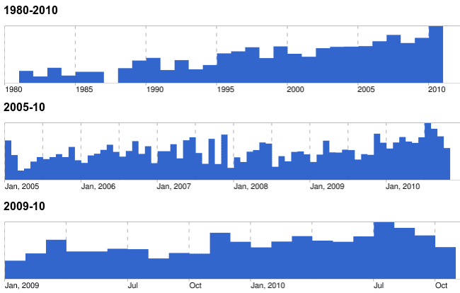
“Data Visualization” has been an extremely active and popular topic for a few years – we can use Google’s Timeline search feature to see the growth in interest since 1980:
That local high in July of this year was due in no small part to David McCandless’ Information is Beautiful talk at TED this past summer. It appeared in my RSS stream here, here, and here, so I got the hint, spent 18 minutes watching it, and got suitably jazzed on the power and potential of visualizations.
McCandless uses a variety of visualization techniques to generate insight into a wide range of topics ..
- Mountains out of Molehills – what are we afraid of? Funny stuff, but hidden patterns that jump out at you with just a little extra context.
- Facebook break-ups – at 6:15, the roller-coaster graph of predictable relationship demise, recently Slashdotted
- Military Budgets – a digression into the knack we all have of misunderstanding / misrepresenting that facts via statistics. Did you know that Myanmar is the world’s biggest war machine (as a percent of GDP)?
An important section comes when McCandless talks about the start of his work in design of data visualizations. Note that he’s not had any formal training – it was just sort of dormant within – and is very probably there within all of us, practically forced on us with the information overload of the web-enabled era. The bulk of your sensory input is visual, and the majority of our perception is happening unconsciously.
… the eye is exquisitely sensitive to patterns and variations … [it’s] the Language of the Eye. And if you combine the Language of the Eye with the Language of the Mind – which is about words and numbers and concepts – you start speaking two languages simultaneously, each enhancing the other …
I do agree with his point that an effective visualization is self-evident, and appreciated by many – but I do not think it’s easy for the average Data Consumer to see themselves as a Data Artist, one who can conjure the magic on command. I have noticed that most of the data visualizations catching the public’s eye are not the ones you can easily generate with Excel (data navigation and manipulation tool for the masses. McCandless’ “balloon race” interactive diagram of health supplements is sublimely useful, easy to understand – and beyond the tool- and skill-sets of most of us.
Nevertheless – the inspiration, the examples, and tools are out there, and I am convinced that there are more Data Artists among us – they just don’t know it yet. I’m starting a series of posts today – I’ve been following many blogs and writing about this topic for some time – but it’s been a few years, and I’ve got a big backlog of topics to cover.
So check out the McCandless video; be prepared to get psyched, and then carve out some time to join me in this review. Data is the new soil, as McCandless points out – and just like good writing, those who can effectively help other visualize data and have their own insights will harvest some interesting insights, for themselves and their employers.