I love data dashboards. They are a great way to visualize data, to spot trends quickly, to get a handle on complex relationships, and to just geek out in general. At the Tableau conference last fall, the central ballroom area had its own data dashboard that showed you interesting up-to-the-second stats about how many Tweets were posted, where attendees came from, and other fun conference facts. You would expect something from the company that delivers a data dashboard product line to do something like this.
I love data dashboards. They are a great way to visualize data, to spot trends quickly, to get a handle on complex relationships, and to just geek out in general. At the Tableau conference last fall, the central ballroom area had its own data dashboard that showed you interesting up-to-the-second stats about how many Tweets were posted, where attendees came from, and other fun conference facts. You would expect something from the company that delivers a data dashboard product line to do something like this.
Data dashboards are popping up everywhere, and this past week I took a closer look at some of the ones that local cities are creating to monitor their own performance and connect to their citizens. A good “mayor’s dashboard,” as they are known, should show a lot of information in one screen, be attractive but not completely eye candy, and do more than just be a brochure for advancing the latest political agenda.
When you think about a mayor’s dashboard, it would be nice if they were actually used by the mayor to monitor progress and to help with his or her decision-making too. It should weigh items such as crime stats, quality of life metrics, and things that a city’s residents care about: trash pickup, time on hold in various phone queues and so forth. While the mayor’s dashboard is still an evolving area, here are some example of cities that have already implemented them and my initial thoughts.
And if you want some great general guidelines on building your own dashboard, start with this presentation from a past Tableau conference here.
Feel free to recommend your own in the comments below.
New York City has been working hard on opening various databases to public access, with more than 1200 different ones that can display various insights. It is all a bit overwhelming, not much different that what a visitor new to the city might find in real life. There isn’t a single pane of glass to summarize the information that I could find however.
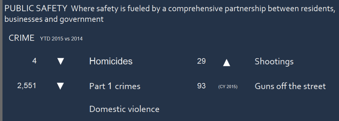 Boston’s Mayor Walsh has had a public dashboard for more than a year, and is perhaps one of the more attractive ones (one part of which is shown here), with a rotating series of graphics on city performance data. You can see that there have four homicides this year, and compare with last year’s numbers. This is very actionable information too.
You would expect Portland Oregon to have a dashboard, and it does, showing things such as the percentage of renewable energy consumed and other groovy-oriented stats. It is arranged as more of a brochure than a dashboard: so you have to click around to find a particular stat, such as the average response time for a fire alarm is more than seven minutes. You can see in the graph that this hasn’t changed much over the years.
Detroit’s dashboard is more of a book report than an interactive dashboard. This shows you what they have accomplished last week such as how many LED-based streetlights were installed or blighted homes torn down.
London’s dashboard was launched last fall and is just for crime stats. It is chock full of graphs and figures, but you can’t see the whole picture on one page unfortunately.
Denver’s dashboard is more of an RSS portal, and you can customize it to your own particular needs, displaying alerts and news feeds on economic or public safety stats.
LA has several different data dashboards including a “performance” top-line summary that shows single numbers for things such as total employment, non-attainment air quality days, and the time it takes for police to respond to 911 calls. Clicking on any of these items will bring up graphical displays and lots of city rhetoric and more marketing information. There is also an open data project too.
Seattle’s dashboard has a similar design to LA’s, with single number top-line summaries that can be expanded with more graphical detail.