

If the work of a human?s mind can be somehow represented, interactive data visualization is the closest form of such representation right before pure art.
So, what is Interactive data visualization and how are they driven by modern interactive data visualization tools?
Generally speaking, data visualization itself visually represents a certain database. With the widespread implementation of the IoT (Internet of things), these databases might be understood on both small and large scales. The database is interpreted as the information that has been compiled in a schematic, illustrative form such as variables or coordinates. The data visualization?s main assumption is to put content, thus data in an appropriate medium – data visualization tools. According to mentioned before IoT, this might be useful in any household, where e.g. the house is controlled via intelligent systems. To obtain a good representation of the current situation in the house, the visual representation software has to be used. Such a tool provides designers with a more feasible way to create a visual representation of large sets of data. Dealing with big data sets requires automation of arrangement of given data is a vast help for data visualization designers. Overall, data visualization is a common area of interest for researchers and managers. The purposes of such data visualizations might be e.g.:
- Sales and marketing materials
- Annual reports
- Dashboards
- Relationships
And any information that needs an immediate interpretation.
The appropriate method of data presentation allows for a correct and quick understanding of the dependencies described by the data. To obtain a suitable visualization, interactive software is needed. There are a number of great tools worth looking at.
What is interactive data visualization software?
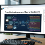
An interactive data visualization software application is a feature-rich Javascript library that incorporates tools that enable interaction between the parameters of the data. Its main aim is to implement custom, interactive diagrams for the stored data. It helps in creating new insights and capturing the full value of the data. There are several great tools worth exploring.

1. GoJS
GoJS is interoperable with any other virtual library. It is useful for basically any developer or team, whose work is in dire need of diagrams and visualizations of the project. What GoJS does precisely is to create a lively database that is flexible, that means ready to active inscribing of new data in real-time. The ?real-time? phrase is of the utmost importance. GoJS is made for teams that need to create their work flexibly and remotely, that means from any place and on the spot.
GoJS offers an abundance of possibilities ? from simple flowcharts and org charts to industrial and medical diagrams. Its possible user might vary from a marketing team needing to coordinate their tasks to a team of robotic engineers. GoJS makes it all easy with customizable templates and layouts. (put exemplary layouts here). GoJS advanced functions feature user interactivity such as drag-and-drop, copy-and-paste, in-place text editing, tooltips, context menus, automatic layouts, templates, data binding, and models, etc.
Want to learn more about GoJS? Check out this article. Synergy Codes is the most viable GoJS consultant out there.
2. Domo
Domo is another popular data visualization tool. It has earned 4.5 stars in a review from G2.
Domo offers a lot of great data manipulation features. It is used by a number of Fortune 500 companies, especially those in the retail, entertainment and media sectors.
There are a lot of reasons that it is so popular. One of the biggest benefits is versatility. Domo can connect with almost a thousand different connectors from a single dashboard.
3. IBM Data Refinery
IBM Watson Studio is a great platform for people that want to make the most of big data. One of the best big data applications available with Watson Studio is IBM Data Refinery.
There are a number of great big data capabilities with Data Refinery. Its data visualization sets are some of the most beneficial. You can leverage over 30 built-in charts and graphs to create graphical representations of your data.
Use Data Visualization Tools to Your Full Advantage
There are a lot of great data visualization tools available. Your company should use them to their full effectiveness if you want to see great results.


