

Data is one of the most valued assets for the businesses today. And since every aspect of the organization creates data, which is relevant to the businesses to understand the whys and whens in the processes, companies are in a rush to gain the ability to capitalize on what data has to offer. This capturing of value from the data and to present it in a readable, understandable format for the non-experts to implement the insight are still a challenge.
While the collection and processing of data involves a lot of technology and expertise, creating a visual representation of the data, which can be read and understood by one and all, also requires an intuitive excellence. Such excellence predominantly is needed to select visualization formats for a specific set of sample data.
It is basically a two-fold challenge; the first is how different teams perceive the importance of variables in the data and the second is to select the best format to visualize the data which could be easily read by those teams. It is therefore important for the teams, especially marketing and business analysts, to have basic knowledge of data visualization techniques for assorted variables to effectively implement the data insight.
Before we delve into data visualization techniques, let us quickly brush up the details related to classifications of data and levels of measurements, which helps in determining the best suitable data visualization approach.

The classification of data
Well, the data is classified in two different types: population and sample data. Population is the collection of objects in a survey. For example, if you need to know the average age of entrepreneurs in the USA, you must contact every entrepreneur in the USA to find out the exact average age. Since it is hard to observe and contact, one rarely works on the population data.
On contrary to the population data, sample data is collected, which has two characteristics: randomness and representativeness. Where randomness indicates that each member has been chosen by chance, representativeness indicates the accuracy of the member of the population.
For instance, when you want to know the average number of entrepreneurs in the USA, variables that your contacts must be the residents of the USA play an important role in the quality of data. An appropriate sample is one that is both random and representative, which can provide genuine insight on the subject.
Imagine you are working in a large enterprise, and you want to know the most favorable time for you to conduct a meeting with your prospects. You can easily get access to the database of your CRM, and check at what time most successful meetings have been conducted.
However, it is not easy as it seems, because there are several variables, which will impact your data outcome. And so you need to be strategic to apply the insight in real life.
Data is further classified on the basis of two factors, which impact data visualization approaches.
1. Types of data
There are two types of data. The first is categorical data. This type of data basically depends on yes or no answers. It is appropriate for a question like do you have a college education? The second is numerical data, which has two subsets: discrete and continuous. The discrete data type represents something that can be counted, for example, the no. of women managers in your organization. On the other hand, continuous data represent something which is difficult to count, for example, the weight and height of everyone in your organization.
2. Measurement levels
Data is measured in two levels: qualitative and quantitative. The qualitative data is further categorized into two subsets: nominal and ordinal. Nominal categories are specific, independent groups. For instance, different brands of cereals such as Honeycomb, Froot Loops, Lucky Charms, and Rice Krispies. The ordinal data is groups which is available in certain order. For example, if someone asks you to rate the customer service in the order of very dissatisfied, dissatisfied, neutral, satisfied, and very satisfied.
On the same account, quantitative data is categorized in two types: interval and ratio. Ratios are data categories which contain no zero. For instance, the gender ratio in your organization 3/2 i.e. for every 3 men there are two women. Interval data never comes in absolute numbers. For example, temperature of a room or weather data, which is measured in Fahrenheit or Celsius.
Data Visualization Techniques for Assorted Variables
Understanding the classification of data is essential to understand how the variables are categorized into groups, and to determine the best option to represent those variables in statistical formats. As a marketing, sales or business analyst, you might be using different types of software to perform your daily tasks.
Let us take an example of field sales CRM, which is usually available with reporting and analytics capabilities. In the dashboard of the CRM, you would find the statistics depicting the performance of your sales team or overall business. Most of those reports are based on the variables you have already fed to the database.
As a process leader, you must ensure that the variables you have taken in account to create the statistics are appropriate and the visualization approaches effectively present the performance picture of your business.
Here take a look at the most common data visualizations techniques, depending on the categories of variables.
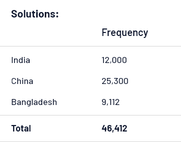
1. Frequency distribution table
It is the simplest form of arranging data, typically in two columns. For example, the data shows the number of automobile manufacturing units in India, 12,000, China, 25,300, and Bangladesh, 9,112. Now when you order the data in frequency table, it would look like this:
This is for depicting categorical variables. But when you visualize the numerical variables with a larger dataset, you need to group the data into intervals and then find the relative frequency to give meaningful presentation to the data.
Choosing intervals is again a complex task, which largely depends on the dataset available with you. For example, you can take desired interval 5 for a large dataset and use a formula to determine the interval width, which is: largest number-smallest number/number of desired intervals. Once you get the numbers, you can order it in distribution table format.
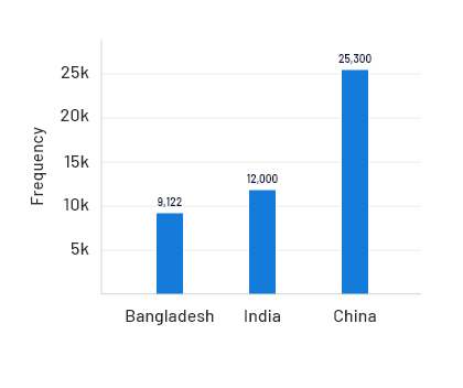
2. Bar Chart
Now, we can depict the same data in a bar chart as well, where the vertical axis represents the names of the countries and the horizontal axis represents the number of manufacturing units.
3. Pie Chart
When the same data is represented in the pie chart, we need to calculate the percentage of total of each country represented. Here we need to find the relative frequency, which in all pie charts add up to 100 percent. So the relative frequency for the above dataset would be:
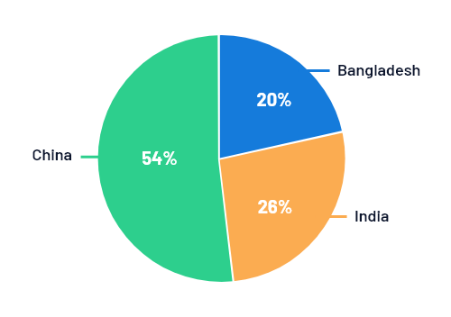
Pie chart is not just used for comparison purposes, but to see the entire share.
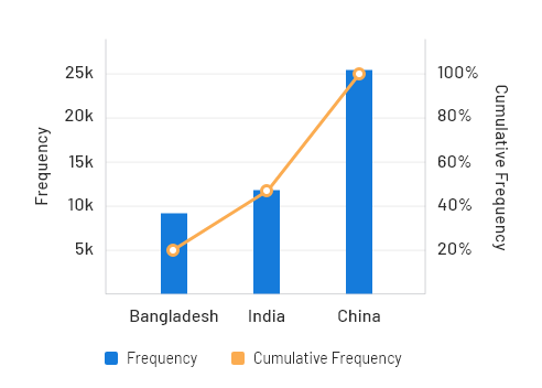
4. Pareto Diagram
Pareto diagram is basically a combination of bar and chart. In the diagram, categories are shown in descending order of the frequency, wherein the frequency represents no. of occurrences of the same event. In the same chart, you can show both relative and cumulative frequency. While you already know how to get the relative frequency, cumulative frequency is referred to the sum of relative frequency, which is indicated by a polygon line measured by the vertical axis in the chart.
Another three types of charts used for visual representation of data are Histogram, Cross Tables, and Scatter Plots. However, you won’t find them easily, especially as any software features.
The Bottom-line
Whenever you need to plot data, there are multiple variables that must be considered for an effective visualization and interpretation of data. Although background work involves a lot of mathematics which is not usually performed by marketing or business analysts, professionals in decision-making roles must be aware of what goes into data so that they can accurately interpret the outcome.


