
We use cookies, including third-party cookies from Google to serve personalized ads through AdSense, to operate this site and understand how it is used. By continuing to browse, you accept this use. See our Privacy Policy and Terms of Use for details, including how to opt out of personalized advertising.
Accept
SmartData CollectiveSmartData Collective
  • Analytics
    AnalyticsShow More
    chatgpt image jul 21, 2026, 04 34 30 pm
    4 Core Benefits of Predictive Maintenance after Vibration Analysis
    10 Min Read
    How Does Data Mining Boost Customer Satisfaction in Logistics? Harnessing Analytics for Results -- AI-generated illustration
    How Does Data Mining Boost Customer Satisfaction in Logistics? Harnessing Analytics for Results
    11 Min Read
    chatgpt image jul 13, 2026, 04 23 45 pm
    How Data Analytics Helps Companies Improve User Engagement
    19 Min Read
    chatgpt image jul 13, 2026, 03 59 46 pm
    How Data Analytics Improves Multi-Location Search Strategies
    10 Min Read
    cybersecurity efforts
    How Behavioral Analytics and AI Are Redefining Cybersecurity for Boca Raton Businesses
    14 Min Read
  • Big Data
  • BI
  • Exclusive
  • IT
  • Marketing
  • Software
Search
© 2008-25 SmartData Collective. All Rights Reserved.
Reading: Using TIBCO Spotfire to Analyze Google Analytics Data
Share
Notification
Font ResizerAa
SmartData CollectiveSmartData Collective
Font ResizerAa
Search
  • About
  • Help
  • Privacy
Follow US
© 2008-23 SmartData Collective. All Rights Reserved.
SmartData Collective > Big Data > Data Visualization > Using TIBCO Spotfire to Analyze Google Analytics Data
AnalyticsBusiness IntelligenceData VisualizationDecision ManagementExclusivePredictive AnalyticsStatisticsWeb Analytics

Using TIBCO Spotfire to Analyze Google Analytics Data

gopykryshna
gopykryshna
5 Min Read
Using TIBCO Spotfire to Analyze Google Analytics Data
Illustration generated with Qwen Image.
SHARE

Using TIBCO Spotfire to Analyze Google Analytics Data

At one of the websites where I have been tracking traffic for many years using Google Analytics (GA) I wanted to do analysis beyond what GA would allow. I present in this post a way of extracting data out of GA and importing it into an anlysis tool of my choice (TIBCO Spotfire), but I am sure you could use other tools as well like SPSS, SAS, Tableau, Excel etc. This post assumes a level of comfort using GA amongst its readers.

I chose the old version of GA for the purpose extracting data. I extracted data for four years by

  1. Clicking on Visitors | Overview on the left menu of GA
  2. Changing the date range to (1/1/2008-12/31/2011)
  3. I then clicked on Export and chose “CSV for Excel”. It created a CSV file with a generic name like Analytics_www.yoursite.com_200811-201112_(VisitorsOverviewReport).csv in the browsers default Download directory.
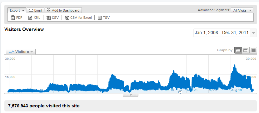

Traffic in Google Analytics

More Read

Gartner BI and Collective Insight
More Questioning Minds Needed (And Don’t Forget the Analytics)
Creating a Better Educational Experience With IoT
How Big Data Can Help Forex Traders And Brokers Build A Better Future
Get the Most Out of Your Oracle Application

Now that I have the raw data I will move to TIBCO Spotfire. But before I do so I have to clean up and massage the data to make it usable in Spotfire. Clean up  and massaging involved the following steps:

  1. I opened the CSV file in Excel.
  2. Removed the 9 rows at the top and 10 rows at the bottom to be left with
  3. Used an Excel formula to remove day-of-week at the beginning and convert to date by using the formula  =Datevalue(SUBSTITUTE(A13,LEFT(A2, SEARCH(“,”,A2)),””))
 

We now have data which should look like:


Now that we have the data ready we open this Excel file in Spotfire.

  1. File | Open | {Your Excel File} | {Correct Worksheet} | 
  2. Ensure that the “Date in GA” is imported as a Date field, and the Visitors as an Integer.

Using the power of Spotfire, very quickly we can get some comparisons, here are a few:
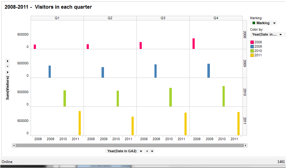
Four years by quarter
 
This indicates that the rate of growth in traffic in Q1 over the foour years has been faster than in the other 3 quarters.
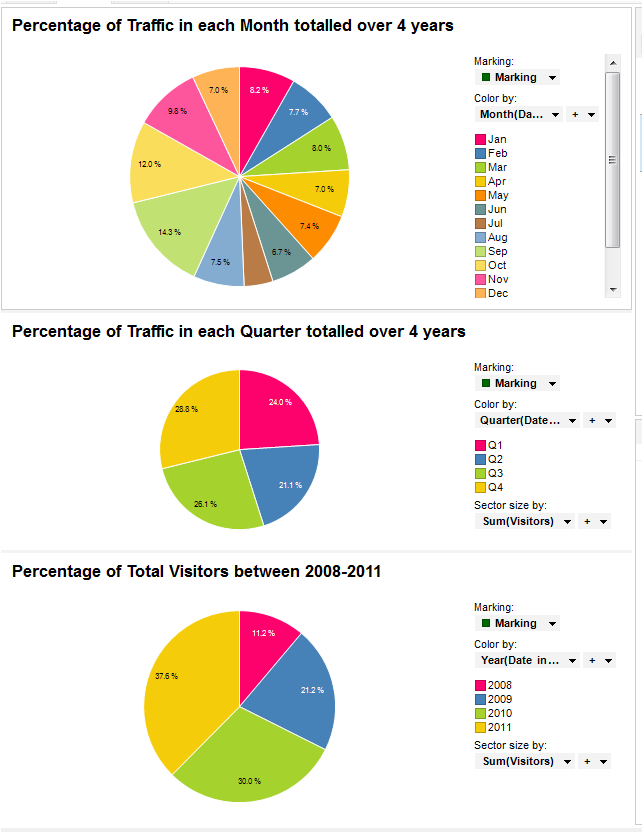
Pie Charts

Spotfire has the ability to generate such charts and also do drill-down with just a few clicks.  The pie-charts above indicate that September is usually the busiest month for the website with 14.3% of the traffic. Most traffic at the site is during the fourth quarter. Finally there has been significant increase in traffic year after year from 2008 at 11.2% to 2011 at 37.6%.
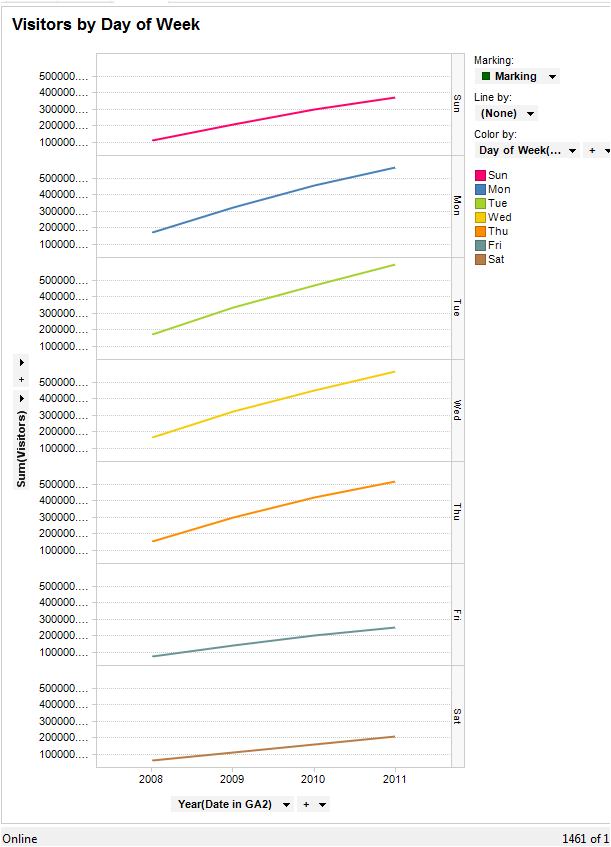
Weekly Traffic

Mondays, Tuesdays and Wednesdays the traffic at the site is at a peak, Saturday being the quietest.
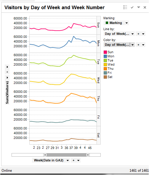
Day of week by week number

Note that by using a Zoomer Slide we have restricted the view to between weeks 20 and 45. We notice that consistently that number of visitors increases during weeks 35 to 37, with a peak on week 37. Several marketing campaigns can be targeted during this period to get the best conversion.
 
All these charts were drawn in TIBCO Spotfire using few clicks and took no more than couple minutes each. This is just the “tip of the iceberg”. We can extract data from Google Analytics under different categories like geography, keywords, browser used, screen resolutions etc. Spotfire can then provide in-depth segmentation and analysis of this data. While GA does provide some capability  for segmentation and analysis, using a specialised tool for statistical analysis like TIBCO Spotfire really makes sense.

I am a regular blogger in this network. You can see some of my other blogs on Social media here:

http://socialmediatoday.com/posts/published/user/117154

TAGGED:spotfire visual analysis tool
Share This Article
Facebook Pinterest LinkedIn
Share

Follow us on Facebook

Latest News

Illustration of mobile analytics dashboards with ad performance charts connected to backend databases
11 Best Sisense Alternatives for Embedded Analytics
Business Intelligence Exclusive
Analyst points at colorful circular data dashboard on screen - information technology business metrics
How Fragmented Workplace Tech Undermines Reliable Business Metrics and Reporting
Cloud Computing Exclusive Infographic IT
Using Multi-Source Data and Analytics to Detect Operational Drift Across Franchise Networks -- AI-generated illustration
Using Multi-Source Data and Analytics to Detect Operational Drift Across Franchise Networks
Exclusive Infographic
Beyond The First Impression: The Long-Lasting Impact Of Sensory Marketing -- AI-generated illustration
Beyond The First Impression: The Long-Lasting Impact Of Sensory Marketing
Infographic Marketing

Stay Connected

1.2KFollowersLike
33.7KFollowersFollow
222FollowersPin

You Might also Like

Stalking the why: selling visual analysis
Data Visualization

Stalking the why: selling visual analysis

6 Min Read

SmartData Collective is one of the largest & trusted community covering technical content about Big Data, BI, Cloud, Analytics, Artificial Intelligence, IoT & more.

5 Great Tips for Using Data Analytics for Website UX
Big Data
Chatbots and SEO: How Can Chatbots Improve Your SEO Ranking?
Artificial Intelligence Chatbots Exclusive

Quick Link

  • About
  • Contact
  • Privacy
Follow US
© 2008-26 SmartData Collective. All Rights Reserved.
Welcome Back!

Sign in to your account

Username or Email Address
Password

Lost your password?