Once businesses have gone online it became much easier to actually track and analyze the activities that provide the most beneficial results. Today it is as easy as never before to identify your customer, understand his behavior patterns and purchasing habits. And the best thing is that all of this can be learnt without actually seeing a customer with your eyes.
Data analysis is one of your main concerns If you are involved in Internet marketing, as you certainly want to optimize your site, content and campaigns to have the highest possible conversion rates. However, today we are also living in the times when the amount of tools at your disposal is just too large. Even though each of such tools is handy, it is often possible to simply lose lots of time previewing all of the data or just to lose your outlook of the big picture. This is where dashboards come handy as they are able to aggregate the data from numerous sources and display it in an easy and comprehensive way.
Main Benefits of Dashboards
Having a dashboard in place solves a few issues in your online business, no matter what kind of niche you are running. The following advantages found the most useful for my personal sites in online trading niche. I have been testing a few dashboard solutions, yet for this article I am not going to compare every single one, I will mostly focus on Cyfe, a dashboard I decided to use.
More time left for other things
It goes without saying that time is the scarcest resource we’ve got and, sometimes, it is possible just to lose hours digging into a few google analytics, mailchimp, webmaster tools and other accounts. A Dashboard allows you to structure the data in such a manner that displays all of the information and makes this data understandable from a glance.
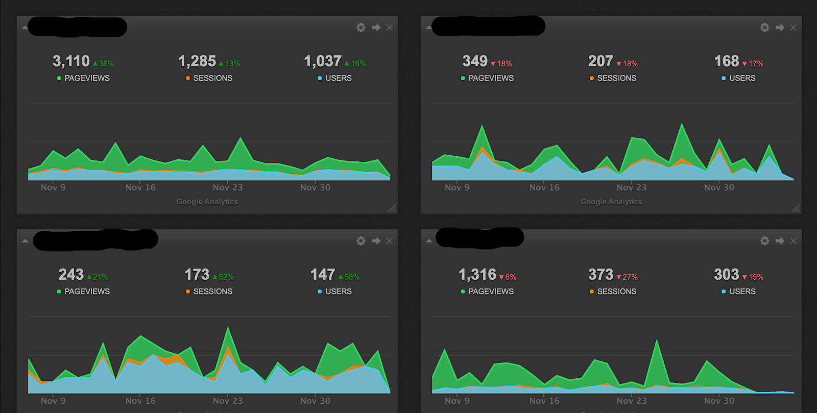
Image above shows the search visits data from 4 different google analytics properties for the last 30 days with a comparison to previous 30 days. It is a great way to keep track of your SEO activities without actually spending a minute or two per site at google analytics.
On average I was spending around 20 minutes a day on checking google analytics data for 4 of my sites. With help from the dashboard I managed to cut this into 3 minutes. This allows me to have an extra 8.5 hour working day over the course of 30 days, isn’t that cool?
No accounts conflict
It is often the case that you need to use a few accounts within a single service. The reasons for this are many, some services, like mailchimp would simply require you to pay if you have to store all of your data under one login. In other words, you can have 3 mailchimp accounts and send emails to 6,000 subscribers at no cost or do the same for $75 using one paid account.
Checking the data for various accounts within one service could be quite painful and often requires to run multiple browsers at the same time. With dashboards you can certainly eliminate it as you can feed the data from dozens of accounts on a single screen. It is hard to estimate the amount of time this saves, but it has quite some positive impact on the nerves too.
Mailing Overview
Direct email marketing and automated email marketing is still a great way to drive the traffic and achieve higher conversions. Unlike google services that come with powerful analytical tools and customised dashboards on its own, mail services are usually lagging behind quite a lot. I personally use a premium mailchimp account for the purpose of autonomation. In other words, it doesn’t make much sense for me to visit mailchimp once my campaigns are set up, yet I had to do it for reporting purposes. Luckily this is no longer the case.
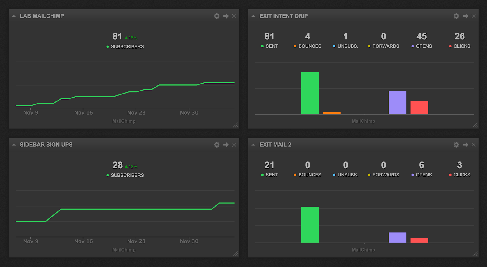
A dashboard quickly displays the amount of subscribers one of my site gets from 2 main sources – sidebar and exit intent. Next to this, each of these sources comes with automated drip campaign attached to it. Not only I can quickly observe the progress of my mailings, but I can also compare the data, something that is not really available in mailchimp that easy.
Social Media Made Easy
I don’t try to get much traffic from websites’ social channels, hence I have neglected the pages quite a lot. When I started to think of restoring social activities, I did want to have clear measurements in place and even though Facebook and twitter provide quite handy tools, it is still much more convenient to use a dashboard for drawing social data.
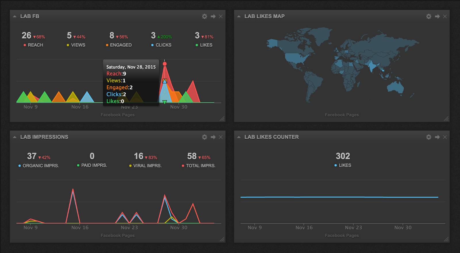
From a single look at the figures, without going into FB itself and getting distracted by new messages and your friends’ selfies, you can get a clear picture of what is going on. As you can see, my social media page is actually managed quite terribly and needs some more manual content to drive the impressions higher. Considering that each of the 4 sites comes with its own twitter, Facebook, G+ and pinterest profiles, Cyfe here is a great time saver.
Summing up
The benefits of the dashboard are just enormous. You can display the data from hundreds of sources and you can also show your own custom data. The ability to set up all of the services you use in a few clicks and consolidate all of your data under one ceiling is an important step in making more informed decisions.
You may wonder, why did I go with Cyfe? There are many alternatives and a few of them supply a larger number of integrations. However, what I love about Cyfe and couldn’t find anywhere is the 30 day chart that shows a summary with an option to put your mouse over a single date and preview the data from this given date.