Back story
Back story
35 years ago a mathematics theorist-teacher named Al Inselberg was thinking, “enough of placing data variables on x-y axes, why not put them parallel to each other to see what can happen?” Actually, he was responding at the time to a challenge made to him by his students (and the tone might not have been as flippant as my hypothetical quote suggests!). In the end it was a great question, though answers did not really start to arrive until a decade later, when his invention, the “parallel coordinates method,” was published.
By 1987 Dr. Inselberg had nicknamed his parallel coordinates approach “||-coords,” and set the stage for exploring its use in applications to air traffic control tasks. At the earlier (1977) milestone another “data luminary” named John Tukey first coined the phrase “exploratory data analysis” (EDA).
EDA was an early part of the “venn diagram” of today’s broad and popular field of “data visualization,” one that includes dozens of specific methods, one of which is ||-coords (for other examples, visit this website). Back then it was mostly an inductive journey (“collect and see data patterns, then ask questions and hypothesize”), whereas today it offers deductive paths as well (“hypothesize first, then confirm — or disconfirm — with the data”).
||-coords visualization was covered in an interesting workshop I attended titled SPACE, held at the University of California Santa Barbara in 2007. Earlier iterations of the workshop included, as co-leader, Luc Anselin. Even in his absence at my workshop, it was clear by reputation that Dr. Anselin was, like Inselberg, another theory-and-practice pioneer, one who had brought a “spatial dimension” to EDA as an exciting new path. In 1994 he coined the phrase “exploratory spatial data analysis,” or ESDA.
By 2001, he and others had ushered it to full technical realization with effective “interactive” software called DynaESDA-2; it acted as a plug-in for ArcView GIS software. The workshop I took was in part was an NSF-sponsored showcase for the latest software iteration of ESDA, fully open-sourced and interactive, now in release as “OpenGeoDa.” OpenGeoDa includes a rich array of menus, one of which is ||-coords, that act on spatially-referenced data with which a user can import, analyze, and visualize.
Enough of history — so what is the ||-coord method, who does it, and how?
Common wisdom suggests that data explorers compare continuously distributed variables on x-y axes, first in table form…


Then, as a 2D scatterplot (a “bivariate” treatment)…

Gadi Yedwab, author of a recent short essay titled Visualizing Data Correlation Using an XY Chart that appeared here at Smart Data Collective, described all this very nicely.
One can compare three variables on a scatterplot if it is made 3D, but that is less common because it gets so tricky for one to judge results…

Back to Dr. Inselberg… In a nutshell what he did was to assume three or more variables could be displayed parallel to each other, with data points (instances) appearing located along each axis.
I had trouble with “getting this” until I came up with a guitar metaphor. When Dr. Inselberg linked data instances with continuous broken line segments, the whole thing had became a digital “guitar of data,” complete with conceptual frets and strings. Instances are sorted in ascending order and they are connected across all axes so one can trace where an instance falls on a variable’s distribution (across as many variables as there are axes).


Parallel coords could then be selected and queried by plucking and even strumming the cases (over the years the latter data task became known as “brushing”) for display of results that reveal patterns.
The answer to “who” uses ||-coords is scientists (all varieties), geographers, historians, demographic and census specialists, and business folks, to name a few.
I had immediately seen intrinsic innovation present in the ||-coords method at my SPACE workshop, so I got skilled fast, then prepared and offered my own workshop on the subject at a large and international software conference in Las Vegas in 2008.
Slide decks of mine that address “what” and “how” are here: as an overview, and delivered as a focused “how-to.“
Another primer on ||-coords by Robert Kosara is here. I like it because it is well paced and illustrated. In the “comments section” you’ll see that Dr. Inselberg himself offers a favorable note about the narrative and a blogged response. Back in 2008 I learned he was, though retired, still quite active in the field of his invention’s theory and practice. So I arranged a telephone interview with him prior to delivering my parallel coordinates geovisualization workshop. Please refer to my essay’s endnote for excerpts from the “Dr. Al interview.”
Technical preamble
The open-source software to help accomplish a ||-coords analysis probably needs to be assembled as a suite: OpenOffice (for .dbf file editing), QuantumGIS (for shapefile orchestration), and OpenGeoDa (for its data import and ||-coords menu). Some people prefer using proprietary software, for example, ESRI ArcGIS, in order to tweak shapefiles prior to import into OpenGeoDa. Other researchers like using a Javascript library (such as D3.js), which is free and open-source, as the most contemporary path to web-enabled implementation. In terms of styling one’s visual presentation, screen captures that one makes can be (actually, I argue, “should be”) moved into Adobe Photoshop or other software for image editing. Over time one learns presentation is everything when it comes to ||-coords patterns; “tell” is only effective when it goes hand in hand with “show.” I recommend creating stylesheets (colors and typefonts) that reflect best practices for visual presentations. (One reason why luminary Edward Tufte visually presents data so well is that he is partnered with one of the best graphic designers in the U.S., one who has quietly championed, for decades, clear, legible and lovely datagraphic styles.) The research folks at OpenGeoDa are readying an improvement of file export capabilities that may obviate screen snapshooting. Stay tuned.
Lastly, the two meta-cases featured below are much easier to inspect as a high-resolution Acrobat PDF file. Link to a PDF (200 ppi resolution, 2.5 mb in size) of Where’s George is here, link to Minnesota 672 (200 ppi, 3 mb) is here.
Meta-Case 1: Where’s George? (and Tom, Abe, Alex, Andy, Ulysses, and Ben)


Above: seven U.S. currency denominations we know so well are shown (oops, perhaps most of us know five well!); and a map of the twelve U.S. Federal Reserve Bank Districts.
Meta-case summary: the Federal Reserve Bank Districts act as a basemap to feature where all the main seven currency denominations “reside,” and in what quantities of bills. Data are tied by boundary polygons to the regions. Seven variables are analyzed, and five small multiples are presented as maps with matching ||-coords on the right side.

Data source: a large table from wheresgeorge.com. The latter is a “crowd-source-collector” for the data, quite a popular one. Date for data download was June 2012. Basemap for the data is courtesy GeoFRED.
Connections and patterns: Just read the headlines/captions and inspect the visualization to see for yourself.
Caveats: Getting shapefiles to act as basemaps can be tricky, I had to ask folks at the Federal Reserve Bank for that. Data was rich, but being 100% crowd-sourced, good metadata is not readily available; and who knows if and/or how well it is normalized?
Questions: Why so many low-denomination bills in the SF district, whereas high-denomination bills dominate the NY region? What’s the story with the Minneapolis district as utter champion of the Jefferson $2 bill?
Meta-Case 2: Minnesota 672 (and Counting)
Meta-case summary: the state of Minnesota acts as a basemap to feature the tornadoes that touched down here from 1950 to 2011, with multivariate attributes on display. Data are tied to points, i.e., 672 tornado touchdowns. Four variables are analyzed and three small multiples are presented as side-by-side pairs.
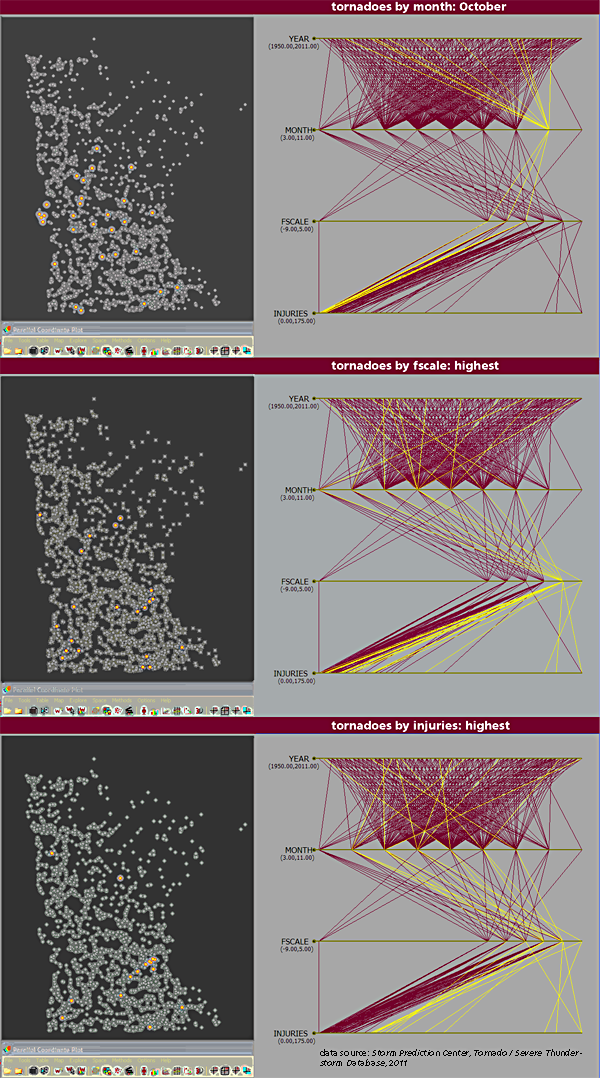
Data source: Tornado/Severe-Thunderstorm Database from the Storm Prediction Center.
Connections and patterns: Again, please read the headlines/captions and inspect the presentation.
Caveats: When one goes from polygons (as was the previous case) to data points, one ends up with so many instances! One problem that emerges is that so many points occlude or hide other points nearby. That said, data source here seems more credible than does the previous case, since its metadata are public.
Questions: Why do the tornadoes of ef4 and ef5 scale seem to cluster into four spatial sub-groups? Yet, of those, why are none in the northern one-third of the state? Do we observe that injuries in fact happen mostly in biggish conurbations (such as the Twin Cities), and if so, why? Is it because that is where population is most dense, or might it pertain more to access to better media coverage and reporting of disasters?
If and when one ends one’s analysis with this many questions, then the path has probably been an inductive one, “data in search of hypotheses.” Empirical legitimacy and related debates between inductivists and deductivists continue within today’s smart data zeitgeist. Proponents of the latter, such as David Hendry, might critique the ||-coord cases that I feature as “torturing data till a false confession is obtained.” That said, deductivist critiques do seem to be on the wane right now, while some of today’s inductivists are riding a wave of popularity with the upswing of sophisticated data-mining methods (code named “big-data”). I noticed Robert Gourley offered his interesting essay regarding the latter, titled Discussion of Big Data in the Geospatial Intelligence Domain, here at Smart Data Collective last month. Either way, ||-coords could work well for both camps.
What’s next?
The better question might not be what but rather where, and when. It turns out Dr. Inselberg himself discovered that the ||-coord method could actually address “where” questions. One of his own early meta-cases was a detailed analysis of ground emissions in a subregion of Slovenia. Historically, when (and how often) have been popular concerns for ESDA research – more so lately. It was clear to me while attending the interesting data visualization conference titled Eyeo 2012 last month that time-based animated geodata were magnets for the audience’s attention.
When I reflect on Rudyard Kipling’s famous “six serving men” I think of the sequence of questions we ask ourselves as we engage in research, and I arrive at responses to each set as follows…
What and why: philosophy, epistemology, axiology
What and how: every discipline on the planet (what = theory, how = methods)
What and who: biography, demography
What and when: history
What and where: geography
What, where, how often, how long, how much, and when: data visualization, especially after the new millennium
EDA is a more focused realm than data visualization, and ESDA is even more focused than EDA. Clearly, the ||-coords method I have showcased here is about as micro-focused as one can imagine. That is good, I would argue. The promising attributes for the future of data visualization are both a methods focus (micro-tools) and a data locus (space and scale).
Depending on your age you may recall Star Trek’s TV-broadcasts, wherein we heard its narrator making the now-all-too-famous claim of “space [being] the final frontier.” I believe the “when” for its crew’s voyages were the years 2371-2378. As much as I “bought into it” at the time, it is clear to me now that no frontiers are ever final (and that data will never stop with simply “being big”). Would it be fair to leave the three-and-half-century future trends to Gene Rodenberry or Nostradamus, and instead offer a more modest assertion? Data visualization of the next decade will lay claim to richly addressing those heretofore unanswered Kipling questions of where and when (space and time).
§§§
My Interview with Dr. Al
Dr. Al Inselberg was in Tel Aviv when I spoke to him by phone, four years ago this month. Very active at age 72, he was just back from a teaching stint at Korea University. He said he was a year or so away from publishing his life’s work as a book titled Parallel Coordinates: Visual Multidimensional Geometry and Its Applications.
As I started to aim questions his way about “parallel coordinate plots” he immediately put me on pause: “Hold on! Hey, they have nothing to do with plotting. I prefer the phrase ‘||-coordinates,’ or ||-coords.” I got a timeline of what Dr. Al viewed to be his publishing milestones. I couldn’t write that fast so I only got halfway through the 1980s before my hand hurt: 1981, PAMA, in Monterey, California; 1981, a 144-paged tecnical report; 1985, an IEEE Intelligent Instrumentation Conference in Miami Beach. Wow. Finally he told me his website had it all.
I said I was looking for metaphors to share with workshop attendees. “Well, OK, think of your data as a multidimensional watermelon. ||-coords are a kind of knife that that let’s you make complex but elegant cuts.” (I ended up preferring a guitar metaphor, but so it goes.) What about the “brushing” metaphor that I had heard about from folks at my SPACE workshop? “No, avoid fancy terms if you can, what it really is is querying, i.e., selecting data subsets.”
Back in 2008 I think that the phrase “big data” may have still been a twinkle in many data visualizers’ eyes, but I happened to ask Dr. Inselberg back then, “How on earth can one apply the parallel coordinates method to really large datasets?” His tip: “Never look at it all, rather, figure a way of performing ‘intelligent sampling.'” We wrapped it up with chitchat about why data visualization needs more beauty, along with a social exchange about our families. It wasn’t easy at first, but the interview ended up both unforgettable and fun.
Fact-checking and editing assistance courtesy Dr. Julia Koschinsky. Editing assistance courtesy Brendan Byrne