
Data visualization has become a significant part of life for those looking to use the large swathes of data available in the modern world. As important as this data is, understanding and making use of that data is even more critical.
- 10 Ways Data Visualization Can Benefit Your Content Strategy
- 1. Visualization leads to faster absorption of more Data
- 2. Images add to your SEO
- 3. Visualization unlocks big data difficulties
- 4. Visualization tells and sells stories
- 5. Data visualization makes patterns and trends easier to spot
- 6. Visuals go viral
- 7. Your goals and achievements can be easily shown
- 8. Speeds up the decision-making process
- 9. Video Infographics are key
- 10. Analytics made easy
That’s where data visualization comes in. To put it simply, data visualization is converting hard data and lists of numbers or facts into an easier-to-comprehend form. Instead of hundreds of rows and sheets of numbers, various types of graphs, charts, heatmaps or infographics can be used to make the same information more understandable.
Whether big businesses use data visualization to show executives market trends or patterns or small businesses use it to make digestible reports. Sport is even making use of data visualization. Just look at this heatmap of where Manchester United Midfielder Bruno Fernandes has played recently.
As the world and various businesses, companies, blogs, and individuals across the world gain access to analytics and data of all sorts, understanding that information is increasingly crucial.

And that’s where data visualization comes in.
10 Ways Data Visualization Can Benefit Your Content Strategy
In case you haven’t yet been sold on why data visualization is important, these ten ways should be enough to convince you to go from huge data sets to digestible visuals in no time!
1. Visualization leads to faster absorption of more Data
If you’re in marketing, you’ve probably heard the mind-blowing statistic that humans process visual information up to 60 000 times faster than text-based info. While it may be a bit of an internet misnomer, the idea that data visualization allows people to absorb vast amounts of data at the glance of the eye is a well-known reality.
This is because not only is 90% of all information the brain processes visual, but according to the Visual Teaching Alliance, our brains retain images seen even for just 13 milliseconds combined with our eye’s ability to register as many as 36,000 visual messages per hour.
This means graphs, charts, infographics, and other visualization techniques immediately affect the brain. It’s a much more natural process than for you to read, comprehend the text and then create a mental picture of what that text means.
It’s easier than ever these days to make a graph online as well as other forms of data visualization that will make data more easily absorbable. The more data visualization evolves, the more interesting and attention-grabbing visualizations will become.
2. Images add to your SEO
Data visualizations are essential for anyone working with analytics in terms of their reporting, and they actively contribute to good SEO practices.
Authority is an essential concept in terms of SEO. By having high-quality content (in the form of great and informative data visualizations), other websites will want to use your visualizations and link back to your content! This then builds your authority as search engines begin to recognize you as an expert on the topic you’re talking about.
Great data visualization can also benefit other SEO aspects such as the structure of your posts and the bounce rate of your audience.
As it stands, image-based searches account for 19% of Google searches alone. So it’s more than fair to say that having good quality data visualizations is something worth taking into account.
3. Visualization unlocks big data difficulties
By 2025, the total amount of data that’s been created, captured, and used globally will be around 180 zettabytes. For anyone who’s not a data scientist, a single zettabyte is the equivalent of a trillion gigabytes.
That’s a lot of data.
The problem at this scale is analyzing it and making something useful. Companies worldwide have increased access to this information, and many are unable to use such large amounts of information fully. Combing through this information is unfathomable.
Luckily, data visualization and AI are combined, not just to sort through the data, but to create meaningful reports and visual representations of their findings. Converting legions of data from facts and figures to something human leaders and decision-makers can use to make actionable and increasingly real-time decisions.
Big data is becoming increasingly important for companies like Apple, Meta, Amazon, and various leading companies to make informed decisions.
4. Visualization tells and sells stories
While there’s still a place for text and written articles, stories that use data visualization techniques can be just as compelling, if not more.
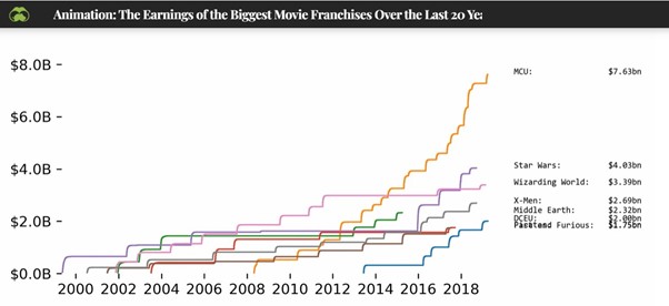
Imagery is often far more emotive and so can leave a lasting impression. The number of words it would’ve taken to tell the “story” of the rise of the MCU as a movie franchise, for example, would’ve been far more dull and lengthy than just using a graph like the one below.
Data visualization builds upon one of writing’s oldest adages; show, don’t tell.
5. Data visualization makes patterns and trends easier to spot
Data visualization is a handy tool for identifying trends or patterns. These can easily be lost in data sets or even blog posts that rely on the written word alone.
Data visualizations are a great way to display facts and trends that are relevant to your goals – but they’re also a great way to create an impactful visual representation of them.
Not only are visualizations more memorable, but they’re infinitely more shareable. Something that can’t be underestimated in today’s social media age.
6. Visuals go viral
A recurring theme in this post is just how visual people are when it comes to processing information. Our eyes love color, movement, and general simplicity. It’s just who we are.
Visuals generally elicit more emotion than long winding texts or data sets. Data visualization carries an emotional weight that connects with people far more than facts and figures simply don’t.
It’s why scientists have been making increasing use of data visualization techniques like the one below.
Reports on topics of global warming can be dry and off-putting, with the average reader either getting bored or lost in pages of the reports necessary to convey their message. This is much more likely to translate into emotion and from emotion, lead to engagement, and from there, the information is much more likely to be broadcast.
There’s a reason why memes are so popular after all.
7. Your goals and achievements can be easily shown
One of the more obvious uses of data visualization is its ability to reflect achievements and goals.
Whether this is in the form of creating measurable goals like subscriber targets, numbers of clicks, sales, and so on, all of this data can be collected and then shown through a visual medium.
Charts and graphs in a modern context are great ways to go about this. Think of an HR department using an interactive pie chart to display the effectiveness of their diversity hiring process.
The applications are endless and with today’s workforce often requiring positive, healthy work-based reinforcement, data visualization is a great way to go about it.
8. Speeds up the decision-making process
Our ability to rapidly comprehend data that is in a visual form far exceeds that of other means. And the faster humans process information, the faster they can make decisions using that information. Data visualization has a major role to play when it comes to increasing the speed of decision-making.
If you make use of data visualization during meetings with clients or managers, odds are those meetings are not only more likely to be decisive, but as much as 24% shorter. The same article even stated that using visual language during meetings meant you’re 21% more likely to reach a consensus!
9. Video Infographics are key
The word has come a long way from painfully slow powerpoints and unappealing forced graphics. Infographics have become commonplace in the blogging world thanks to their knack for using color, creativity, and making information easy to understand and video infographics are now the way forward.
Video infographics are the latest in terms of data visualization and data storytelling. It adds a whole new aspect to the “story” you are telling. Think about it, if you had to choose between this essay on the topic of global warming or this Crash Course video that makes use of video infographics, which would you choose?
10. Analytics made easy
Anyone who works in any of the more data-driven spheres of marketing like SEO or PPC will tell you that without data visualization, relaying their findings to coworkers or managers is nearly impossible. A jargon-filled report about conversion metrics, click-through rates, and so on can be tricky for people with no marketing knowledge.
According to Phi Dang from Sidepost, “…data visualization simplifies this process and makes these relationships easy for the average person to understand.” Anyone who’s ever heard the old adage “time is money” would sooner run through a brick wall than have to take the time to have someone explain everything that goes into acquiring those analytics rather than just seeing them represented visually.
Final Thoughts
What makes data visualization as a whole so important is its ability to convey information visually. Human beings are incredibly visual and so anything that can condense vast amounts of information through the use of graphs, charts, and infographics is a recipe for success.
Complicated text or number-based data sets are not only confusing but dull. Given the fact that the average attention span of Millennials is around 12 seconds and Gen Z is almost 8 seconds, the more info you can get across the better.
Given that background, it’s easy to see why and where data visualization can benefit your content strategy. Hours of research, time, data, and analytics can all be combined into a neat package that people naturally gravitate to.
Data visualization is as close to a universal language as most marketers will get. Today’s and indeed, tomorrow’s audiences demand shorter, more informative, and shareable content.
The result is that data visualization is a key that marketers today simply cannot go without.


