In this post I am going to show you how to customize existing Salesforce dashboards, such as those provided in apps you install from the AppExchange, or dashboards you may have inherited from a coworker or Salesforce consultant.
For examples I will be using two of my own Salesforce apps:
In this post I am going to show you how to customize existing Salesforce dashboards, such as those provided in apps you install from the AppExchange, or dashboards you may have inherited from a coworker or Salesforce consultant.
For examples I will be using two of my own Salesforce apps:
-
CloudAmp Analytics Dashboards, a dashboard application that integrates Google Analytics data into Salesforce for marketers to see the top of their funnel
-
Lead & Opportunity Dashboards, a free set of dashboards to better visualize your salesforce lead and deal trends
But the tips and techniques here are applicable to any Salesforce dashboards and reports.
This post also assumes you have the proper Salesforce permissions to modify Reports and Dashboards, and have some basic familiarity with Salesforce reports. If not, you may want to start with Salesforce’s Reports and Dashboards Quick Start documentation.
With all that out of the way, let’s get started!
Clone / Save As
The first rule of customizing dashboards and reports — and this is especially important if you are new to Salesforce’s reporting capabilities — is to ALWAYS make copies of the dashboards and reports you are modifying. That way you always preserve the original copy, in case you need it later.
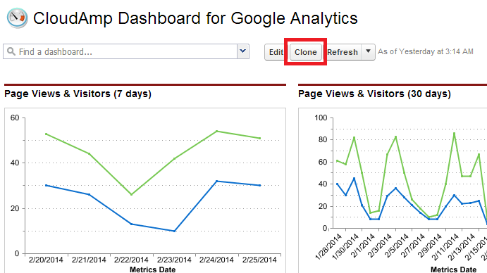
For Dashboards, just click the “Clone” button that is above every dashboard. This creates a full copy of the dashboard you can rename and save.
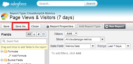
For reports, after you click the “Customize” button, be sure to click “Save As” to make a copy of the report before going any further. This is even more important than cloning dashboards, since a report could be used in one or more dashboards, so modifying a report that you did not create might cause changes you did not expect in dashboards where that report has been used.
Changing Date Ranges or Date Groupings
One of the simplest changes to make in your dashboards is adjusting the date ranges displayed in the charts. Sometimes date ranges are just based on personal preference, but often you need to modify them based on your business. If you measure sales on a monthly basis or want to be able to see the immediate impact of a campaign, you may want to see shorter time periods, but if your sales cycle is long or you want to understand longer term trends, then seeing longer periods makes sense.
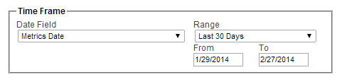
To edit the date range in a Dashboard chart, simply click on the chart to get to the underlying report, modify the “Time Frame” drop down, and click “Save As” (you can also do this through the “Customize” button, but Salesforce gives you the option of changing date range without changing the underlying report as well).
Depending on how much data you have of a particular kind, you may also want to change the groupings of the dates. Salesforce Summary or Matrix reports can be grouped by any field in the report, which cause reports to be summarized by those groups — for example, you could group leads by Lead Source, or by Created Date.
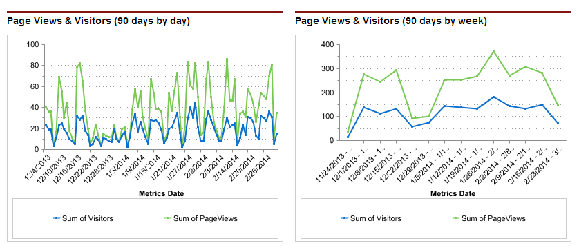
When you group by a date field such as Created Date, you have a choice of multiple date ranges to group by — everything from days to years. As you can see by the graphs below, two charts showing identical data look quite different when one changes the grouping from daily to weekly. Changing the grouping to monthly would decrease the number of data points even further. It would smooth out the curve to show the month over month trends more clearly, but for some purposes it might not show enough data (for example, if you had atypical traffic spikes on a particular day, those events would not be visible in the monthly graph).
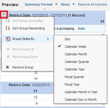
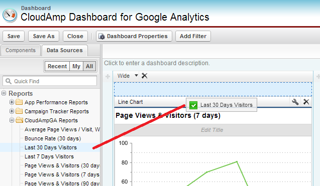
To change a report date grouping, go to the report and click “Customize”. The groupings are shown in the shaded blue sections. Click the down arrow on the left side, and then select “Group Dates by” and change how you wish the range to appear. If you click “Save”, the dashboard that uses the report should automatically refresh the chart when you return to it. If you click “Save As”, just go to the dashboard and drag the newly named report onto the appropriate chart to update the dashboard.
Remove Charts you don’t need
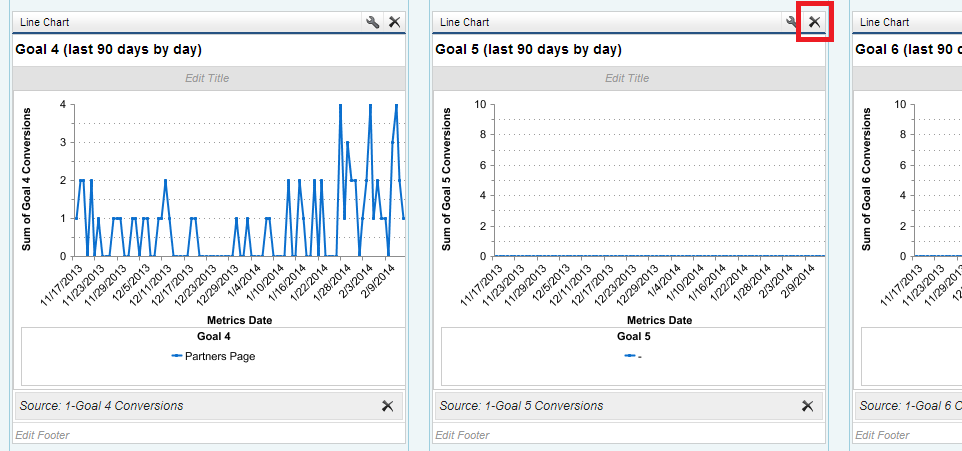
Some existing Salesforce dashboards will have a number of charts for areas where your company may not have data. For example, the CloudAmp Analytics Dashboards have charts for all 20 goals that you can define in a Google Analytics account, but most organizations only have a few goals set up for their web site.
In these cases, after first cloning the dashboard it is easy to remove unused charts from the dashboard, and reposition the ones that are in use. Simply click “Edit” on a dashboard and click the “x” in the upper right hand corner of the charts you wish to remove. Any charts below will shift up when you delete a chart, so you may have to drag the remaining charts to reposition them as you wish.
Change Chart Types
I prefer line graphs for most of my dashboards, but you may prefer bar charts. Or perhaps your boss just loves pie charts. Depending on the type of data in your report, it may not be advisable (or technically possible) to switch to a certain type of chart, but generally it is quite simple to change a chart type in Salesforce dashboards.
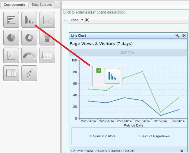
After cloning your dashboard, just click “Edit”. Then go to the “Components” tab in the left hand side, select the type of chart you want, and drag it over where your current chart/report is positioned. That’s it.
Use Charts Elsewhere
A final common task when customizing existing dashboards is the need to add certain charts to other dashboards. You may have an executive dashboard where you may need a certain chart of a key performance indicator (KPI), or be tasked with building a dashboard for the marketing department to review in a weekly meeting, where everyone just wants to see the high level reports.
If you don’t have a pre-existing dashboard, a good way to start is to find a dashboard that has some of what you want, and click the “clone” button (shown above). You can then delete charts you don’t want (also shown above), move some charts around, and you have a good starting point.
To add a chart to a Dashboard, and click “Edit”. Drag the Data Source (report) you want onto the dashboard, then drag the Component (chart type) on top of that to format it (or start with the Component and then the Data Source — it doesn’t matter which one you drag and drop first). You will see a blue box with a dotted line highlight the places you can place the new chart as you drag it.
There are many other options for customizing Salesforce dashboards and reports, but those are some of the basics. Questions? Favorite dashboard customizations? Leave them in the comments below, and thanks for reading.