 Today Big Data has made the impossible, possible. Collecting and analyzing unstructured data types such as social media data, web click streams, network and data center logs is no longer a daunting task.
 Today Big Data has made the impossible, possible. Collecting and analyzing unstructured data types such as social media data, web click streams, network and data center logs is no longer a daunting task. While Hadoop and MapReduce are the technologies behind the scenes to crunch massive volumes of data, advanced visualizations have become the art that show us the best (and worst) parts about our data.
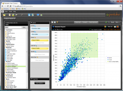
Out of all types of different visualization styles, bubble charts are unique in the sense that they allow you to show hundreds of individual values at once! They are the perfect visualization for showing data sets that have a high degree of distribution in their frequency. Let me give you a couple examples:
Example # 1 – A call center looking at hourly tickets, on a week by week basis, to understand what issues cause the most service calls. Optimizing the call center performance requires analyzing average call duration as well as call wait times, for each service issue. This can be 1000s of calls every hour of every day. How you graph this? With a bubble chart that shows:
- X axis – days of the week
- Y axis – hours of the day
- Color of the bubbles – reason for the call / service issue
- Size of the bubbles – quantity of calls or call duration or call wait time
Example # 2 – A marketing organization looking to improve its branding and customer sentiment. What is the best way to visualize their online presence such as tweets as well as other social media sentiments?
- X axis – previous week vs. current week, for a week over week analysis
- Y axis – their company and their major competitors
- Color of the bubbles – keywords such as “bad quality” or “crash”
- Size of the bubbles – volumes (# of tweets) or the intensity of the sentiment (e.g. “hate”, “worst”, “like”, “love”, etc.)
Want to see this in action? Check out this 3 minute video to find out how a bubble chart can help you visualize your data.
What are your data troubles? Do you have the Big Data technology and the advanced visualizations required to see it? I would love to hear more use cases of this visualization. So, drop me a line at @farnazerfan or leave a comment below.


