
As with most things in life, the ability to communicate is the one of the keys to success. As a matter of fact, applying this philosophy to analytics and data mining is often considered one of its major challenges.
As with most things in life, the ability to communicate is the one of the keys to success. As a matter of fact, applying this philosophy to analytics and data mining is often considered one of its major challenges.
In analytics, it is now recognized that data represents the foundation or building blocks of analytics. Yet, how do we “tell the story” regarding the data. Effective communication is not simply conveying results and reports to people but rather “ telling a story” regarding the results and reports . This so-called art of story telling is done with the objective of actioning the results from an analytics exercise. Why is this so?
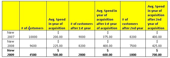
If we think about the basic psyche of the human being, we all understand that messages which resonate to our emotional side are often the ones that we remember and take action on. Messages that are conveyed through stories do seem more likely to appeal to our emotional psyche and are thereby remembered in future initiatives. Although one might argue about the limits of data mining’s appeal to our emotions, the notion of telling a story does seem to resonate in such a way that we have stronger recollections of the key findings and results of an analysis. What do I mean by this? Listed below is an example of a cohort report on new customers.In the cohort report above, key metrics such as looking at the trend in customer counts in each year along with average spend provides the key data or results in being able to “tell the story”. From this data, the story can be told as follows. For some reason, new customer growth was low in 2009, yet spending was really high for this cohort group. Yet, both retention and growth in spending in subsequent years for this cohort group experienced clearly inferior results when compared to 2007 and 2008. Is there something unique about the 2009 cohort group and more importantly what kind of initiatives and strategies were conducted to attract new customers in 2009.


Let’s take a look at some other data and results. In this case, we are looking at results of an insurance response model. Listed below is a table of a final model variable report:
|
Variable |
% contribution to Model |
Impact on Response |
|
Number of Products |
35% |
+ |
|
Number of Previous Promotions |
25% |
– |
|
% spent on financial products |
15% |
+ |
|
Credit score |
15% |
+ |
|
Live in Quebec |
10% |
+ |
In the model report above,key indicators such as % contribution of the model helps to determine the importance of each variable in the response model while the impact metric helps to determine the relationship or trend of each variable versus response. Both these metrics then allow us to “tell the story “ of what an insurance responder looks like. The “story” here is that insurance responders tend to have many products, have not received many promotions , tend to buy financial products , are credit worthy and tend to live in Quebec.
The above two examples represent just a small sample of the many situations where one can attempt to tell a story with data and output. As human beings, we are inundated with facts and results. Yet, we pay attention to those individuals who are the story tellers. Story telling helps to increase retention of learning and knowledge increase. Ultimately, this is the key to increased actionability. If we expect data mining and analytics to become more entrenched within organizations, send in the story tellers.


