
We can spend years discussing the psychological, neurological and abstract business potential behind the use of dashboards as part of our business intelligence software. It’s quite literally never ending.
We can spend years discussing the psychological, neurological and abstract business potential behind the use of dashboards as part of our business intelligence software. It’s quite literally never ending.
As product managers, analysts and designers, we’ve buried our faces in pages of scholarship related to color schema, organizational layout, labeling and the exportability of our information. We’ve debated the relative merits of 3D vs. 2D, sparklines, deviations, and it always seems like we’re still striving for continuous improvement in design and user acceptance. The volume of work dedicated to the study of analytical dashboard science – present and past – has been truly tremendous and worthy of applause from every corner of our industry.
Having said all that, it’s also been tremendously overwhelming for many of us who are trying to get down to brass tacks and increase the usability of the visual information we produce. The clients and consultants we work with need to know how the dashboards translate to palpable business purpose. The virtually indiscernible shades of orange for our bar graphs or the size of our aggregate table measurements may be keep us up at night as we’re tossing and turning to achieve visual perfection, but we need to plainly accept the fact that our business users just don’t care about that as much as we do.
Organizations purchase business intelligence tools for the outcomes they produce from data. Sure – the visual appeal is really great, but let’s never lose sight of the central principle of implementing BI in order to fundamentally better understand a business and make data-driven decisions more confidently.
As such, let’s take an extremely holistic and practical look at dashboard design and implementation. These three simple tips not only compare the benefits of certain visual formats over others, but they also look at the business context behind these considerations. Let’s begin by revisiting some rudimentary questions.
What is a dashboard and why should we care about them?
Let’s keep it simple: a dashboard is a group of resources combined into one unified visual display. It brings in graphs, tables, charts and KPIs in an effort to make patterns abundantly obvious to the consumers (and eventual purveyors) of this information. In the context of BI software, a dashboard is the canvas that contains all of your actionable out of the box scorecards, KPIs, reports, etc. Basically, it’s the house for all your pertinent business content.
According to the preeminent expert on data visualization and analysis, Stephen Few, a dashboard is a “visual display of the most important information needed to achieve one or more objectives; consolidated and arranged on a single screen so the information can be monitored at a glance.” The challenge is not necessarily building the resources to display, it’s to design and present these resources effectively and in a way that makes the processing of the information quickly.
That leads us to an overarching and significant dichotomy of sorts in the BI universe. A BI solution has a number of interrelated components, and if you want a BI solution that’s successful and sustainable, all of these components need to be wrapped together harmoniously. On the back-end, you need to make sure the data is accurate with unwavering integrity, and on the front end, you need to ensure the reports are effective so users can actually use them.
You can spend years on your visualization and dashboards, but if your BI data quality is questionable, they won’t be accepted. Similarly, if your data is great and trustworthy, but you have unreadable and obscure dashboards, people will defect from the BI cause.
Preventing that from occurring isn’t something that anyone could patently guarantee with brazen confidence, but there are some cardinal rules to follow to ensure your dashboards will become an indispensable part of your organization’s reporting and informational culture. These tips are meant to be used in conjunction with your organization’s unique and incomparable situations. They’re meant to be suggestions for the layout of your dashboard design, not infallible truths for your inimitable BI implementation as a whole.
Having said that, let’s give them a whirl:
#1. Determine the business goal AND your audience
This seems simple and almost painfully obvious, but you’d be surprise how many people forget all about this when producing their dashboards. We need to fundamentally understand the business, what the users are trying to do and what they’re looking for.
By being involved in the BI industry for the last decade or so, I’ve seen one exceptionally strong technique behind the framework of reinforcing the business goal: focusing on the business extremes. Users of BI content love to focus on what is failing or about to fail, OR what is working really well, so action can be taken immediately. For example, if you have a retail business, you’ll pull in the bottom 10 performing stores and the top 10 performing stores. You can quickly learn lessons from what’s working and what’s NOT working. Additionally, even though retail BI users will request a typical general ledger with all the postings, they usually also request the general ledger amount against the budget, so they’re always focusing on what’s within the budget and what’s outside of it.
It’s all about extremes. The middle “zone” will figure itself out, but the users really like to understand the wider points of their business scenarios.
Another important variable within this category is determining your audience and the way they intake information. Depending on the position/department (VP, C-level, Manager, Sales Director, Analyst), the granularity of the data, the metrics and the interaction between individual reports MUST change. A more varied and nuanced audience also means that the medium of data consumption will change – a VP of Sales may only consume a dashboard on a PC while a field sales rep would only consume relevant data on a mobile device so it’s important to optimize the design for numerous formats.
By asking yourself who the audience is and what the purpose behind their usage will be, you can then confidently build the metrics, the interactivity, layout and content.
#2. Determine the most effective way to communicate your data
So you’ve got all your data arranged into a set of packaged analytics in your BI tool. Since there’s a lot to consider and look at, in what way(s) do you present them to your users?
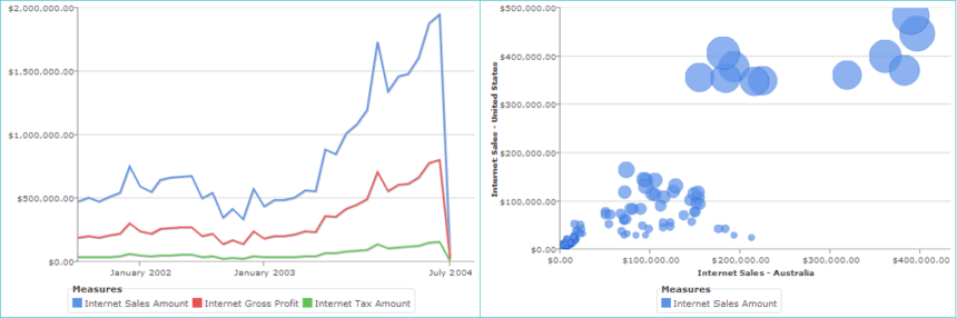
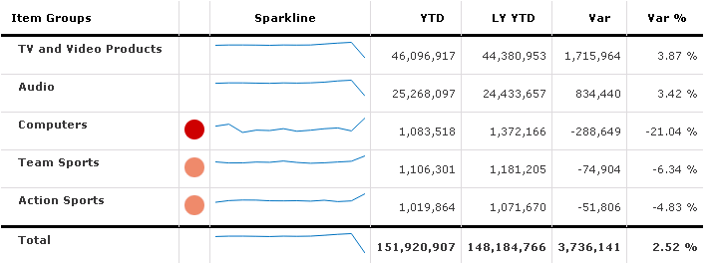
Tables are great when you need to look up and compare individual values, when your figures are extremely precise and you need to show both the details and the totals, so aggregations drilled down from the category into the correspond detail level. Graphs are particularly great when you don’t necessarily need to look at or compare individual values, but when you’re really trying to highlight patterns, understand features and discern exceptions. Or, you may need a mixture of both of these common formats of tables and graphs when you need to analyze and compare individual values while highlighting patterns and features. Pairing a few tables with a few sparklines might make the analysis a bit more pronounced for your users as it brings a visual way to report on history from rather than a fixed pivot table.
So, for example, in determining the most effective way to communicate your data, line graphs are great when you’re displaying a time series, deviation or distribution whereas point and bubble graphs are particularly useful when attempting to demonstrate correlation.

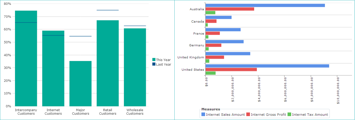
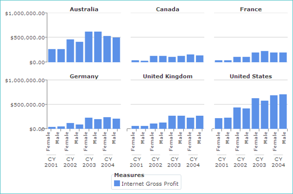
Additionally, vertical and horizontal bar graphs may be utilized when presenting a time series, ranking, deviation and distribution. These are great for comparing data of the same group (e.g. top 10 users, regions, etc.). Vertical bar graphs in many BI tools contain not only the standard bar, but also a horizontal line on top of each car in order to show current values against a goal. This can be quite convenient when analyzing budgets across various departments where the primary bar is the current year’s monetary value and the separate line is last year’s.
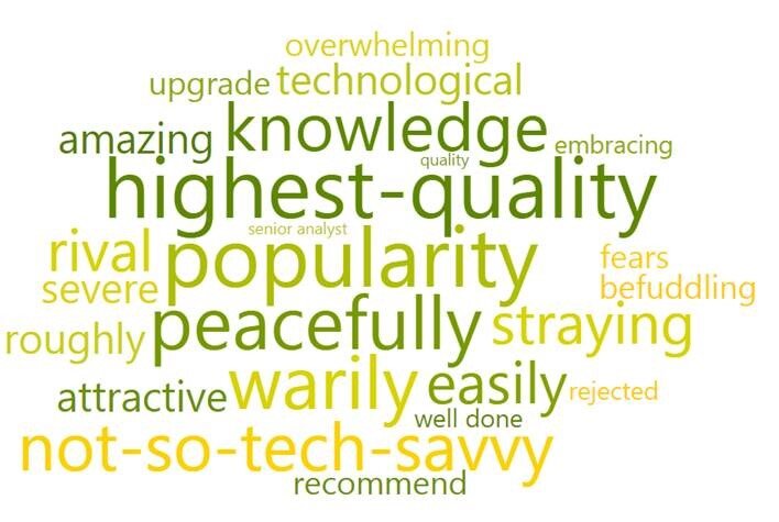
Other effective display formats may include word clouds, circular gauges and small multiples. Word clouds can be used for stimulating text analysis. For example, I work with a client that closely analyzes customer feedback data for their retail stores. We saw this in their database, we brought in this data and began displaying it in a word cloud in their dashboard. It literally highlights the main themes in what the users want to communicate to the company when it comes to feedback of their stores. A very neat way to conceptualize a word cloud and put it into practice.
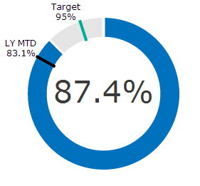
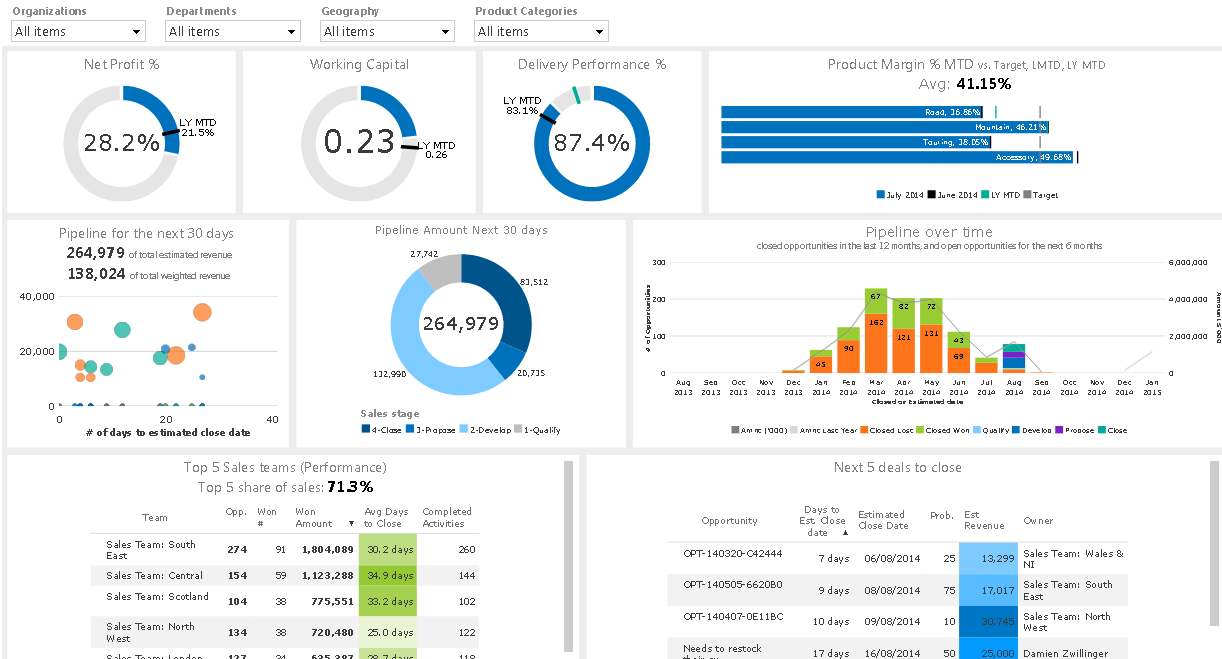
Circular gauges are also crucial in effective dashboard design because it shows percentages to totals – the quintessential measurement behind many analytics. It also appeals to more subliminal and intuitive sensibilities. The gauge resembles a clock with time, and the 100% mark is a full completion of the circle. They should always be couple with targets, relative time metrics and industry benchmark values for a better data comparison experience.
Lastly, you can display small multiples as a useful output of data for your users. It allows you to create multiple charts with one set of data or “group data,” effectively producing an easy method to compare various sub-charts since they’re all sharing the same scale.
#3. Design the component clearly
Finally, what makes dashboards visually consumable and allows your users to look at their analytics without developing a migraine?
We can delve into spatial theoretics of designing an effective user interface, but let’s just step back and flesh out some cardinal rules here.
First of all, if you’re designing tables, all figures should be aligned to the right while all text should be aligned to the left unless the displayed text is shorter than the column label and there’s a set of discrete categories (e.g. “yes” and “no”). If you have totals or aggregates, it might be helpful to make these obvious so users aren’t conflating totals with other data sets or any other category within your columns. Simple labeling or emboldening will achieve that without much hassle.
Additionally, you should always list any assumptions or notes that might be relevant. Many advanced business intelligence solutions will provide the calculated members to the users to show which filters and slicers are being applied. You can also insert a description into the title to describe how the calculations are being derived or what the assumptions behind the data might be.
Finally, you should strongly consider reducing the “data to ink” ratio – that is, minimizing the amount of ink used to display anything that is non-data (e.g. vertical lines). If you have a standard table with data housed in boxes as part of columns and rows, make sure there’s ample breathing room between the lines that the field boxes are comprised of and the data you’re hoping to display. If they’re cramped and cluttered, your users’ eyes might be distracted by extraneous visuals.
You can apply a very similar set of guidelines when it comes to the charts in your BI dashboards. It may seem obvious, but be sure you have Y and X axes titles with units along with a clear legend and title. Also, while people get carried away with colors, they’re actually meant to help the analysis, not to make the graph look fancy and obscure the message for your users. Designers, this means that you should stick with a color based on metric and try not using a green color for a bottom 10 chart!
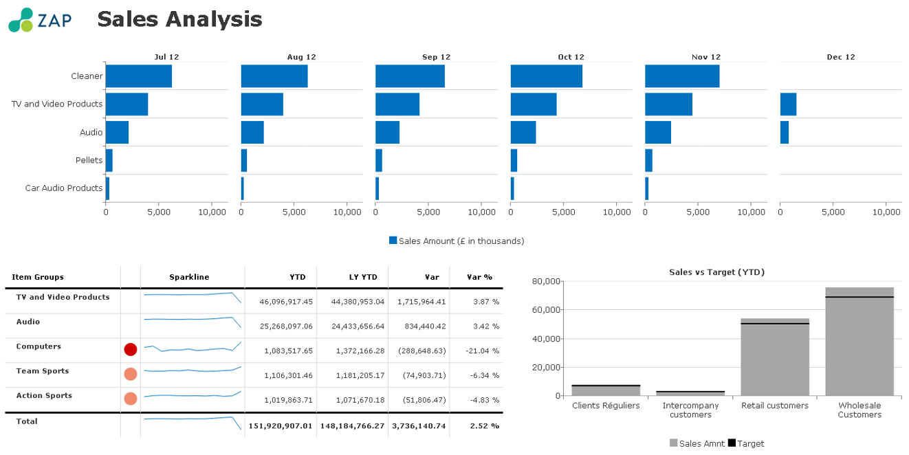
Also, consider adding a few visual aids to regular tables to highlight exceptions or trends in an expedient way. Basically, mixing tables with graphs. If the underlying data is needed, use a set of drill down reports that can go from a graph to a table with the data. The example below shows how there’s a color-coordinated cue to show the performance of a certain item group. In this hybrid model, which is sometimes called heatmap conditional formatting, we’ve used various intensities of the same shade vs. different colors to display the item group’s distance from the goal. Trends can also be illustrated with sparklines and exceptions highlighted. The goal is to simply draw attention to where it’s needed.
So once you’ve designed the dashboard’s individual components, then it’s time to frame out the entire presentation layer or the canvas to be used properly and in the true sense of a dashboard’s fundamental purpose. After you’ve pulled in the charts and tables that will represent the dashboard, I would recommend including a project or company logo to ensure clear attribution to one entity over another and creating a dashboard title showing the selected parameters or predefined constraints in the query.
Conclusion
The significance of smart and effective dashboard cannot be understated, and neither can the benefits that dashboards potentially yield. They allow users within an organization to quickly monitor how we that organization is performing, measure efficiencies and inefficiencies, generate reports unveiling new trends, make more informed business decisions with aligned intradepartmental strategies and quickly identify data outliers and correlations.
The one big benefit that I keep hearing in building out and using a dynamic dashboard is the fact that you save a tremendous amount of time when compared to running multiple reports in a piece-meal fashion. Dashboards have been designed to render the constant export of singular reports futile; you have all your data, analyses and KPIs in front of you at once.
Lastly, and just to reiterate, dashboards (and BI visualization) should be effective above all else. It’s not simply about what looks good – it’s about what’s effective. Make sure you understand what the users are trying to do and what they’re hoping to gain from the use of dashboards, try to analyze the measurements from the extremes and build it from that. Don’t underestimate the presentation later when delivering a BI dashboard, either. It’s just as important as a good back-end, a respectable dimensional model and watertight data quality.


