We use cookies, including third-party cookies from Google to serve personalized ads through AdSense, to operate this site and understand how it is used. By continuing to browse, you accept this use. See our Privacy Policy and Terms of Use for details, including how to opt out of personalized advertising.
Accept
SmartData CollectiveSmartData Collective
  • Analytics
    AnalyticsShow More
    chatgpt image jul 21, 2026, 04 34 30 pm
    4 Core Benefits of Predictive Maintenance after Vibration Analysis
    10 Min Read
    How Does Data Mining Boost Customer Satisfaction in Logistics? Harnessing Analytics for Results -- AI-generated illustration
    How Does Data Mining Boost Customer Satisfaction in Logistics? Harnessing Analytics for Results
    11 Min Read
    chatgpt image jul 13, 2026, 04 23 45 pm
    How Data Analytics Helps Companies Improve User Engagement
    19 Min Read
    chatgpt image jul 13, 2026, 03 59 46 pm
    How Data Analytics Improves Multi-Location Search Strategies
    10 Min Read
    cybersecurity efforts
    How Behavioral Analytics and AI Are Redefining Cybersecurity for Boca Raton Businesses
    14 Min Read
  • Big Data
  • BI
  • Exclusive
  • IT
  • Marketing
  • Software
Search
© 2008-25 SmartData Collective. All Rights Reserved.
Reading: Analysis of a Bad Indicator
Share
Notification
Font ResizerAa
SmartData CollectiveSmartData Collective
Font ResizerAa
Search
  • About
  • Help
  • Privacy
Follow US
© 2008-23 SmartData Collective. All Rights Reserved.
SmartData Collective > Big Data > Data Mining > Analysis of a Bad Indicator
Business IntelligenceData Mining

Analysis of a Bad Indicator

Editor SDC
Editor SDC
5 Min Read
Analysis of a Bad Indicator
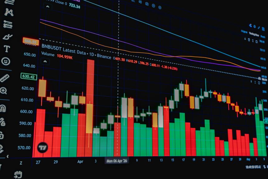
Photo by Rafael Minguet Delgado on Pexels (https://www.pexels.com/photo/financial-chart-showing-cryptocurrency-market-trends-38782892/)
SHARE

I watched a video lecture, as I often do, on data analysis. here’s the video: the Hilbert Spectrum. Here are the notes I took while watching it:


The idea is appealing- to decompose a time series into underlying trends of different periodicities. In the trading world this would correspond to maybe a long term macroeconomic trend, a monthly pattern occurring around announcement of the federal funds rate, and a short term pattern caused by supply and demand and liquidity constraints. The researcher in the video was trying to study ocean waves with satellite data. Obviously there may be a difference in the two processes.

I implemented the Hilbert spectrum algorithm because I was excited about it. Here’s the R script. For example, here’s what the spectrum looks like for GOOG & TYP share prices:

At the top is the actual price series and below that are the series with the high frequency patterns removed one by one. They look nice.

Here’s the code, hspect.r, in the language R. R is basically an advanced calculator that’s also programmable.

More Read

Why Budgeting Is "Mission Critical" in Higher Education
Why Budgeting Is “Mission Critical” in Higher Education
What makes “CRM” social?
Forrester: The Era of Self-Service BI is Here
Using Big Data to Win: How to Create Data Driven Strategies for Your Company
Business Intelligence: Intuitive vs Cool Data Visualization and Infographics

The problem is that this is a type of smoother, useful for summarizing and exploring data, but useless for extrapolation or prediction. Among this family is cubic spline interpolation and LOESS. At the edges, if you extend these curves to make predictions the estimates will have extremely high variance. Making predictions with one of these smoothers is equivalent to throwing away almost all your data except the bit at the very end, and then either fitting a 3rd degree polynomial to it (in cubic spline interpolation) or a straight line (in LOESS).

Cubic spline interpolation is especially insidious because most people don’t understand it and a confusing name doesn’t help. Everyone knows how to interpret two derivatives: velocity and acceleration. The third derivative is interpretable, in two different contexts, as curvature or as burst. Burst is like if you’re standing in an elevator and it goes up, how much you feel it. If the elevator is designed will, burst
will be a constant and you will barely feel it. It’s also important in roller coaster design to ensure you have a smooth ride. In terms of curvature, if the third derivative is constant, it will be pleasing to the eye as if it were drawn by sweeping hand motions. That’s the qualitative explanation. This latter interpretation of curvature is what cubic spline interpolation is based on. The cubic spline
interpolation fits a nice-looking piecewise (between each two points) polynomial which matches 1st and 2nd derivatives at each knot.

Unfortunately you have to understand these methods to know not to use them and not to trust systems based on them. I’ve had people contact me about using cubic spline interpolation for prediction but it’s just not applicable.

Feel free to add your own thoughts.

TAGGED:data analysis
Share This Article
Facebook Pinterest LinkedIn
Share

Follow us on Facebook

Latest News

Illustration of mobile analytics dashboards with ad performance charts connected to backend databases
11 Best Sisense Alternatives for Embedded Analytics
Business Intelligence Exclusive
Analyst points at colorful circular data dashboard on screen - information technology business metrics
How Fragmented Workplace Tech Undermines Reliable Business Metrics and Reporting
Cloud Computing Exclusive Infographic IT
Using Multi-Source Data and Analytics to Detect Operational Drift Across Franchise Networks -- AI-generated illustration
Using Multi-Source Data and Analytics to Detect Operational Drift Across Franchise Networks
Exclusive Infographic
Beyond The First Impression: The Long-Lasting Impact Of Sensory Marketing -- AI-generated illustration
Beyond The First Impression: The Long-Lasting Impact Of Sensory Marketing
Infographic Marketing

Stay Connected

1.2KFollowersLike
33.7KFollowersFollow
222FollowersPin

You Might also Like

Real Estate
Big DataBusiness Intelligence

Why Real Estate Should Utilize Big Data

5 Min Read
Spurring Growth in the UK Economy with Data Analysis
Analytics

Spurring Growth in the UK Economy with Data Analysis

4 Min Read
Big Data Maturity
AnalyticsBest PracticesBig DataBusiness IntelligenceCloud ComputingData ManagementData QualityExclusiveIT

CIOs Still Face Challenges to Reaching Big Data Maturity

10 Min Read
Hell is other people’s data
Data Quality

Hell is other people’s data

5 Min Read

SmartData Collective is one of the largest & trusted community covering technical content about Big Data, BI, Cloud, Analytics, Artificial Intelligence, IoT & more.

From Bolts to Bots: How AI Is Fortifying the Automotive Industry
Artificial Intelligence
The Art of Conversation: Enhancing Chatbots with Advanced AI Prompts
Chatbots

Quick Link

  • About
  • Contact
  • Privacy
Follow US
© 2008-26 SmartData Collective. All Rights Reserved.
Welcome Back!

Sign in to your account

Username or Email Address
Password

Lost your password?